drawing, graphic-art, typography, ink
#
word art style
#
drawing
#
graphic-art
#
script typography
#
hand-lettering
#
dutch-golden-age
#
lettering
#
playful lettering
#
hand drawn type
#
hand lettering
#
typography
#
ink
#
hand-drawn typeface
#
typography style
#
calligraphy
#
small lettering
Dimensions: height 205 mm, width 326 mm
Copyright: Rijks Museum: Open Domain
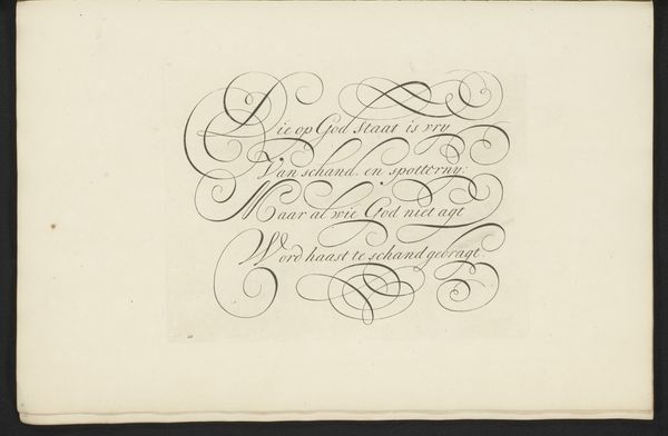
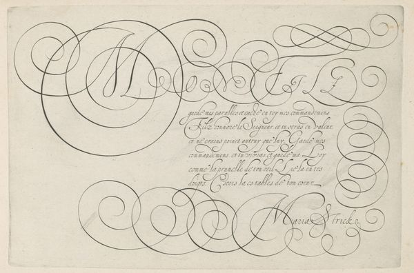
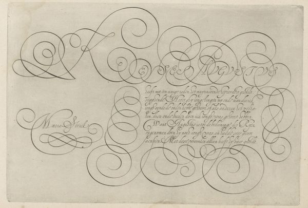
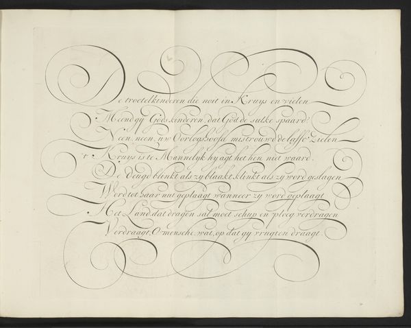
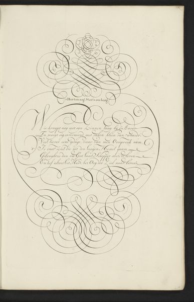
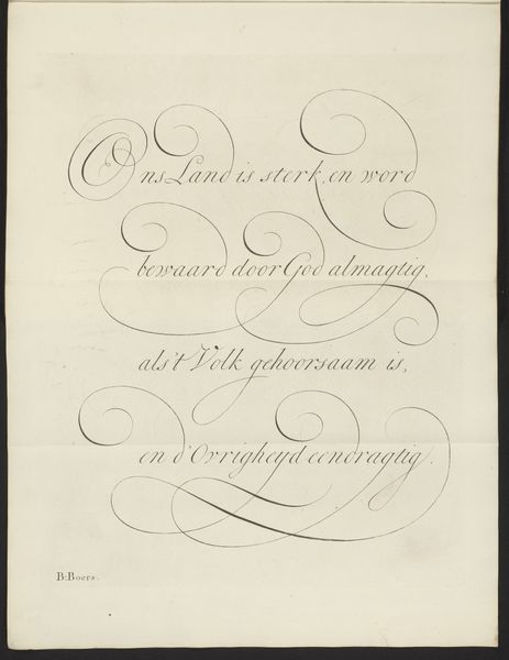
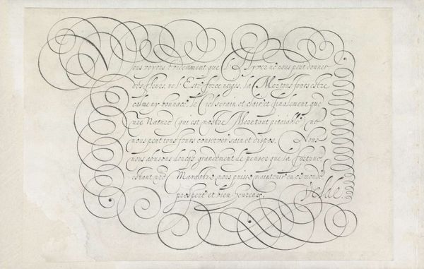
Curator: We're looking at "Schrijfvoorbeeld: De Wraak-zugt quetst wel aldermeest (...)" a drawing in ink, likely from sometime between 1660 and 1751. The artist is Bastiaan Boers. Editor: Immediately, I'm struck by the fluidity. Look at these elegant, almost dance-like calligraphic strokes! The scriptwork reminds me of intricate ironwork. I imagine a specialized hand that worked with metal would have found great use for lettering as a signature, identification for workshops, or names for businesses. Curator: Indeed. And think about the symbolism embedded within calligraphy. Each flourish isn't just decorative, but can express social status. Writing well was a valuable skill. Consider too that in this period, script embodied cultural memory. The very act of writing, replicating the hand of masters, was a way of connecting to tradition, to authority. Notice how the "De Wraak-zugt" translates roughly to "The Vengeance-desire" and the following line speaks of inward destruction. Isn't it ironic that the beauty and poise that is shown to us visually carries a tragic theme? Editor: Absolutely. This drawing acts as a fascinating object when you bring the paper itself into play. Someone made and likely prepared this surface to exacting standards. Think of the social hierarchy dictating the value of raw materials; a piece of writing paper was an object itself, like parchment, often watermarked to show its maker and region. This wasn't some disposable notepad doodle. The ink also contains materials brought to point and prepared as a precious dye, a paint almost. How was Boers supported while training to do this work, and what systems supported his mastery and artistry? Curator: Right, the act of vengeance becoming almost ornamental, part of a respected, elevated craft... Editor: Yes, the tension between the words themselves and the craft of presenting the text, creating new symbolic tension. Boers created both at once! Curator: Thinking about it, the controlled grace, is in some sense trying to mask or channel those destructive desires the writing speaks about. Editor: This examination of materiality in art truly alters how one considers not just art, but the very framework behind how any creation is formed in history, and its many complex entanglements.
Comments
No comments
Be the first to comment and join the conversation on the ultimate creative platform.
More like this