drawing, ink, pen
#
portrait
#
drawing
#
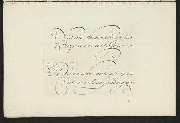
script typography
#
hand-lettering
#
baroque
#
old engraving style
#
hand drawn type
#
hand lettering
#
personal sketchbook
#
ink
#
hand-drawn typeface
#
pen-ink sketch
#
pen work
#
sketchbook drawing
#
pen
#
calligraphy
Dimensions: height 209 mm, width 329 mm
Copyright: Rijks Museum: Open Domain
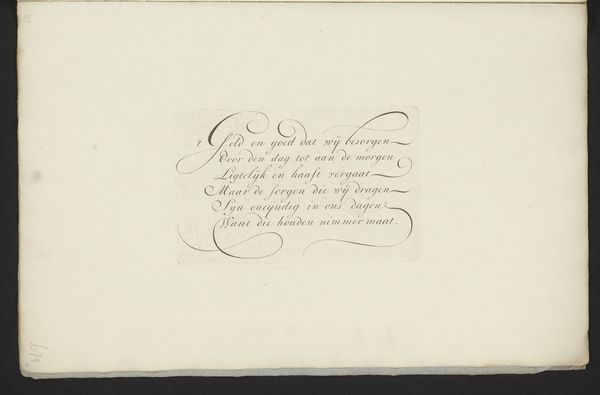
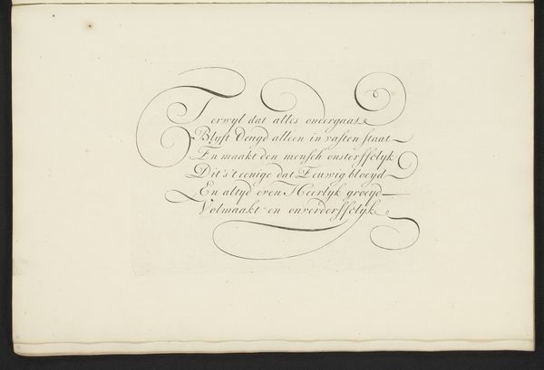
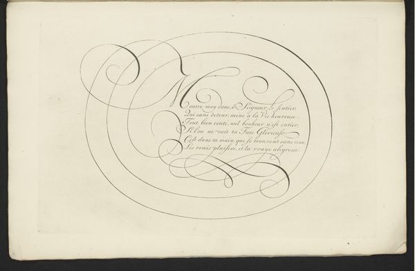
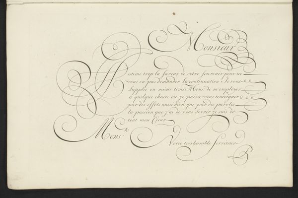
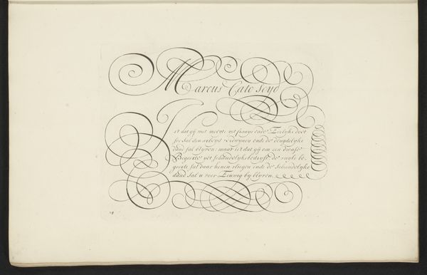
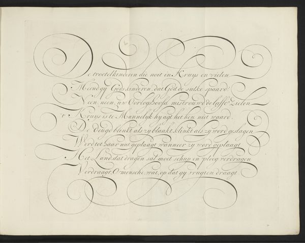
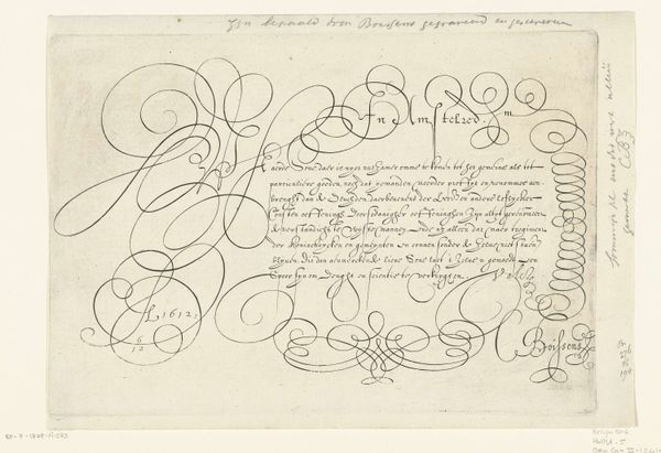
Editor: This is "Schrijfvoorbeeld: Monsieur Hieronimus vander Burg," a drawing using pen and ink, dating somewhere between 1660 and 1751. It's calligraphy, really, but something about the elegant script feels more like a portrait to me, as if the text itself is a representation of this person. What do you see in it? Curator: It’s interesting that you see a portrait. Consider the period: handwriting, especially formalized scripts like this baroque calligraphy, were markers of status, education, and belonging. The flourish isn’t merely decorative; it actively constructs the identity of Monsieur Hieronimus vander Burg. Who do you think would have been able to read this script and what might that signify? Editor: I imagine only a select, literate few. It creates a sort of exclusive club. So, the visual elegance reinforces existing social hierarchies? Curator: Precisely. And let’s consider what the text *says*. It dictates that Hieronimus vander Burg should be paying a sum of money to a Mr Abraham Serardin; the script then isn't just performative, but serves a transactional purpose related to wealth. Does knowing this influence how you interpret the artistic merit of the work? Editor: It does. I initially viewed the piece formally, appreciating it aesthetically, but understanding its historical function adds depth. The document is both beautiful and a testament to power relations within that society. Curator: Indeed. It challenges us to think critically about how artistic expression is so often intertwined with social and economic forces, then and now. Editor: I'll definitely think differently about calligraphy moving forward!
Comments
No comments
Be the first to comment and join the conversation on the ultimate creative platform.
More like this