drawing, textile, paper, ink
#
drawing
#
type repetition
#
script typography
#
hand-lettering
#
dutch-golden-age
#
hand drawn type
#
hand lettering
#
textile
#
paper
#
ink
#
hand-drawn typeface
#
thick font
#
varying line stroke
#
thick lined
#
calligraphy
#
small lettering
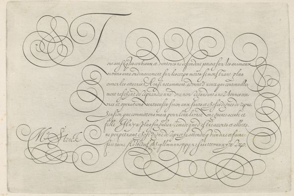
Dimensions: height 327 mm, width 415 mm
Copyright: Rijks Museum: Open Domain
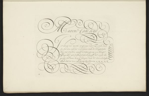
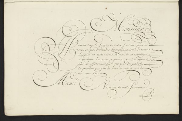
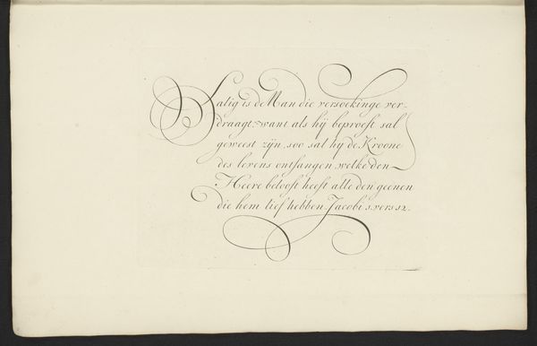
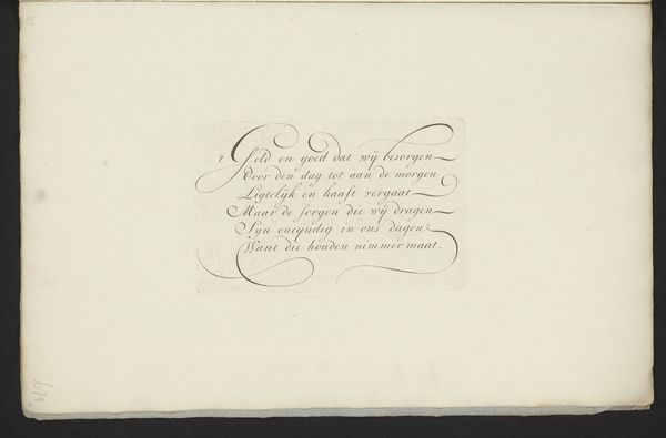
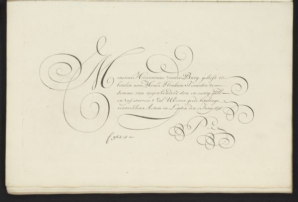
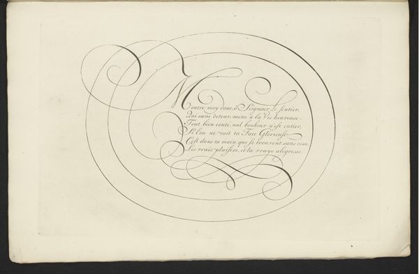
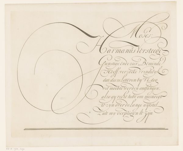
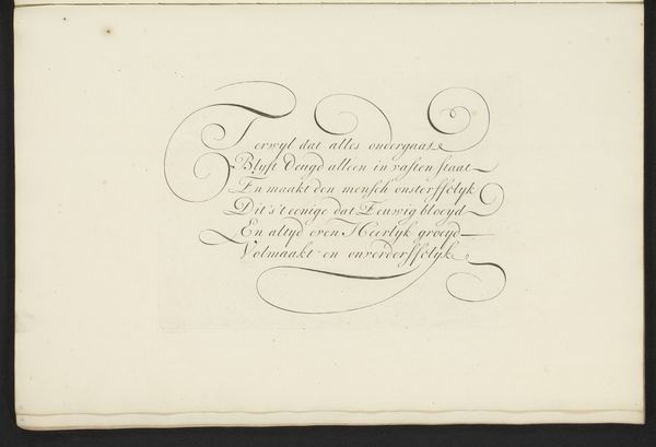
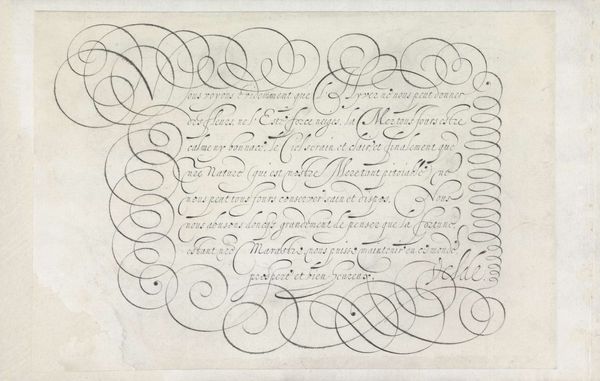
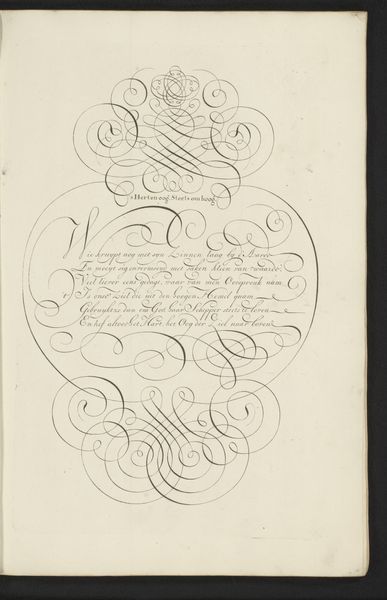
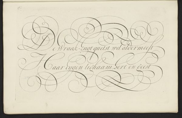
This striking calligraphy was created by Bastiaan Boers in the late 17th or early 18th century, using ink on paper. Calligraphy is not just writing, it's drawing with letters. The artist uses the pen to make the words dance on the page, creating a fluid sense of movement and rhythm. This emphasis on form and aesthetic expression elevates the act of writing to a skilled craft. Think about the amount of work involved. Each curve and flourish of the letters is the result of careful execution and focused labor, requiring rigorous training and disciplined practice. It's a pre-industrial form of production, where the labor of the hand is directly visible in the final product. In a world increasingly dominated by the printing press, this kind of personalized script would have been a mark of distinction. This piece underscores how materials, process, and context are crucial to understanding the meaning of an artwork, challenging traditional notions of what constitutes fine art.
Comments
No comments
Be the first to comment and join the conversation on the ultimate creative platform.
More like this