drawing, graphic-art, paper, typography, ink
#
drawing
#
graphic-art
#
paper
#
11_renaissance
#
typography
#
ink
#
calligraphy
Dimensions: height 201 mm, width 298 mm
Copyright: Rijks Museum: Open Domain
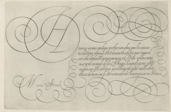
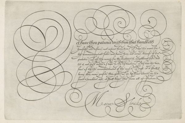
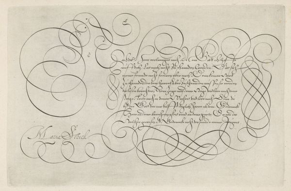
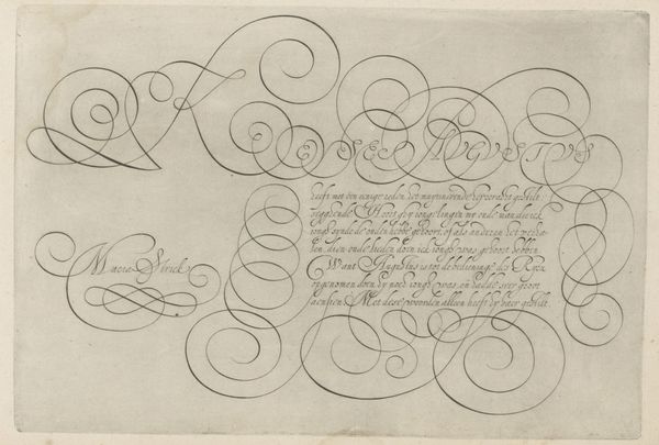
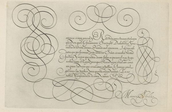
Hans Strick’s ‘Writing Sample with a Capital T’ presents an example of calligraphy rendered around 1566 in the Netherlands. During this period, calligraphy manuals served as tools for both education and self-expression, reflecting the rising literacy rates and the cultural importance of refined penmanship. Here, Strick uses elegant swirls and carefully structured lines, representative of the value placed on precision and artistry of handwriting. This work embodies the paradox of its time, aiming for both rigid adherence to form and the expression of individual style. The capital 'T', adorned with elaborate flourishes, highlights the performative aspect of writing, transforming text into a visual spectacle. It invites us to consider how even seemingly standardized forms can be infused with personal expression. This piece can stir reflection on the societal expectations placed on skill and artistry.
Comments
No comments
Be the first to comment and join the conversation on the ultimate creative platform.
More like this