drawing, ink, pen
#
word art style
#
drawing
#
script typography
#
hand-lettering
#
baroque
#
old engraving style
#
hand drawn type
#
hand lettering
#
word art
#
ink
#
hand-drawn typeface
#
geometric
#
pen work
#
pen
#
calligraphy
#
small lettering
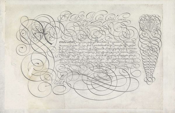
Dimensions: height 196 mm, width 294 mm
Copyright: Rijks Museum: Open Domain
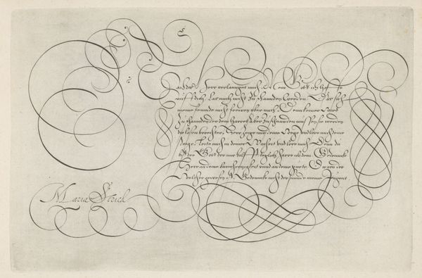
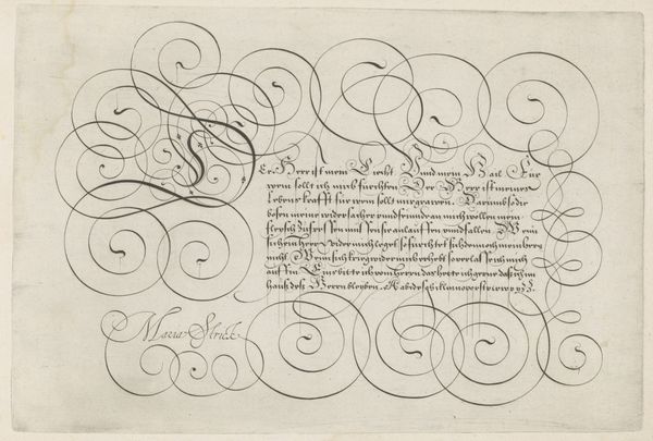
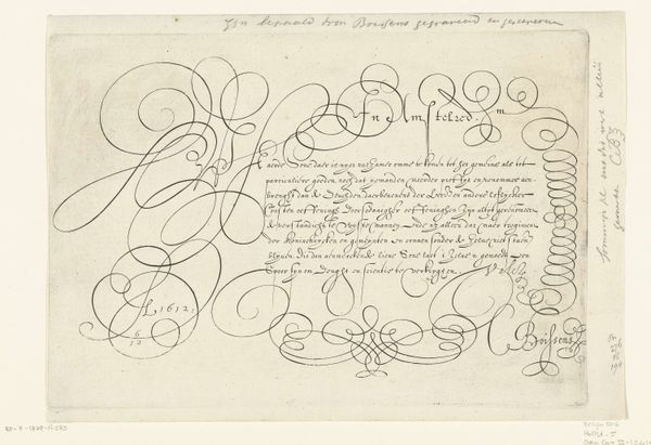
Editor: This is "Schrijfvoorbeeld met kapitaal S," a drawing in ink and pen by Hans Strick, dating back to 1618. It feels almost musical, the way the lines flow and curve. I’m immediately drawn to the large ‘S’ – it dominates the composition. What do you see in this piece? Curator: I see a reflection of a deeply embedded cultural practice – the art of script as a carrier of knowledge, power, and beauty. The swirling lines of the "S," almost obscuring the text, transform the letter into a symbol laden with emotional and intellectual resonance. It isn’t just about conveying information. How do you think the average person of that era viewed something like this? Editor: I imagine it was a sign of education, wealth, perhaps even social status to be able to create or even read such intricate calligraphy? Curator: Precisely. Think about the religious texts of the period. Words themselves held a certain divine power. Consider the Reformation and its focus on scripture, made newly available through print. Yet here, the hand persists, lending a unique quality to each word. Doesn't the very act of writing then become almost devotional? What symbolic meanings might the curves, flourishes, and connections hold? Editor: I hadn’t thought of it that way – devotional, you mean? Perhaps each flourish adds to the sanctity or weight of the words, making the text not just read, but felt, right? Curator: Precisely! The artist’s hand imbuing the text with a spiritual quality, inviting a meditative reading. Editor: I’m beginning to see that there is so much more here than just calligraphy; it speaks to literacy, religious beliefs, and even class distinctions of the time. Curator: Exactly, by understanding those symbols, it gives a greater understanding of the culture which made this piece.
Comments
No comments
Be the first to comment and join the conversation on the ultimate creative platform.
More like this