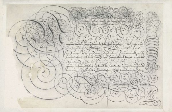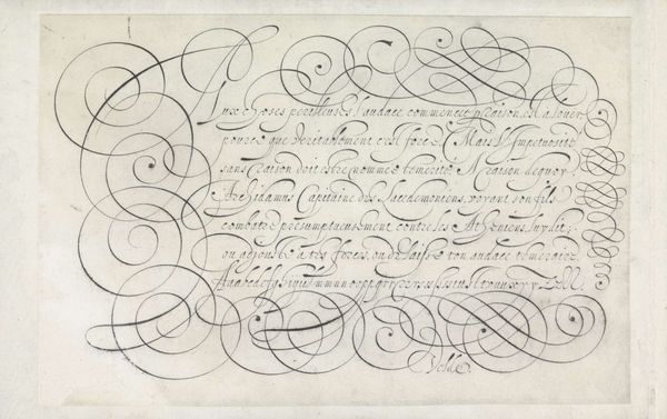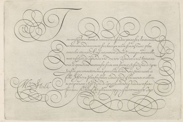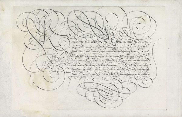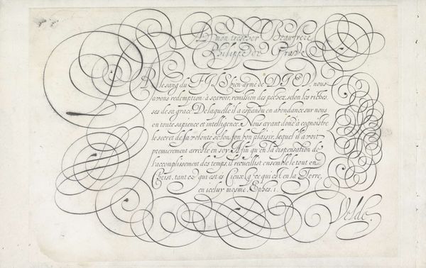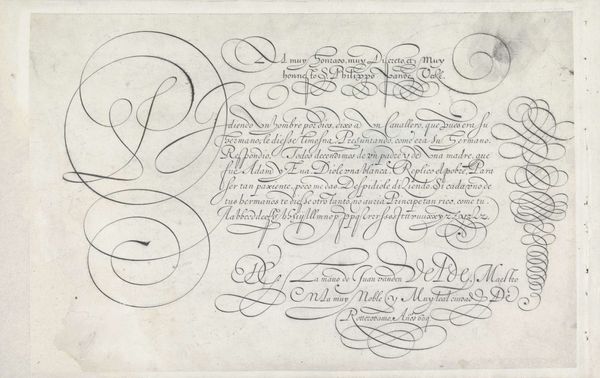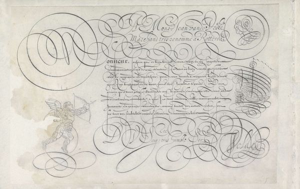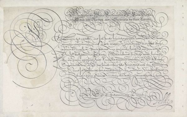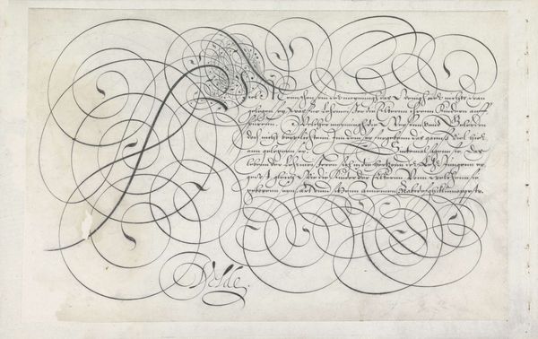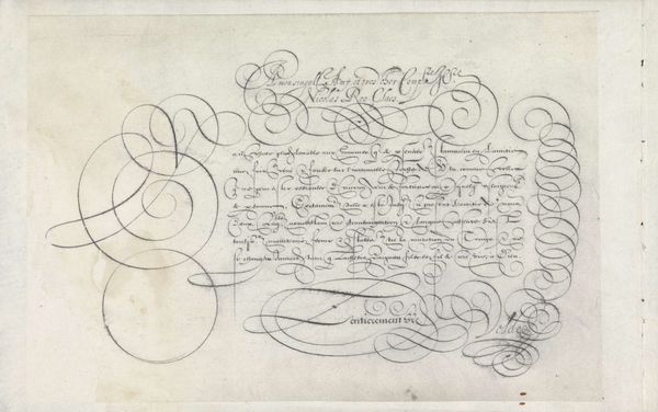
Ontwerp van een schrijfvoorbeeld: A monsieur Jacques Keyser van Bollandt 1605
0:00
0:00
janvandeveldei
Rijksmuseum
drawing, print, ink, pen
#
drawing
#
hand-lettering
#
baroque
# print
#
hand drawn type
#
hand lettering
#
ink
#
hand-drawn typeface
#
hand drawn
#
pen work
#
sketchbook drawing
#
pen
#
sketchbook art
#
doodle art
#
calligraphy
#
small lettering
Dimensions: height 202 mm, width 318 mm
Copyright: Rijks Museum: Open Domain
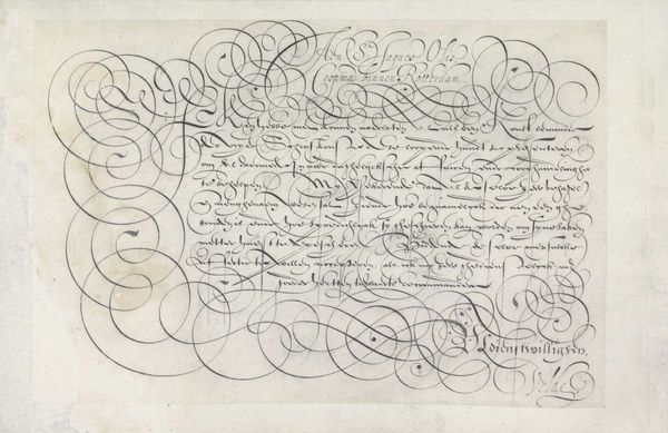
Curator: Here we have "Ontwerp van een schrijfvoorbeeld: A monsieur Jacques Keyser van Bollandt," or "Design for a writing sample: To Mister Jacques Keyser van Bollandt," created around 1605 by Jan van de Velde I. It's a striking example of Baroque calligraphy, rendered in pen and ink. Editor: My first impression is one of disciplined chaos. It's a controlled explosion of swirls and elegantly rendered text. There's a bird-like creature that seems almost heraldic, though its placement feels more whimsical than authoritative. Curator: It’s a demonstration piece, showcasing the calligrapher's skill to prospective clients. The meticulous linework wasn't just decorative. Good handwriting, in the early 17th century, reflected on a person’s social standing, their education, and, by extension, their trustworthiness in business. Editor: Precisely. The flamboyant flourishes, combined with that oddly-formed phoenix figure, could represent prosperity and rebirth, symbolically offered to Jacques Keyser. The swirling patterns—almost labyrinthine—suggest a complex negotiation or agreement, all handled with finesse. Curator: Beyond the symbolism, I am struck by the almost performative aspect of it. Van de Velde is showing off, declaring his skills, making a statement about the art of communication at a time when such artistry was deeply valued, perhaps even essential for societal and economic ascendancy. This design for a letter also provides evidence that early modern merchants from diverse backgrounds communicated among each other with different languages and customs, building early bridges for economic exchange. Editor: The fact that he intertwines a kind of fantastical beast within such an elaborate script reminds me of medieval illuminated manuscripts where text and image worked together to deepen understanding, even across social strata and levels of literacy. I wonder if Keyser was drawn to the precision or the creative flare within this penmanship design. Curator: It does make one ponder about the recipient's reaction! I am sure this design played an important part in their business interactions. Editor: Looking closely, it’s like a coded message, an exchange not just of commerce, but of artistic merit and respect, so it’s a peek into a world valuing both art and careful correspondence.
Comments
No comments
Be the first to comment and join the conversation on the ultimate creative platform.
