drawing, ink
#
drawing
#
baroque
#
dutch-golden-age
#
ink
#
calligraphic
#
calligraphy
Dimensions: height 190 mm, width 282 mm
Copyright: Rijks Museum: Open Domain
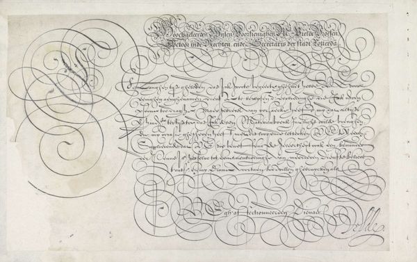
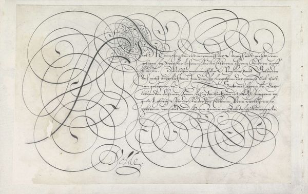
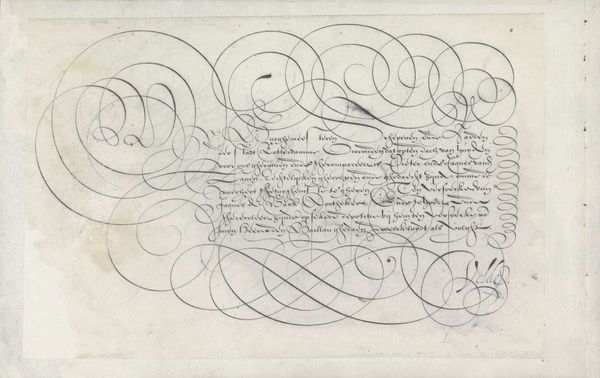
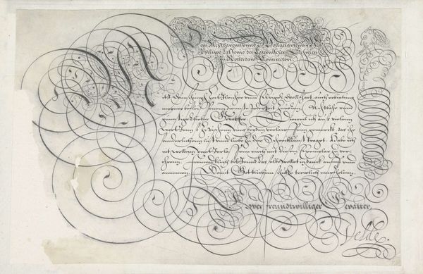
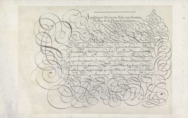
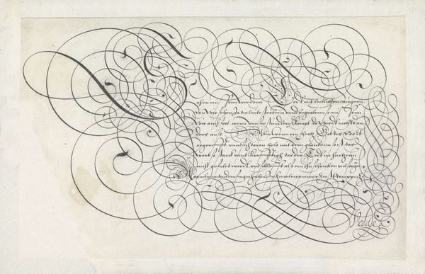
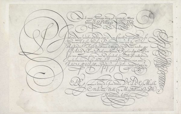
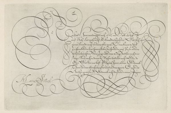
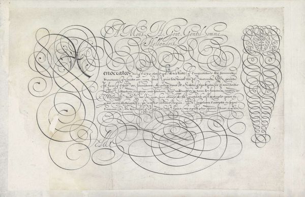
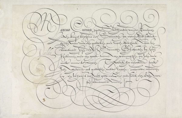
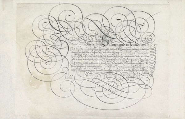
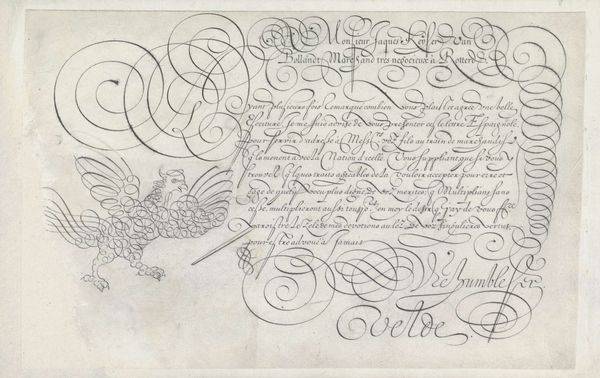
This is a pen and ink calligraphic writing sample, created by Jan van de Velde the First, sometime around the turn of the 17th century. Look closely and you’ll see how the ink bleeds slightly into the fibers of the paper, attesting to its absorbency. But more importantly, notice the artistry on display here: the rhythmic, almost dizzying interplay of swooping lines and tightly-wound eddies. It's a testament to hours of practice, building the necessary muscle memory. Writing in this period was not just about communication, but also about a mastery of technique, a control of the hand. In fact, calligraphy was regarded as a fine art, taught by masters and appreciated for its aesthetic qualities. It wasn't simply a means to an end, but an expression of skill and refinement. Seen in this light, it’s clear that even the most functional objects can be elevated to the realm of art through dedication and craftsmanship.
Comments
No comments
Be the first to comment and join the conversation on the ultimate creative platform.
More like this