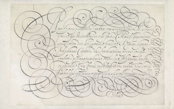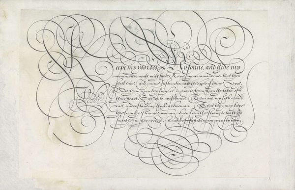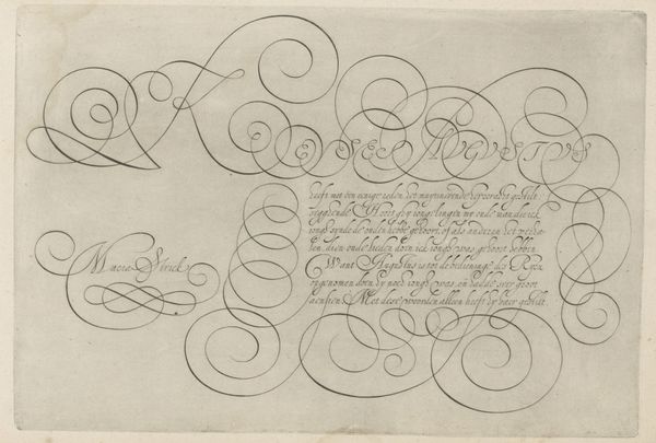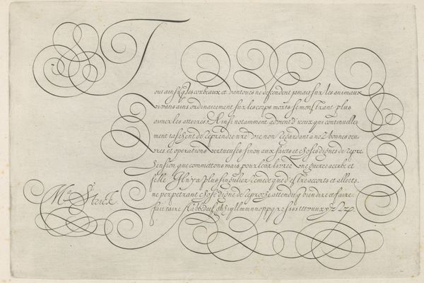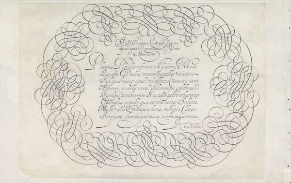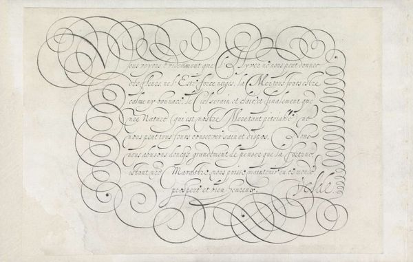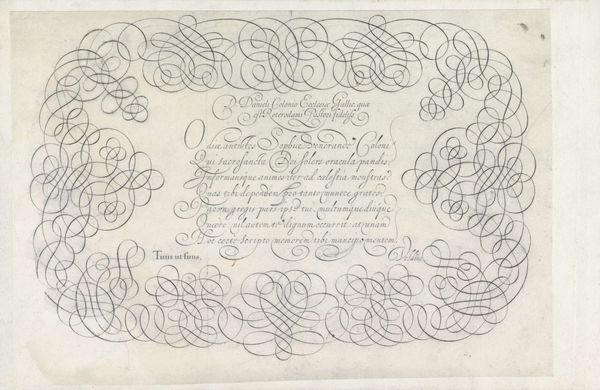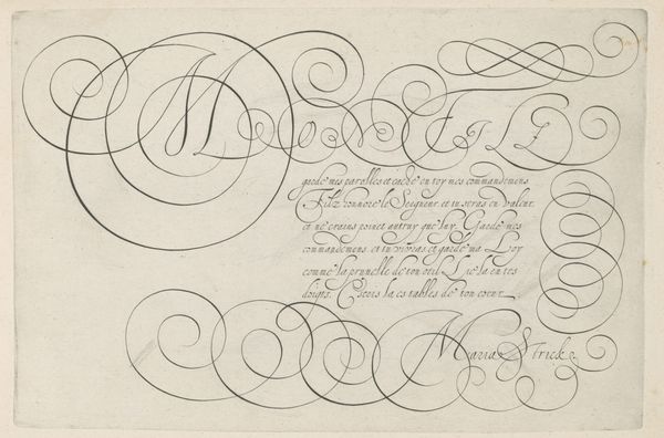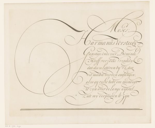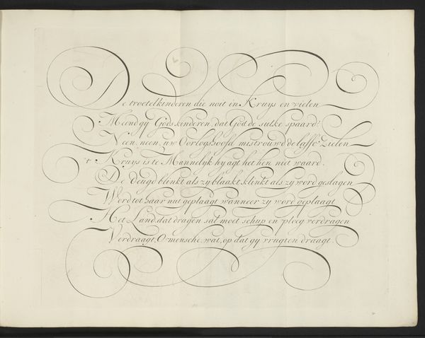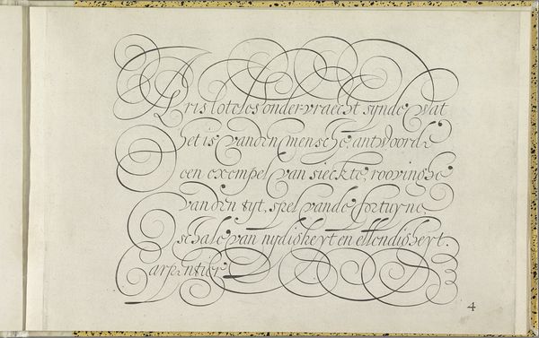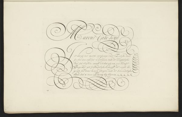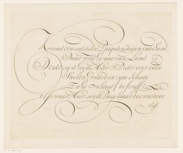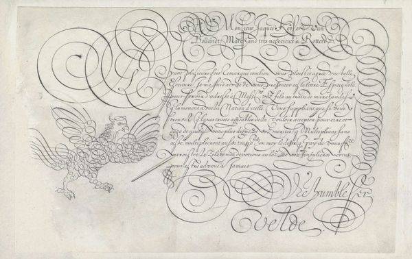
Ontwerp van een schrijfvoorbeeld: A mon tres cher beaufrere (...) 1605
0:00
0:00
janvandeveldei
Rijksmuseum
drawing, graphic-art, paper, typography, ink, pen
#
word art style
#
drawing
#
graphic-art
#
script typography
#
hand-lettering
#
lettering
#
hand drawn type
#
hand lettering
#
paper
#
11_renaissance
#
word art
#
typography
#
ink
#
hand-drawn typeface
#
calligraphic
#
pen
#
northern-renaissance
#
calligraphy
#
small lettering
Dimensions: height 203 mm, width 295 mm
Copyright: Rijks Museum: Open Domain
This calligraphic design was made by Jan van de Velde I, likely in the early 17th century, using ink on paper. This wasn’t just writing; it was a performance, a demonstration of skill and artistry. Consider the flow of the ink, the pressure applied to the quill, the countless hours of practice required to achieve such control. Calligraphy was a highly valued skill, essential for legal documents, religious texts, and correspondence. But it also had a social dimension. Calligraphers were often employed by wealthy patrons, producing elaborate documents and presentation pieces. In other words, calligraphy was labor, tied to social class and patronage. Van de Velde’s design is a testament to the power of the hand. In our digital age, it reminds us of the beauty and skill embedded in traditional crafts. It challenges us to consider the value of human labor in a world increasingly dominated by machines, and invites us to appreciate the ways in which even the most functional of crafts can be elevated to an art form.
Comments
No comments
Be the first to comment and join the conversation on the ultimate creative platform.
