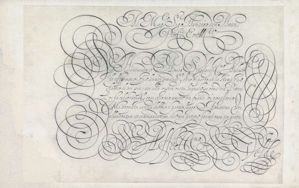
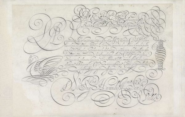
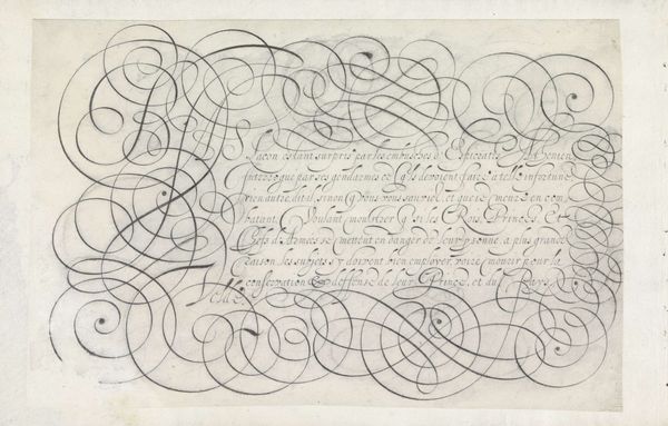
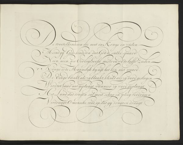
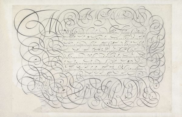
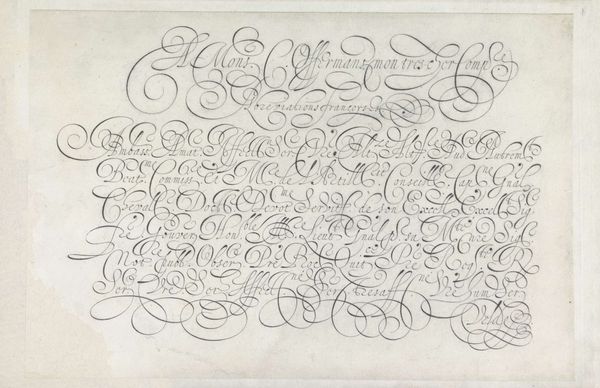
Ontwerp van een schrijfvoorbeeld: Nous voyons evidemment (...) 1605
0:00
0:00
janvandeveldei
Rijksmuseum
drawing, graphic-art, paper, ink
#
drawing
#
graphic-art
#
mannerism
#
paper
#
11_renaissance
#
ink
#
calligraphic
#
calligraphy
Dimensions: height 202 mm, width 293 mm
Copyright: Rijks Museum: Open Domain
Editor: This is "Ontwerp van een schrijfvoorbeeld: Nous voyons evidemment (...)," a pen and ink drawing on paper, created around 1605 by Jan van de Velde I, and it's here at the Rijksmuseum. The rhythmic curves are mesmerizing, almost like musical notation. What compositional principles do you observe in its elaborate design? Curator: The interplay of line and space is paramount. Note how the density of the swirling flourishes creates a visual weight on the left, balanced by the disciplined, vertical strokes on the right. This tension is further amplified by the contrast between the chaotic curves and the relative legibility of the text. What effect do you think this arrangement has on the viewer? Editor: It definitely creates a sense of controlled chaos, a beautiful paradox. The curves draw the eye around and around. Is the legibility of the text of any importance from a formalist approach? Curator: Absolutely. Consider the letterforms as shapes, as components in the overall design. The variations in thickness and the elegant serifs contribute to the textural richness of the work, independent of their linguistic function. Each letter acts as an abstract element in an ordered space. Notice, too, how the lines both contain and transcend the text. This is not simply writing; it is line as representation and abstraction, unified as expression. Editor: So, it's less about what it *says* and more about *how* it says it visually. The balance between the dark ink and the light paper becomes really apparent. Thank you for elucidating how to see this! Curator: Precisely! Recognizing the intrinsic values helps reveal layers of complexity that we often overlook.
Comments
No comments
Be the first to comment and join the conversation on the ultimate creative platform.
More like this