drawing, ink, pen
#
drawing
#
lettering
#
ink
#
calligraphic
#
pen
#
academic-art
#
calligraphy
Dimensions: height 202 mm, width 299 mm
Copyright: Rijks Museum: Open Domain
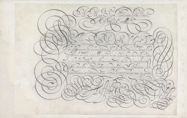
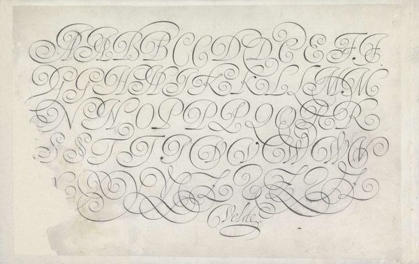
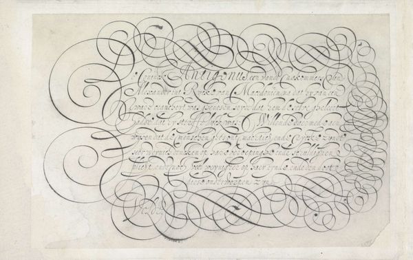
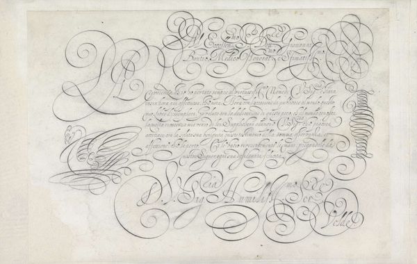
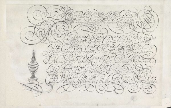
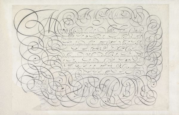
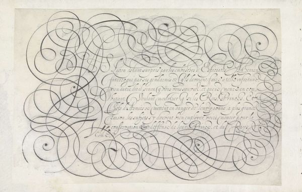
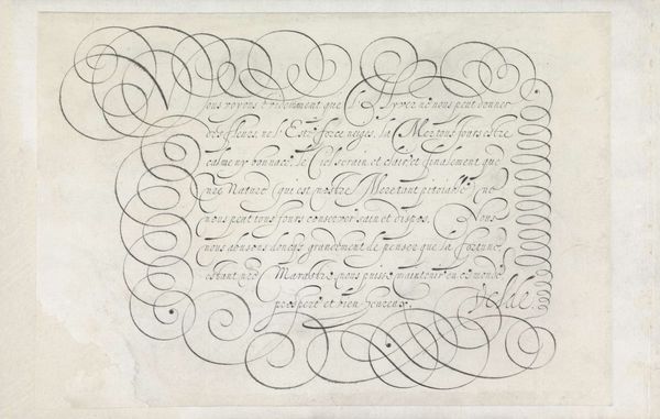
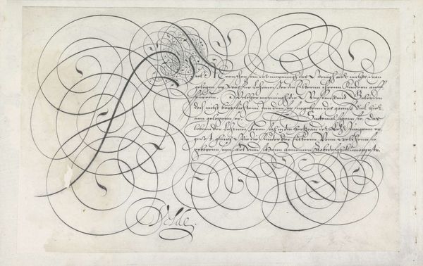
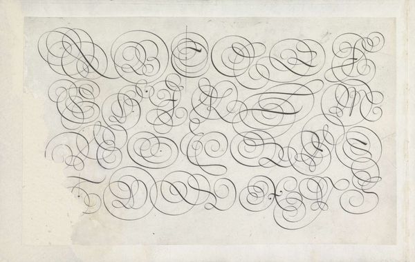
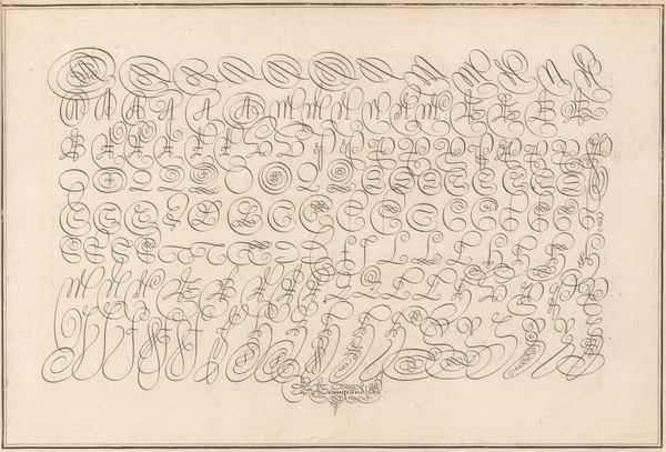
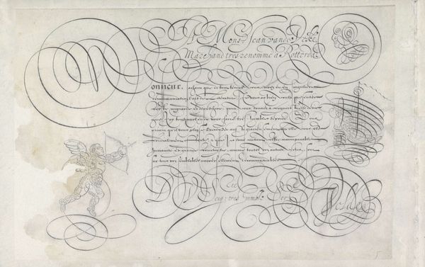
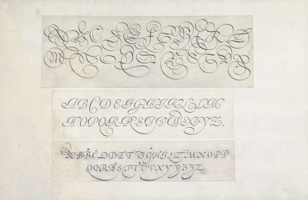
Curator: Before us we have "Ontwerp van een schrijfvoorbeeld: A mons. C. Offermans (...)," a 1605 drawing by Jan van de Velde I. It’s a pen and ink design for a calligraphic writing sample. Editor: My first impression is of fluidity; the entire piece breathes with a certain baroque elegance. The linework seems to dance across the page, and the tonal variation—the slight thickening and thinning of each stroke—adds depth. Curator: It’s fascinating how lettering here transcends simple communication. These aren’t just letters; they are symbolic gestures. Each curve and flourish represents layers of cultural values around literacy and refined societal practices of the era. This speaks volumes about the weight placed on skilled penmanship as a mark of erudition. Editor: Exactly. And looking closely, it becomes clear that van de Velde emphasizes particular shapes and sequences. There's a definite rhythm created through repetition and variation of forms—almost a visual fugue. Notice how the serifs almost coil back on themselves, animating the composition with a palpable energy. Curator: Those stylized loops and dramatic descenders weren't just aesthetic choices; they echoed the social standing that came with mastering such script. This style evokes power dynamics in courtly exchanges—visually mirroring formal, hierarchical structures. Editor: The restraint shown through limited embellishment also interests me; it is quite different from medieval illuminated manuscripts. Even so, there is tension, in the dynamic opposition between positive space filled with lettering and negative areas of paper, allowing our eyes some visual rest before starting over with next phrases, rows or lines… Curator: Indeed, you’re spot on noticing the delicate balance. While appearing ornate, it doesn’t cross the line into excessive. The discipline required to consistently repeat these forms—and subtly alter them to make each line a piece itself —would signify someone cultured and highly disciplined to 17th-century audiences. A display like this served, even then, as an indication to viewers that whoever composed it held status from artistic accomplishment alone. Editor: It certainly changes how I look at fonts! The individual letterforms aren't just building blocks for text but dynamic shapes creating a visual impact. It makes you think about all the things written communication implies, from the simple instruction manual up to declaration of war. Curator: It offers a peek into a period where artistry wasn’t limited to paintings on walls but extended into every aspect of visual culture, reminding audiences then that skill could mean also status—and continues influencing modern script aesthetics still after nearly half-a-millennia since its creation. Editor: After examining such a piece, it gives me deeper recognition how much thought was dedicated to crafting the simplest elements of printed word; this will make us contemplate modern font design anew when exiting Rijksmuseum.
Comments
No comments
Be the first to comment and join the conversation on the ultimate creative platform.
More like this