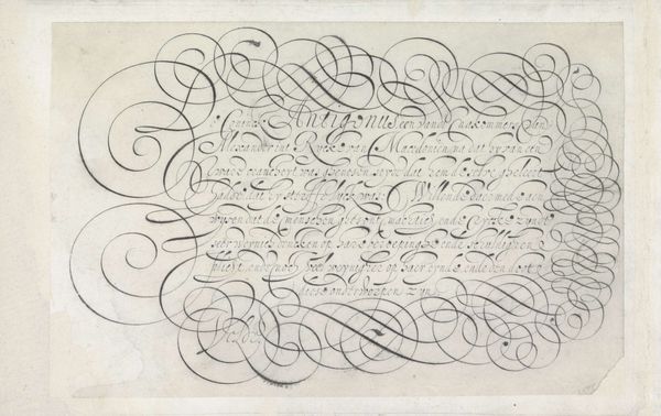
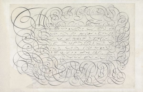
![Ontwerp van een schrijfvoorbeeld: Sig. fr[at]ello mio (...). by Jan van de Velde I](/_next/image?url=https%3A%2F%2Fd2w8kbdekdi1gv.cloudfront.net%2FeyJidWNrZXQiOiAiYXJ0ZXJhLWltYWdlcy1idWNrZXQiLCAia2V5IjogImFydHdvcmtzL2Q5MGYzMDc0LWZkZWEtNDM1MC1iODdlLTg5YWI5ZjBlMDgzMy9kOTBmMzA3NC1mZGVhLTQzNTAtYjg3ZS04OWFiOWYwZTA4MzNfZnVsbC5qcGciLCAiZWRpdHMiOiB7InJlc2l6ZSI6IHsid2lkdGgiOiAxOTIwLCAiaGVpZ2h0IjogMTkyMCwgImZpdCI6ICJpbnNpZGUifX19&w=3840&q=75)
drawing, ink, pen
#
drawing
#
baroque
#
form
#
ink
#
geometric
#
line
#
pen work
#
pen
#
calligraphy
Dimensions: height 196 mm, width 305 mm
Copyright: Rijks Museum: Open Domain
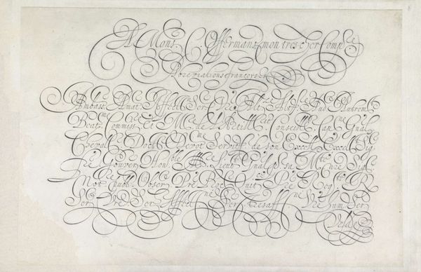
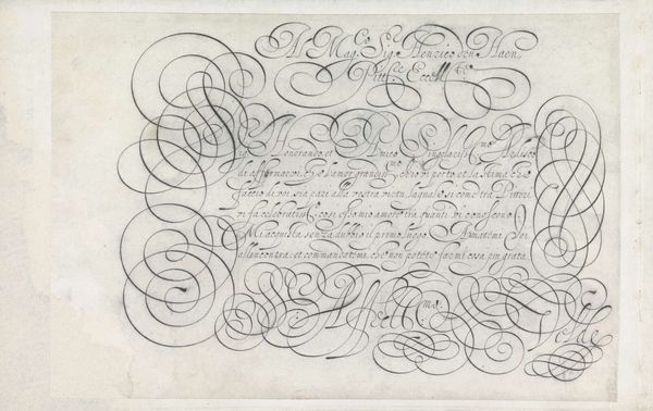
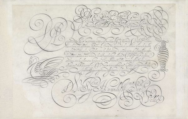
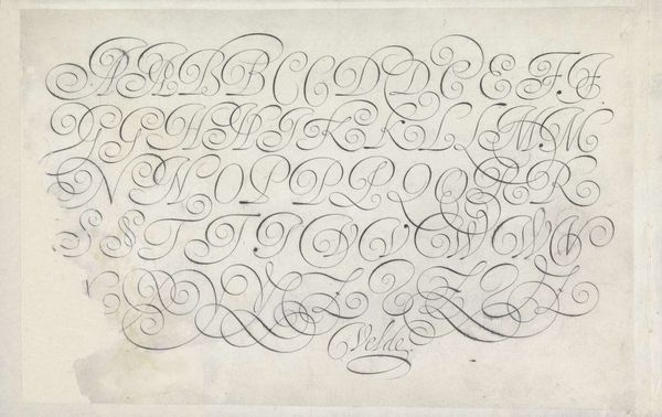
Curator: Just look at the incredible line work on this drawing! Editor: It’s certainly… intense. A whirlwind of swirls and meticulously rendered pen strokes. What exactly are we looking at here? Curator: This drawing by Jan van de Velde I, made around 1605, is called "Ontwerp van een schrijfvoorbeeld: Sig. fr[at]ello mio (...)," or, roughly translated, "Design for a Writing Sample." It’s done in pen and ink, now housed in the Rijksmuseum collection. Editor: A writing sample… I see. It definitely screams Baroque excess. That level of ornamentation – almost illegible! It reminds me of the power and theatricality sought after during the counter-reformation period. It also uses the interesting and odd technique of overwriting! Curator: Indeed! Calligraphy experienced a surge in importance then. Writing masters gained prominence, and specimens like these served multiple purposes: showcasing skill, establishing models for others, and engaging within an increasingly literate society. What we are really observing here is line as form! Editor: From a formal point of view, note the contrasts. Sharp angles meet languid curves. Areas densely packed with flourishes border sections of relatively untouched paper. What purpose do the visual patterns fulfill, outside the constraints of the act of ‘writing’ in that historic socio-economic frame you laid out earlier? The column motif at the lower left of the frame stands in isolation relative to all the lettering, serving as the most identifiable pictorial device that guides our reading of the piece from ‘image’ to text? Curator: Absolutely. Furthermore, its aesthetic reflects period values of grace, education and social accomplishment. Displays of adept calligraphy signaled cultural capital. This object testifies to an early modern world where writing was both practical tool and potent art form, reflecting individual identity. Editor: It’s like peering into a world obsessed with appearances, isn't it? Where even mundane acts become performative, imbued with symbolism and social meaning. That tension between display and meaning making continues to be a part of how writing is taught, appreciated, and understood. Curator: Well said! Examining a work like this makes us reconsider these threads, that the act of ‘mark-making’ always serves an aesthetic as much as it seeks to achieve a representational purpose.
Comments
No comments
Be the first to comment and join the conversation on the ultimate creative platform.
More like this