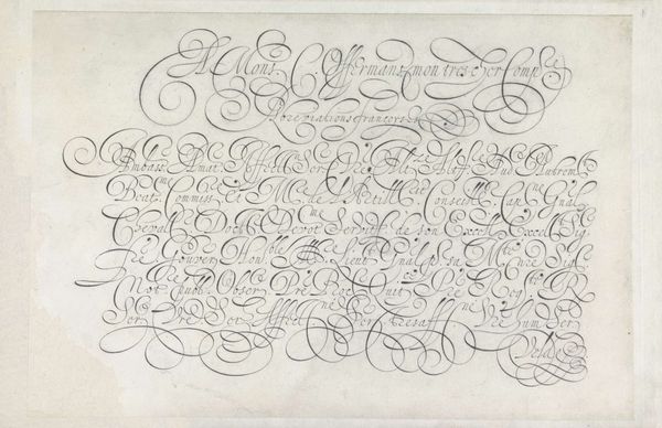
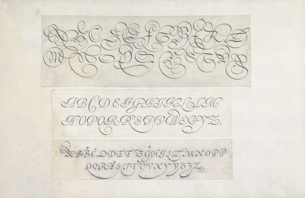
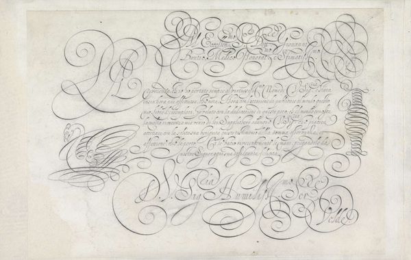
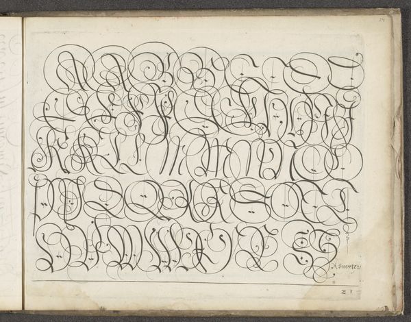
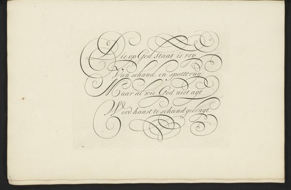
Ontwerp van een schrijfvoorbeeld: het alfabet in vijf regels kapitalen 1605
0:00
0:00
janvandeveldei
Rijksmuseum
drawing, paper, typography, ink
#
drawing
#
lettering
#
typography
#
paper
#
typography
#
ink
#
geometric
#
line
#
northern-renaissance
#
calligraphy
Dimensions: height 204 mm, width 315 mm
Copyright: Rijks Museum: Open Domain
Editor: We’re looking at "Ontwerp van een schrijfvoorbeeld: het alfabet in vijf regels kapitalen," or "Design for a Writing Sample: The Alphabet in Five Lines of Capitals," a drawing in ink on paper made by Jan van de Velde I in 1605. The letters are so elaborate, full of flourishes! It seems like such a formal and stylized form of communication. How do you interpret this work? Curator: This piece offers us a fascinating window into the relationship between power, literacy, and artistic expression in the early 17th century. Calligraphy was not merely a practical skill, but a potent symbol of social status and intellectual authority. These elaborate letterforms were a tool wielded by the elite. Consider who had access to literacy, and thus the power to communicate and participate in civic life. Editor: So, the artistry here isn’t just decorative, it’s deeply connected to social structures? Curator: Precisely. The act of creating such meticulously rendered letterforms can be viewed as a performance of dominance. Van de Velde's work reinforces the idea that access to language and its artistic representation were privileges jealously guarded and expertly executed. In a society marked by inequality, such skill elevated one's status and influence. How does knowing this inform your view of the piece? Editor: I see it differently now. The elegance feels less purely aesthetic and more like a statement of exclusivity. It highlights the disparities in access to education and influence. The "performance of dominance" through lettering is so interesting and relevant, even today when we think about things like code and algorithms being used in ways that restrict access. Curator: Indeed, these historical artifacts can teach us much about present power dynamics. Examining them through a critical lens lets us confront issues of access, privilege, and representation that persist across time. Editor: I'll definitely be looking at calligraphy and typography differently from now on. Thanks!
Comments
No comments
Be the first to comment and join the conversation on the ultimate creative platform.
More like this