drawing, paper, ink
#
word art style
#
drawing
#
script typography
#
hand-lettering
#
lettering
#
hand drawn type
#
hand lettering
#
paper
#
11_renaissance
#
word art
#
ink
#
hand-drawn typeface
#
thick font
#
calligraphy
#
small lettering
Dimensions: height 199 mm, width 297 mm
Copyright: Rijks Museum: Open Domain
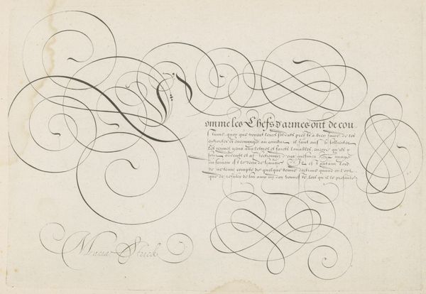
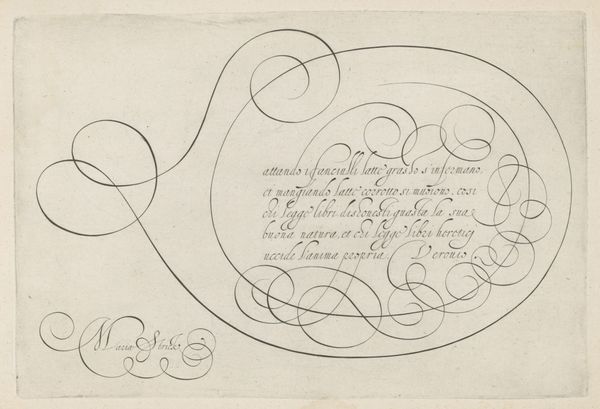
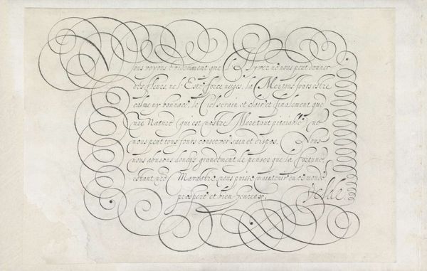
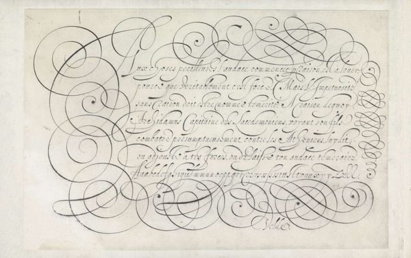
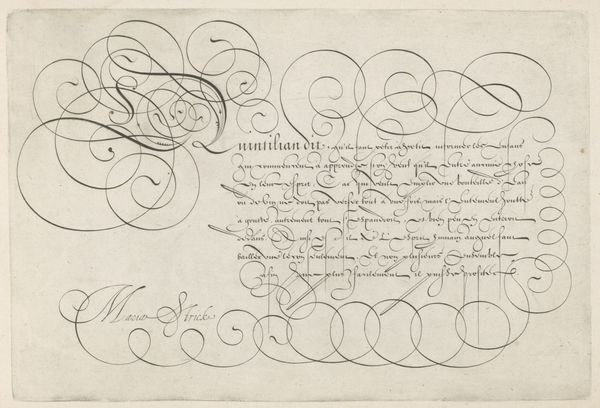
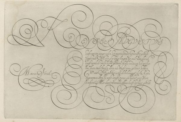
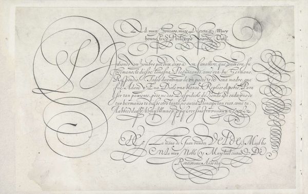
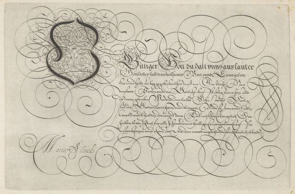
This is a writing sample with a capital M made by Hans Strick, likely in the Netherlands sometime around the late 16th century. The elegant flourishes and careful script remind us that handwriting was once considered an art form, not just a means of communication. In a time before widespread literacy, the ability to write beautifully was a sign of education and refinement, and ornamental scripts were often associated with wealth and status. Note the French text that accompanies the large M, which speaks to the influence of the French language in the Dutch Republic at the time. Who was the intended audience for this piece? Was it meant to be an example for students learning calligraphy, or a display of the artist's skill for potential patrons? As historians, we might look to archives and collections of writing manuals to understand the conventions and expectations of calligraphy in the 16th century. By studying the social and institutional context of this artwork, we can begin to appreciate the values and aspirations of the culture that produced it.
Comments
No comments
Be the first to comment and join the conversation on the ultimate creative platform.
