About this artwork
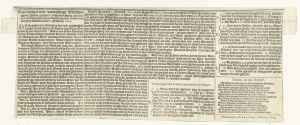
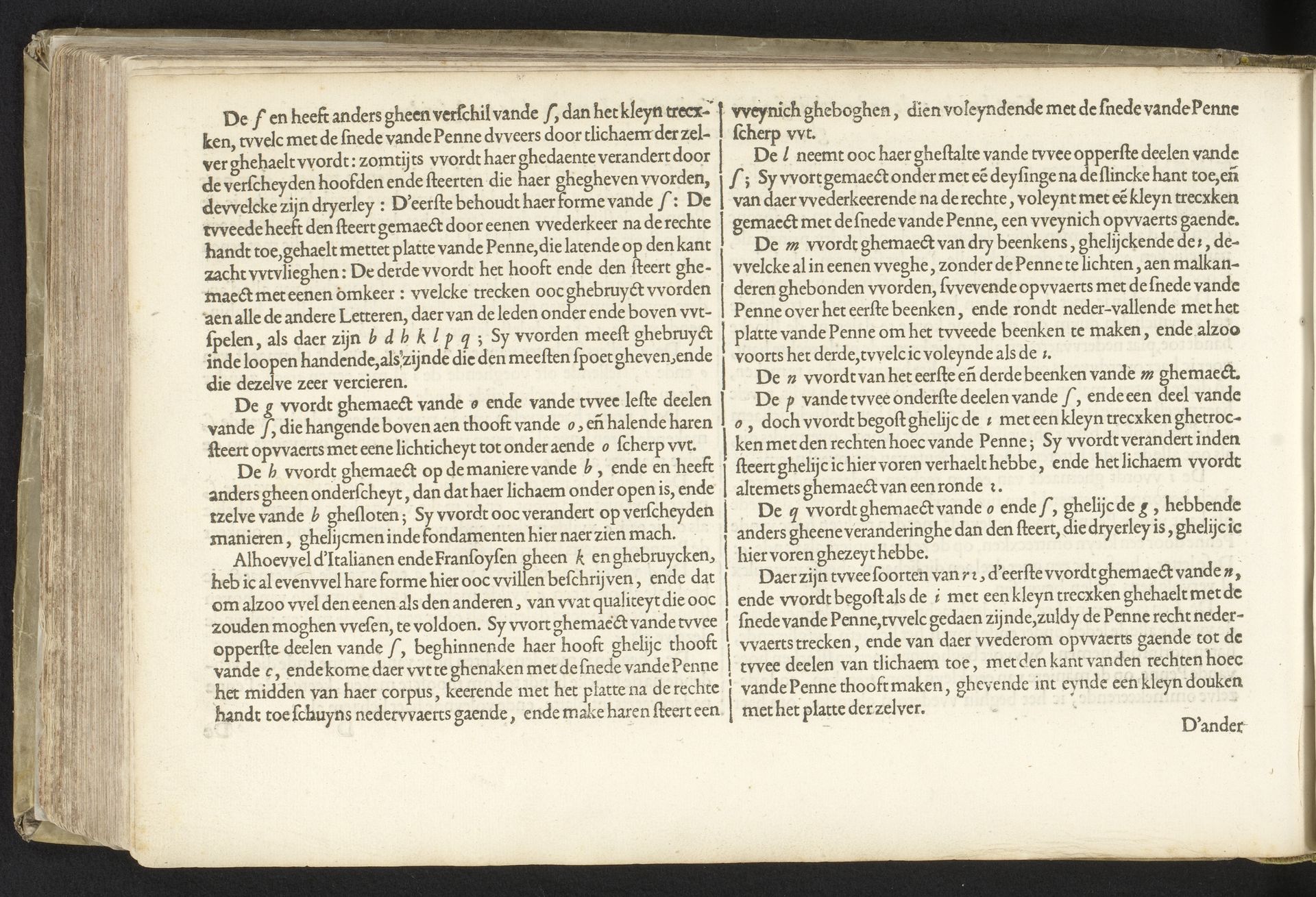
Editor: This is "Beschrijving van het schrijven van de Italiaanse letter (vervolg)" or "Description of the Writing of the Italian Letter (cont'd)," a print from 1605 by Jan van de Velde I. It's part of the Rijksmuseum collection. I'm immediately struck by the typography and the almost dizzying density of the text on this old paper. How do you even begin to approach a piece like this? Curator: Indeed! My interest lies primarily in the interplay of form. Note the precise arrangement of the type; observe how the various letterforms interact and how space, both within and between them, shapes the overall reading experience. Ask yourself, what is the artist attempting by this arrangement? Editor: So, you're less interested in *what* it says, and more in *how* it looks and feels as a design? I thought prints were purely functional… Curator: Function is inherent, yes, but consider the formal elements—the balance of black ink against the off-white of the page. Each letter possesses texture, line, and shape which demand consideration separate from their linguistic role. This is more than the transmission of facts; it’s a visual engagement. Editor: It’s interesting to think of each letterform as an independent unit. I can see now that even without knowing how to read this old form of Dutch, the arrangement still suggests some kind of structure, or almost like a texture across the page. I hadn't considered it like that before. Curator: Exactly! It's a composition built of language. We observe that a relationship is being made; a conversation of abstract visual marks. And now? What more might we determine of its formal design and its intent? Editor: I guess it pushes me to appreciate the artistic intention that can exist in something purely informational. I never would have thought that font could be… beautiful, even. Curator: Beauty is in structure and observation.
Beschrijving van het schrijven van de Italiaanse letter (vervolg)
1605
Jan van de Velde I
1568 - 1623Location
RijksmuseumArtwork details
- Medium
- print, textile, paper, typography
- Dimensions
- height 210 mm, width 315 mm
- Location
- Rijksmuseum
- Copyright
- Rijks Museum: Open Domain
Tags
Comments
Share your thoughts
About this artwork
Editor: This is "Beschrijving van het schrijven van de Italiaanse letter (vervolg)" or "Description of the Writing of the Italian Letter (cont'd)," a print from 1605 by Jan van de Velde I. It's part of the Rijksmuseum collection. I'm immediately struck by the typography and the almost dizzying density of the text on this old paper. How do you even begin to approach a piece like this? Curator: Indeed! My interest lies primarily in the interplay of form. Note the precise arrangement of the type; observe how the various letterforms interact and how space, both within and between them, shapes the overall reading experience. Ask yourself, what is the artist attempting by this arrangement? Editor: So, you're less interested in *what* it says, and more in *how* it looks and feels as a design? I thought prints were purely functional… Curator: Function is inherent, yes, but consider the formal elements—the balance of black ink against the off-white of the page. Each letter possesses texture, line, and shape which demand consideration separate from their linguistic role. This is more than the transmission of facts; it’s a visual engagement. Editor: It’s interesting to think of each letterform as an independent unit. I can see now that even without knowing how to read this old form of Dutch, the arrangement still suggests some kind of structure, or almost like a texture across the page. I hadn't considered it like that before. Curator: Exactly! It's a composition built of language. We observe that a relationship is being made; a conversation of abstract visual marks. And now? What more might we determine of its formal design and its intent? Editor: I guess it pushes me to appreciate the artistic intention that can exist in something purely informational. I never would have thought that font could be… beautiful, even. Curator: Beauty is in structure and observation.
Comments
Share your thoughts