Gebruik van drie soorten rietpennen (vervolg) en een instructie hoe de rietpen vastgehouden moet worden 1608
0:00
0:00
janvandeveldei
Rijksmuseum
drawing, print, textile, paper, typography, ink
#
script typeface
#
drawing
#
aged paper
# print
#
sketch book
#
textile
#
paper
#
personal sketchbook
#
typography
#
ink
#
journal
#
thick font
#
script guideline
#
handwritten font
#
historical font
#
columned text
Dimensions: height 260 mm, width 370 mm
Copyright: Rijks Museum: Open Domain
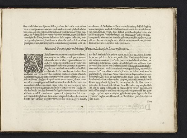
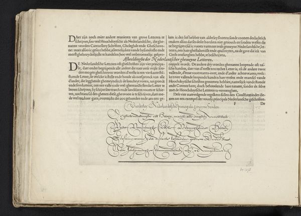
This undated artwork by Jan van de Velde I at the Rijksmuseum, made with pen and brown ink, presents us with a dense exploration of text and instruction. The high contrast between the ink and the page, with tightly packed lettering, creates a visually intense experience, almost overwhelming in its detail. The formal structure of the work is dominated by the grid-like arrangement of the text columns, each a block of tightly-knit information. The meticulous use of line in forming each letter suggests a deep engagement with the act of writing itself. This arrangement can be interpreted through the lens of structuralism, as van de Velde meticulously lays out the elements for effective penmanship. The composition challenges fixed notions by inviting viewers to decode a complex set of instructions, reflecting a broader philosophical interest in how systems of knowledge are organized and transmitted. The texture of the paper, though unseen, is implied through the ink's adherence to its surface, reminding us of the materiality inherent in art. The work ultimately functions as a cultural artifact. It prompts us to reflect on the power of language.
Comments
No comments
Be the first to comment and join the conversation on the ultimate creative platform.
More like this