print, paper, typography
# print
#
paper
#
typography
Dimensions: height 260 mm, width 370 mm
Copyright: Rijks Museum: Open Domain
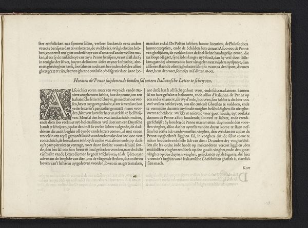
This page, made around 1600 by Jan van de Velde I, demonstrates the use of different reed pens for various handwriting styles. Look closely, and you'll see how each script embodies unique qualities of formality and expressiveness. Notice the contrast between the bold, angular "Fractuer-Schriften" and the flowing "Italiaensche handt." This difference reveals cultural preferences and the emotional impact of each style. The reed pen, a simple tool, becomes a mediator of cultural identity. The "Italiaensche handt," favored for its elegance, often evokes a sense of sophistication that transcends mere words. Similar penmanship styles echo across Europe at this time, each region adding its own distinct flourish. Consider the influence of calligraphy on emotional expression, and how the act of writing itself becomes a deeply psychological and cultural act. The cyclical progression of this seemingly simple tool continues, and penmanship continues to evolve, carrying the collective memory of past scripts into the present.
Comments
No comments
Be the first to comment and join the conversation on the ultimate creative platform.
More like this