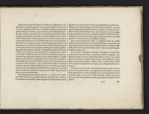
Instructie hoe de rietpen vastgehouden moet worden (tweede vervolg) met een uitleg van de voorbeelden op de vorige pagina 1605
0:00
0:00
janvandeveldei
Rijksmuseum
drawing, print, textile, paper, typography, ink
#
drawing
#
parchment
# print
#
textile
#
paper
#
typography
#
ink
#
historical font
Dimensions: height 210 mm, width 315 mm
Copyright: Rijks Museum: Open Domain
This is ‘Instructie hoe de rietpen vastgehouden moet worden’, a writing manual etched by Jan van de Velde I, sometime before 1623. The engraving presents two blocks of text, closely packed and geometrically aligned. The rigid structure of the sentences mirrors the discipline the manual seeks to impart. Light reflects off the paper, accentuating the contrast between the dark, uniform lettering and the pale surface. The texture is smooth, which invites a closer look at the fine details of typography and layout. Van de Velde's work transcends mere instruction; it embodies the era's emphasis on order and precision, reflecting the rise of rationalism. Each letter functions as a sign, carefully placed within a system designed to convey knowledge and instill virtue. The print's formal qualities invite us to consider the deeper structures of learning and communication. By examining the relationships between the text's components, we confront the intellectual frameworks that shape our understanding of art.
Comments
No comments
Be the first to comment and join the conversation on the ultimate creative platform.
More like this