drawing, print, paper, typography, ink
#
drawing
#
aged paper
#
parchment
# print
#
paper
#
typography
#
ink
#
miniature
#
historical font
#
calligraphy
Dimensions: height 210 mm, width 315 mm
Copyright: Rijks Museum: Open Domain
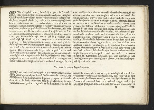
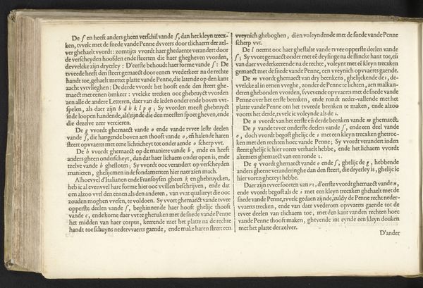
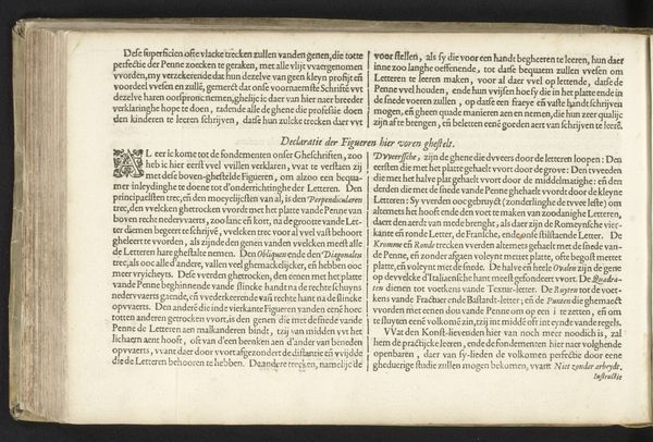
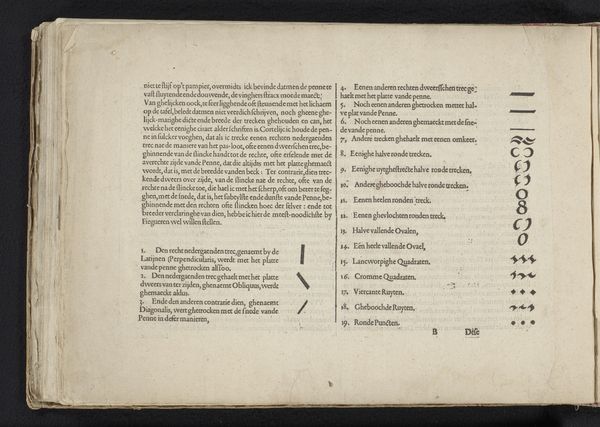
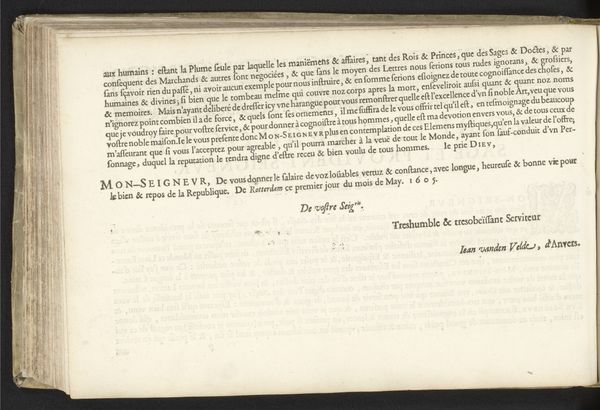
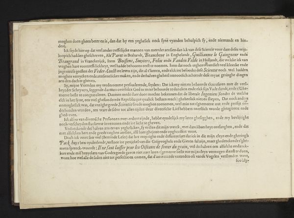
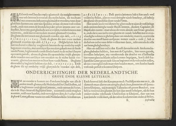
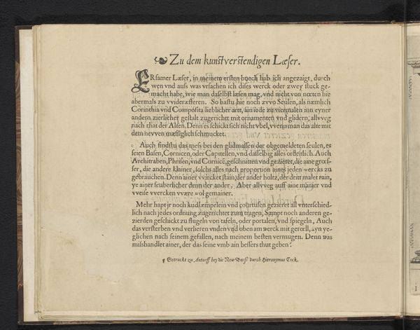
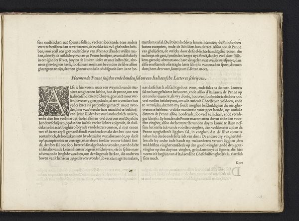
This printed page dating from the early 17th century, made by Jan van de Velde I, offers a description of how to write Italian letters. It shows in great detail how the alphabet was constructed using a broad-nibbed pen. Look closely, and you can almost feel the pen’s movements as it creates the forms of the letters, varying the pressure to give thicks and thins. The printing would have involved setting each character in relief type, inking the surface, and pressing paper against it. The clarity of line speaks to the skill involved in each of these processes. The text treats handwriting not as a straightforward means of communication, but as a constructed set of traditions. You might even say that it approaches writing as a form of design – one that could be taught, learned and perfected through diligent application. Though not often considered, handwriting is just as much a product of labor as printed matter.
Comments
No comments
Be the first to comment and join the conversation on the ultimate creative platform.
More like this