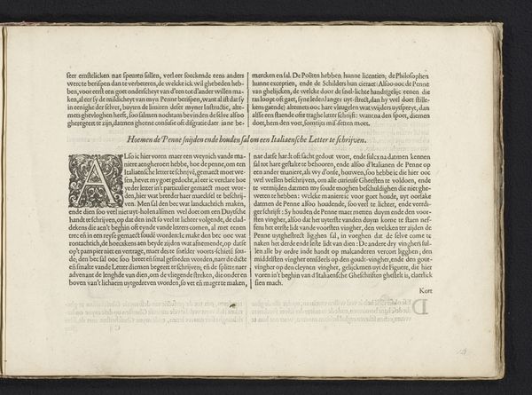
Beschrijving van de Italiaanse letter (tweede vervolg) en uitleg over het snijden van de rietpen voor het schrijven van de Italiaanse letter 1605
0:00
0:00
janvandeveldei
Rijksmuseum
drawing, print, textile, paper, typography, ink
#
drawing
# print
#
textile
#
paper
#
11_renaissance
#
typography
#
ink
#
historical font
#
columned text
Dimensions: height 210 mm, width 315 mm
Copyright: Rijks Museum: Open Domain
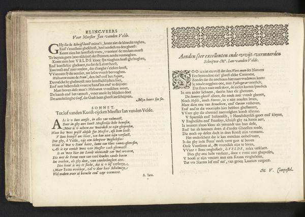
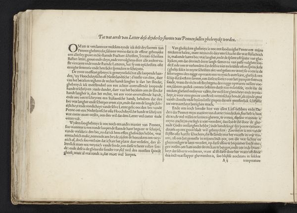
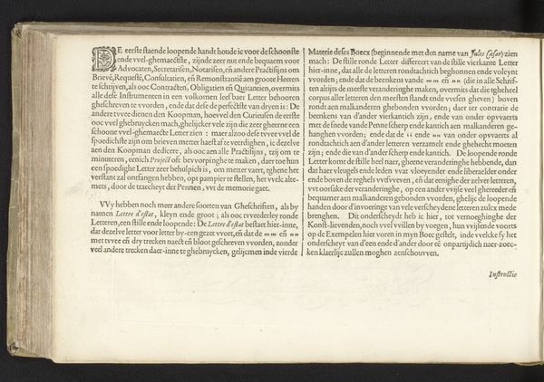
This is an instructional text on Italian script and penmanship, created by Jan van de Velde I, likely sometime around the early 17th century. At this time, the Dutch Republic was burgeoning as a center for trade and culture; Van de Velde was a calligrapher and printmaker whose work reflects the increasing value placed on literacy and refined handwriting as social accomplishments. The text gives us insight into the era’s emphasis on precision and skill in handwriting. The passage emphasizes both technical mastery and artistic expression. Van de Velde highlights how the ideal pen should be held delicately, and that writing should be balanced through a combination of speed and accuracy. He also references “curious spirits” and the need to avoid accusations of ignorance. The emotional investment in writing reveals the cultural importance attached to mastering script, as it was a source of personal pride, connecting one to a broader community of educated individuals.
Comments
No comments
Be the first to comment and join the conversation on the ultimate creative platform.
More like this