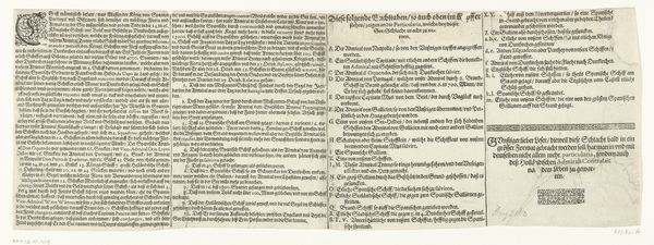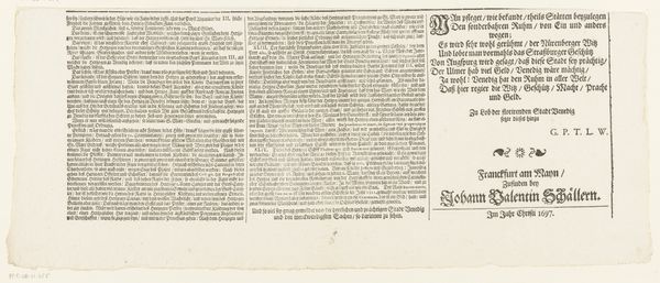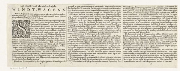
Tekstblad bij de prent van de executie van Reinier van Oldenbarnevelt, David Coorenwinder en Adriaan van Dijk, 1623 1623
0:00
0:00
claesjanszvisscher
Rijksmuseum
graphic-art, print, etching, textile, typography
#
graphic-art
#
informal type
#
narrative-art
#
dutch-golden-age
# print
#
small type
#
etching
#
editorial typography
#
hand drawn type
#
textile
#
paragraph style
#
typography
#
newspaper layout
#
stylized text
#
thick font
#
history-painting
#
handwritten font
#
word imagery
Dimensions: height 138 mm, width 319 mm
Copyright: Rijks Museum: Open Domain
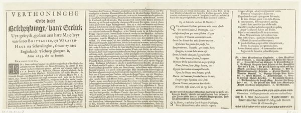
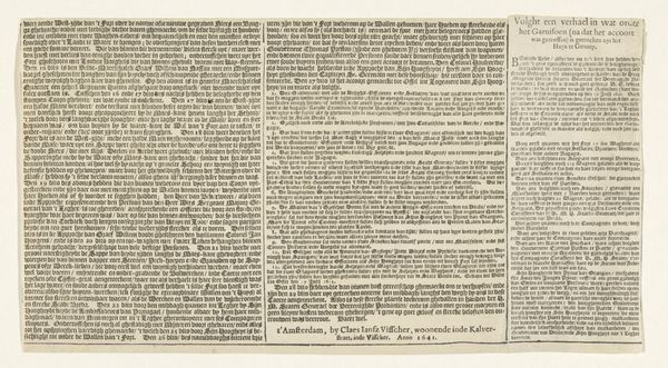
Editor: Here we have "Tekstblad bij de prent van de executie van Reinier van Oldenbarnevelt, David Coorenwinder en Adriaan van Dijk," a 1623 etching by Claes Jansz. Visscher, currently residing in the Rijksmuseum. It's predominantly text-based and, honestly, it’s a little intimidating! All that small print gives it an overwhelming feeling. What can you tell me about it? Curator: Indeed, it presents a striking arrangement of typographic elements. We should analyze how Visscher utilizes varied font weights and sizes to create visual hierarchy. Notice the interplay between the denser blocks of text and the more spacious areas. What does this contrast evoke? Editor: It makes the important bits pop out more, I suppose. But the overall texture feels so uniform, almost like a textile pattern. Curator: Precisely. The repetition of lines and the structured arrangement could be interpreted as a commentary on the rigid social structures of the time. Observe how the lines of text act as both content and form; what does the density of the paragraphs tell us in your view? Editor: Hmm, perhaps the density reflects the weight or significance of the historical narrative being presented? That all the information is compressed in a block suggests the volume is more important than individual parts? Curator: An interesting observation. Also, examine the placement of the text within the frame; it is consciously balanced, isn't it? Editor: Yes, I see the balance now. It's less chaotic than I initially perceived, even kind of formal despite all that text crammed together. I didn’t consider the aesthetic quality to be that important at first glance. Curator: It is crucial not to overlook the aesthetics when looking at the relationship between historical document and visual artefact, a new arrangement produces new and significant impact in any historical art object. Editor: So, seeing it as more than just a document really shifts the perspective. Thanks!
Comments
No comments
Be the first to comment and join the conversation on the ultimate creative platform.
