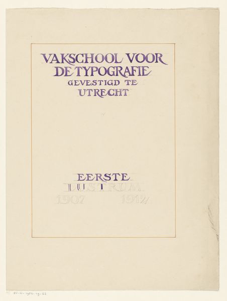
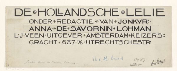
Ontwerp voor het lustrumboek van de Vakschool voor de typografie te Utrecht 1912
0:00
0:00
graphic-art, print, typography, poster
#
graphic-art
#
art-nouveau
# print
#
typography
#
geometric
#
decorative-art
#
poster
Dimensions: height 317 mm, width 241 mm
Copyright: Rijks Museum: Open Domain
Editor: So, this is “Ontwerp voor het lustrumboek van de Vakschool voor de typografie te Utrecht,” designed in 1912 by Reinier Willem Petrus de Vries. It looks like a poster or print, perhaps for a school’s anniversary book. It's simple, almost austere, but with that really elegant typeface. What leaps out at you? Curator: It whispers, doesn't it? A delicate balance. You've got the very ordered framework—that classic Art Nouveau striving for geometric precision—but then those wonderful swirling letterforms almost break free. Doesn't it make you wonder what a 'Vakschool voor de Typografie' actually *did* back then? Like, were they as obsessed with serifs as we are now? I bet they were! Editor: Totally! What’s the deal with the frame around the text? Is that just a common design element? Curator: The frame, for me, it’s all about containment. The exuberance of the type wants to expand, to breathe, but it's held. It gives a sense of formality – this *is* for a school, after all – but that tension… it's delicious. Do you feel it pointing you to a particular era? That tension between modernity and tradition… Editor: Definitely feels turn-of-the-century-ish. What is your impression? Curator: This piece, in a quiet way, reflects the energy of the time. Before everything changed. The first World War changed all that. I mean, this is technically 'just' typography, but it is brimming with personality. Imagine that school, full of these designers. All those debates! Editor: It makes me appreciate the artistry in something we take for granted now, the fonts we see everywhere. Curator: Exactly! That is why it’s so cool that pieces like this can make us see type with fresh eyes, now doesn’t it?
Comments
No comments
Be the first to comment and join the conversation on the ultimate creative platform.
More like this