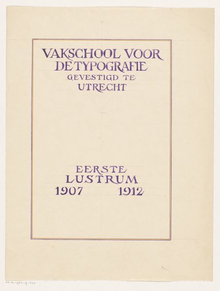
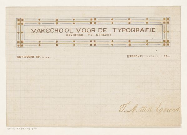
Ontwerp voor het lustrumboek van de Vakschool voor de typografie te Utrecht 1912
0:00
0:00
graphic-art, print, paper, typography, poster
#
graphic-art
#
art-nouveau
#
ink paper printed
# print
#
paper
#
typography
#
geometric
#
poster
Dimensions: height 318 mm, width 241 mm
Copyright: Rijks Museum: Open Domain
Curator: Reinier Willem Petrus de Vries's "Design for the Lustrum Book of the School of Typography in Utrecht" from 1912, a printed poster really showcases the artist's interest in blending text and image. Editor: It's… understated. That faded violet ink and simple layout give it this gentle, almost shy feeling, as if it’s whispering its message rather than shouting. It invites you in. Curator: Absolutely, that whispers a particular aesthetic choice relevant to the early 20th century. Typography was seen as more than just conveying words but also as an art form integral to modern life. The Art Nouveau influence is fairly obvious, though subdued— you see how those gently swirling letterforms still cling to some ornament without being overwhelming? Editor: I notice how "EERSTE" and "LUSTRUM," those words for "First Jubilee" almost seem to be ghosted in, or emerging slowly from the background. It is as though memory is built directly into its design. What was that printing process like then? Curator: Fascinating thought! Well, printmaking at the time allowed for very controlled layering. Here, De Vries might have used a very light application or even intentionally degraded the printing plate in some sections. Its more than decoration, its about crafting identity, of the design that promotes typography. Editor: And that single purple, or is it a violet hue… I’d say it's regal but in a humble way. Curator: The violet definitely directs us to that period's symbolism! You find the color connected with intellectual thought, contemplation, even a sense of inner wisdom, which of course resonates with the idea of this Typography School jubilee. Editor: There’s also this inherent tension here - the subject itself promotes clarity in communication through typography and print design, and yet it veils and subdues parts of its own announcement. Perhaps De Vries wanted to mirror the act of remembrance in visual terms. Curator: Yes, how striking is that contrast! A work so deliberately about communication with parts almost trying to hide; it feels wonderfully honest, and really emphasizes the feeling of that bygone era! Editor: This makes me consider the nature of academic traditions themselves. How they are ever present while equally elusive or partially faded, until summoned forth once more on occasions such as the one being honored by De Vries in this quiet print.
Comments
No comments
Be the first to comment and join the conversation on the ultimate creative platform.
More like this