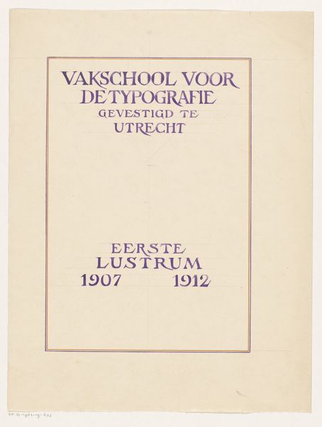
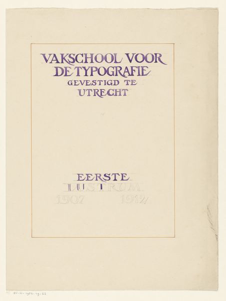
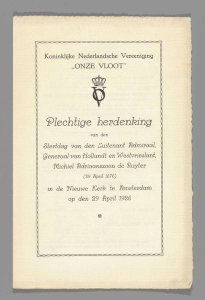
graphic-art, print, typography, poster
#
script typeface
#
art-deco
#
graphic-art
#
aged paper
# print
#
typeface
#
typography
#
fading type
#
stylized text
#
thick font
#
handwritten font
#
classical type
#
poster
#
historical font
#
columned text
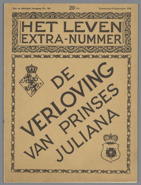
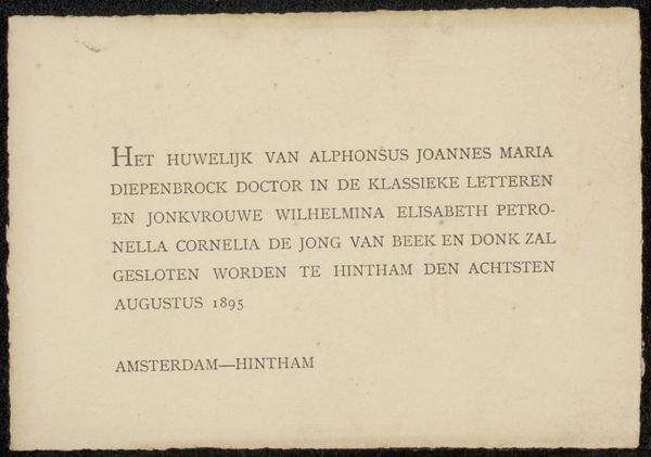
Dimensions: height 27.5 cm, width 21 cm
Copyright: Rijks Museum: Open Domain
Editor: Here we have a print from 1937 titled "Historische documenten en illustraties van de verloving en het huwelijk." It's essentially a poster announcing the marriage of Princess Juliana and Prince Bernhard. I find the typography really striking. What draws your eye when you look at it? Curator: I'm immediately drawn to the interplay of typeface and texture. Notice the way the blocky, sans-serif font of the title contrasts with the more delicate, almost handwritten, quality of the names below. What does this juxtaposition communicate to you? Editor: I suppose it highlights the tension between the formality of the event and the personal nature of the relationship. But I'm not sure about the materiality – the color seems aged, almost faded. Is that intentional or circumstantial? Curator: Observe how that “aged” quality – let us call it “patina of time”– imbues the work with a sense of historical gravitas. The paper’s hue and texture, the fading of the ink – these aren’t merely imperfections; they actively contribute to the piece’s meaning. They speak to the passage of time and the enduring nature of history itself. Notice too, the columned layout of the names and titles. Editor: So you're saying the perceived decay is part of the artistic expression? Curator: Precisely. It elevates the work beyond a simple announcement to something that reflects the very nature of history and memory, which is quite appropriate for a piece commemorating a Royal Marriage. How does considering this transformation impact your interpretation? Editor: It completely changes my perspective. I initially saw it as just an old poster, but now I see the "imperfections" as intentional and adding another layer of meaning to the piece. Curator: Indeed. And by carefully examining these intrinsic visual elements, we gain a richer understanding of its complexities. Editor: Thank you! I will definitely look more into typeface, textures and color of other prints to discover meaning behind choices that I perceived previously as irrelevant.
Comments
No comments
Be the first to comment and join the conversation on the ultimate creative platform.
More like this