1926
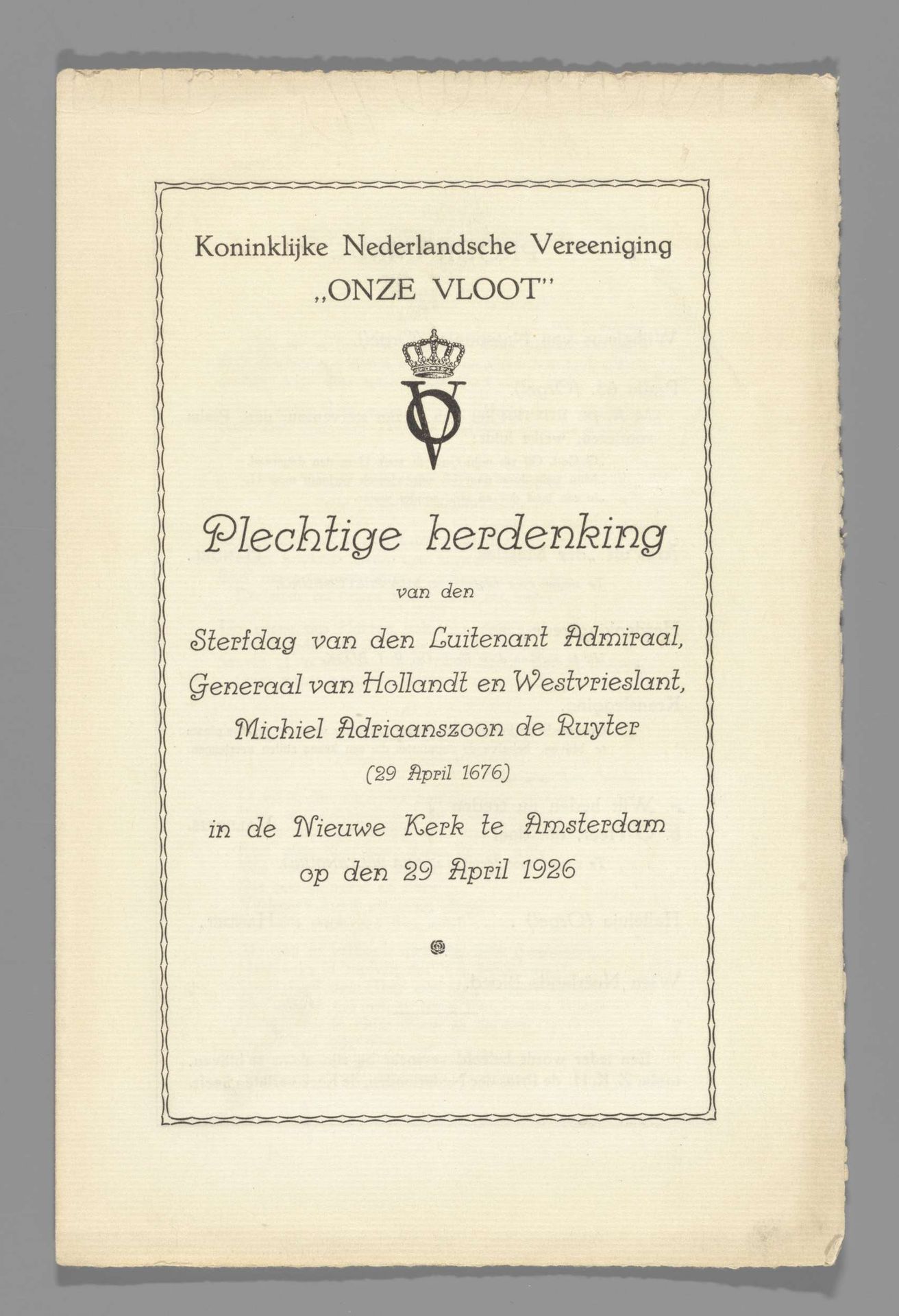
Plechtige herdenking van den Sterfdag van ... Michiel Adriaanszoon de Ruyter (29 April 1676) in de Nieuwe Kerk te Amsterdam op den 29 April 1926
Anonymous
@anonymousLocation
RijksmuseumListen to curator's interpretation
Curatorial notes
Editor: This poster from 1926 commemorates the death of Michiel de Ruyter. It's a printed piece of graphic art. I'm struck by how formal and restrained it is, especially the use of typography. How would you interpret the composition of this piece? Curator: The typography is indeed key to understanding its formal qualities. Note the careful arrangement of text, enclosed within a clean, linear frame. It echoes a neoclassical aesthetic, emphasizing order and clarity through its symmetrical organization. The typography creates a hierarchy of information; each line weight functions semiotically, drawing the eye towards important phrases and ultimately crafting the essence of visual balance. Editor: So, the font and layout are more important than any image or color in this work? Curator: Precisely. Consider the subtle emblem at the top – it provides a focal point but doesn't distract from the text's dominant role. The negative space surrounding the words allows for visual breathing room. This contributes to a sense of decorum and solemnity, crucial for a commemorative poster. Editor: I see how the lack of ornamentation amplifies the message itself. What’s your final impression based on its structure? Curator: The print relies on form to convey content. Its structured layout evokes a sense of reverence through calculated visual choices, rendering an invitation as more of a structured statement. Editor: Thank you. Seeing the work from that perspective helps me appreciate how typography can create art. Curator: My pleasure. Analyzing art’s formal structures encourages a greater awareness of artistic composition in our daily lives.