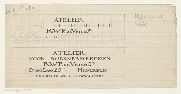
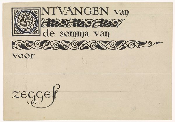
Ontwerp voor een briefhoofd van de Vakschool voor Typografie c. 1900 - 1952
0:00
0:00
Dimensions: height 148 mm, width 216 mm
Copyright: Rijks Museum: Open Domain
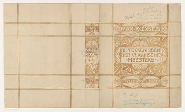
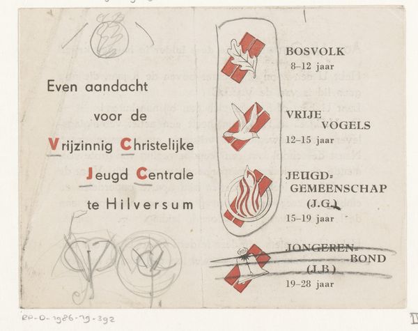
This letterhead design for the Vakschool voor Typografie, by Reinier Willem Petrus de Vries, is a perfect example of precision art. The grid underneath shows its working, the bones of the piece, a reminder that even the most refined design starts with a structure. Look at how the brown and blue lines play against the pale paper. The colours aren't fighting for attention, but rather co-operating. There's a real softness, a human touch, despite the geometric nature of the design. Notice where the ink bleeds ever so slightly, giving it a handmade feel. It's in these imperfections that we see the artist's hand and get a sense of the process involved. It reminds me a bit of early Mondrian, with its dedication to clean lines, and its subtle use of color. But while Mondrian was heading towards abstraction, Vries keeps things grounded in function. Ultimately, this letterhead is a beautiful example of how design can be both practical and poetic, precise, but full of personality.
Comments
No comments
Be the first to comment and join the conversation on the ultimate creative platform.
More like this