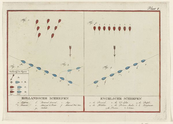
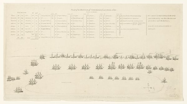
Posities van de Nederlandse en Engelse schepen bij de zeeslag bij Doggersbank, 1781 (plaat II) 1781 - 1783
0:00
0:00
Dimensions: height 195 mm, width 278 mm
Copyright: Rijks Museum: Open Domain
Curator: Looking at this print titled, "Positions of the Dutch and English ships during the Battle of Dogger Bank, 1781 (plate II)," created sometime between 1781 and 1783 by an anonymous artist, what strikes you? Editor: It's visually quite arresting in its stark simplicity. The arrangement of the ships—little blue and red shapes against a pale ground—creates a unique graphic language. Curator: Indeed. It's a bird's-eye view, a schematic representation rather than a picturesque seascape. We see the configurations of naval power during this particular battle, part of the Fourth Anglo-Dutch War. This battle was strategically important because the Dutch convoy was vital to support the Americans against the British forces. Editor: And the visual language reinforces that sense of strategic detachment. The ships almost read as abstract units, moving into position. Look at the crisp lines used to delineate each ship and their formation; a deliberate choice toward clarity. The ships and arrows serve as tools of informational presentation, almost like a blueprint rather than an aesthetic artifact. Curator: I agree. The use of line engraving, along with etching techniques, allows for the clean precision necessary to map out these naval engagements. It gives us insight into how the battle was perceived and communicated to the public at the time. It became imperative to showcase geopolitical power and strategy through visual means. Editor: Precisely, the restrained palette - essentially primary colors - seems fitting for something meant to document with authority. It almost transcends mere visual representation. The arrow pointing directly up from the ensemble of ships conveys a sense of attack. Also the slightly staggered arrangement creates an unsettling visual, which draws the eye and highlights the complexity of the formations. Curator: And what becomes important is that this image speaks to the growing print culture during the period; images such as this informed and helped construct public opinion during wartime. Editor: Looking closely at this now, the way the information is presented – objective and strategic–almost diminishes the very real and brutal engagement that occurred on the open sea. A clear example of rational presentation overtaking visual sentimentality. Curator: Precisely. Understanding that disconnect is key to unlocking this image's true place in cultural memory. Editor: Indeed. The contrast between the almost clinical precision of the visual and the very messy reality it represents is what stays with me.
Comments
No comments
Be the first to comment and join the conversation on the ultimate creative platform.
More like this