drawing, paper, ink
#
drawing
#
script typography
#
hand-lettering
#
baroque
#
old engraving style
#
hand drawn type
#
hand lettering
#
paper
#
personal sketchbook
#
ink
#
hand-drawn typeface
#
pen-ink sketch
#
line
#
pen work
#
sketchbook drawing
#
calligraphy
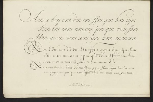
Dimensions: height 159 mm, width 207 mm
Copyright: Rijks Museum: Open Domain
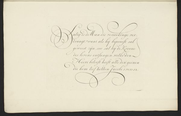
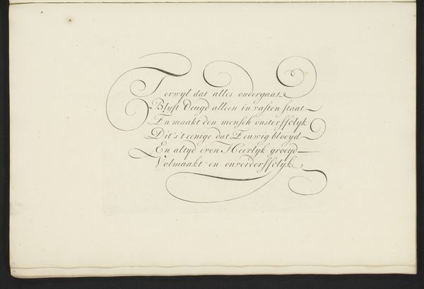
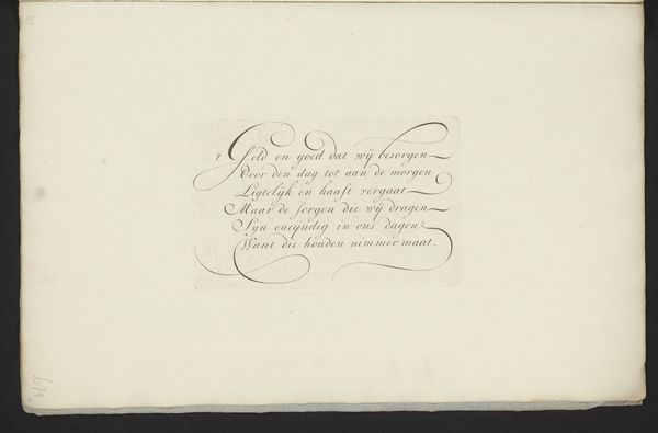
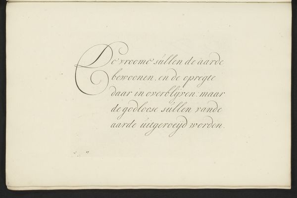
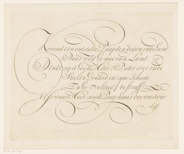
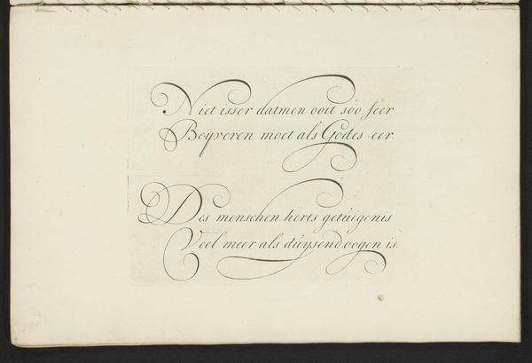
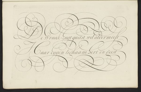
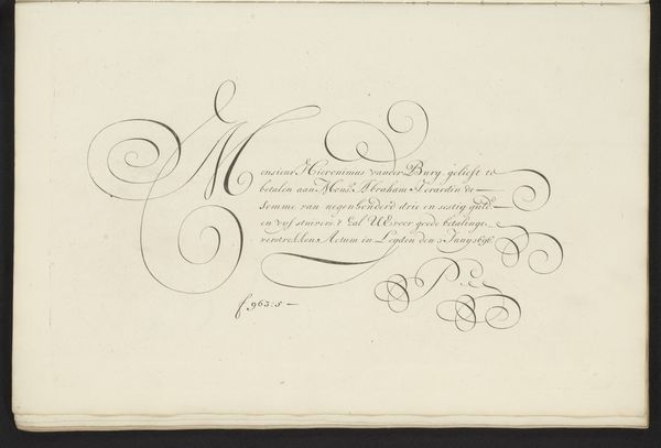
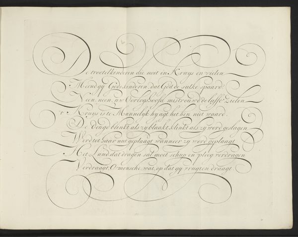
Bastiaan Boers created this calligraphic drawing with pen and ink sometime around the late 17th century. The artwork presents us with a study in elegant restraint, the black ink gracefully contrasting against the pale surface. The script is the picture. Notice the rhythmic interplay of thick and thin strokes, swelling and tapering to create a sense of movement. The curvilinear forms of the letters, almost dancing across the page, evoke a feeling of measured elegance, the loops and swirls of the calligraphy are not merely decorative but structural. The text’s meaning, 'the poor in his integrity is better than the perverse of lips, and he who is also a fool is without knowledge and is hasty with his feet' is secondary. The act of writing becomes a performance, challenging fixed meanings and inviting us to reconsider the relationship between form and content.
Comments
No comments
Be the first to comment and join the conversation on the ultimate creative platform.
More like this