drawing, graphic-art, paper, typography, ink
#
script typeface
#
drawing
#
graphic-art
#
script typography
#
hand-lettering
#
dutch-golden-age
#
hand drawn type
#
hand lettering
#
paper
#
typography
#
ink
#
hand-written
#
hand-drawn typeface
#
thick font
#
handwritten font
#
calligraphy
#
small lettering
Dimensions: height 208 mm, width 333 mm
Copyright: Rijks Museum: Open Domain
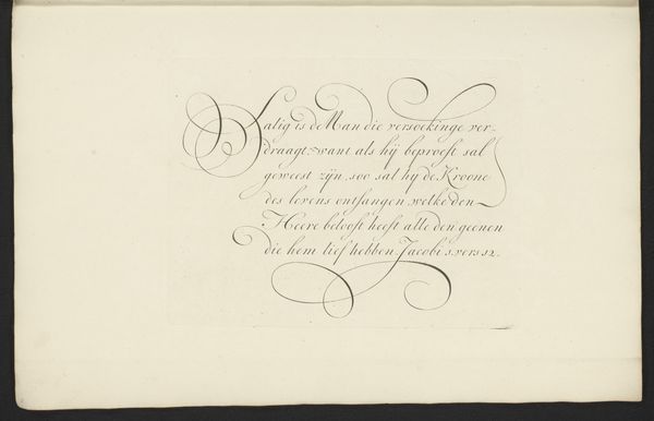
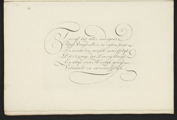
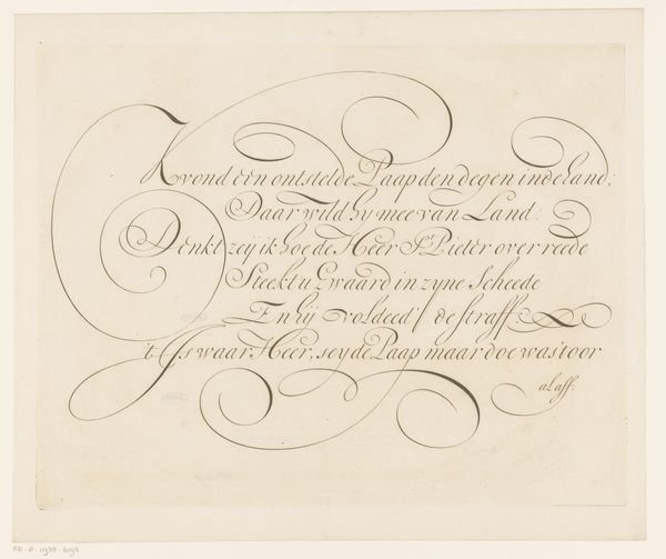
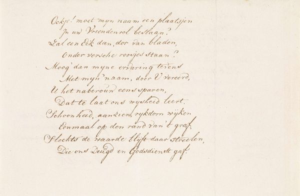
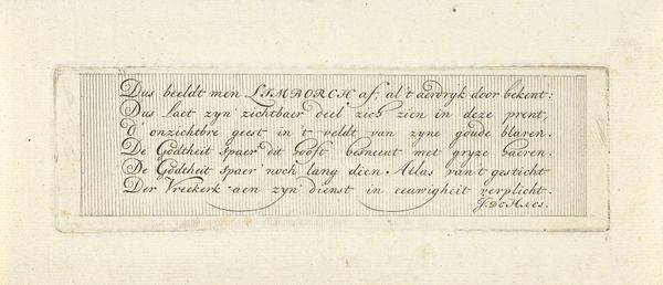
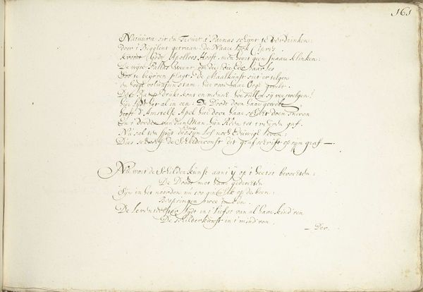
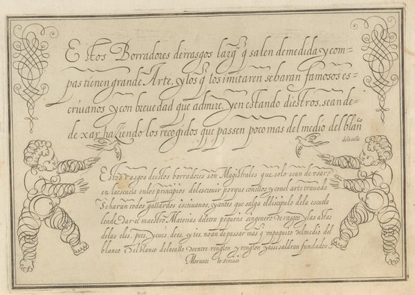
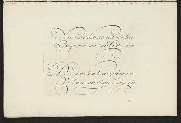
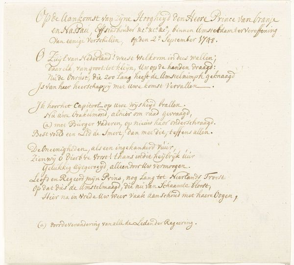
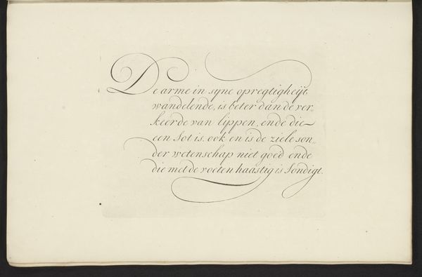
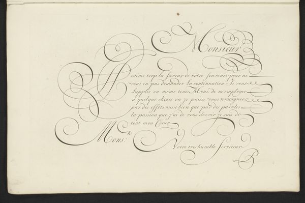
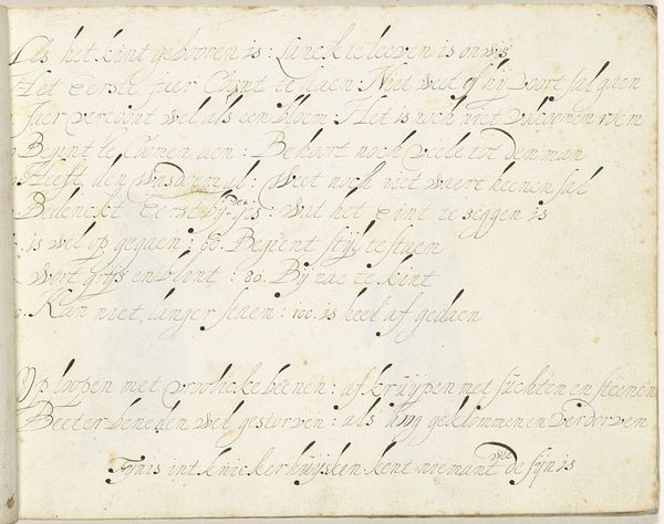
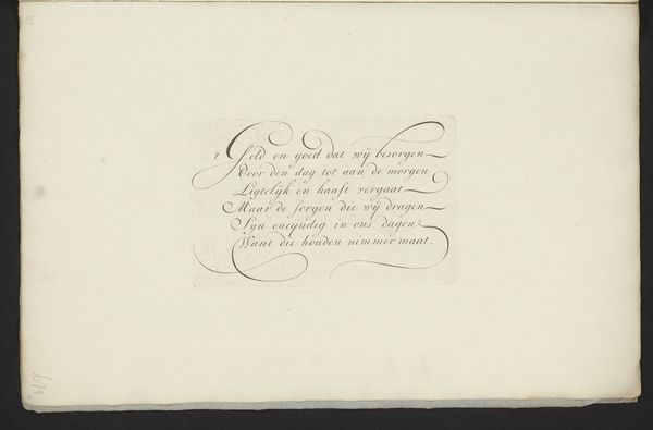
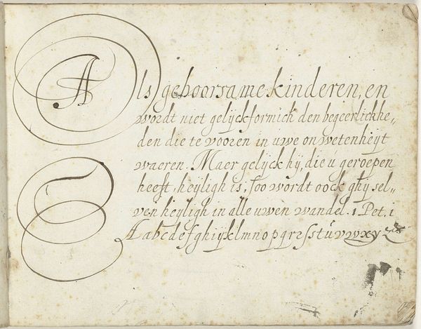
Editor: So, this piece is called "Schrijfvoorbeeld met acht regels letters," or Writing Sample with Eight Lines of Letters, by Maarten Boers, dating from 1693 to 1751. It’s a drawing using ink on paper, a demonstration of calligraphy. What strikes me is how tactile it seems, even though it’s just letters on a page. How do you approach this piece? Curator: Well, let’s think about the means of production. Ink, paper, the hand. These are readily available materials, but the skill to wield them like this represents labor and training. How does the act of meticulously writing out alphabets challenge our assumptions about art versus craft? It's essentially mass production via manual labour, and what’s its use-value? Editor: So it’s less about the beauty of the script and more about the labour involved? I mean, you can almost imagine the hours and practice distilled in it... almost a meditative labour. Curator: Exactly! Consider the social context too. Literacy was power. Who had access to this skill? The very act of producing these elegant forms reinforces existing social hierarchies. Are these letterforms just aesthetic exercises or commodities traded to show high status through refined craft? Do you feel the perfection challenges the concept of authorship itself, reducing Boers to a labourer of letterforms? Editor: That's a great point, I hadn’t thought of it that way. Perhaps that precise rendering masks how handwriting styles can also act like a signature... individual within a framework of conformity. Now I am wondering who commissioned it and its value in their eyes versus ours. Curator: Yes! It really asks us to reflect on the complex intersections of skill, labor, and social class. Editor: I'll definitely look at other calligraphic works with a different perspective now, keeping in mind not only aesthetic aspects but their cultural significance and the economics of labor.
Comments
No comments
Be the first to comment and join the conversation on the ultimate creative platform.
More like this