drawing, print, paper, ink
#
drawing
# print
#
landscape
#
perspective
#
paper
#
ink
#
geometric
#
classicism
#
cityscape
#
history-painting
#
academic-art
#
miniature
Dimensions: height 213 mm, width 268 mm
Copyright: Rijks Museum: Open Domain
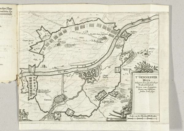
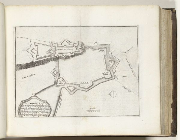
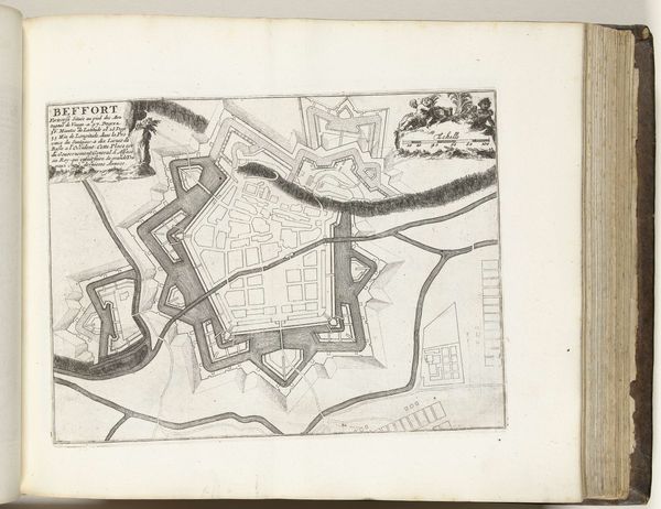
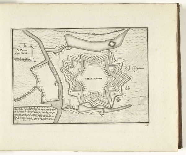
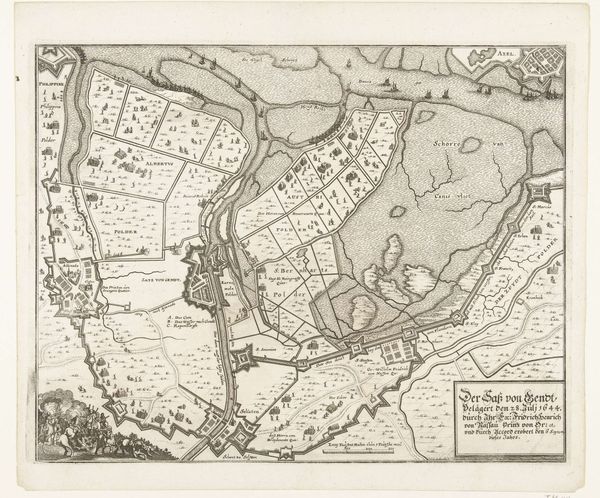
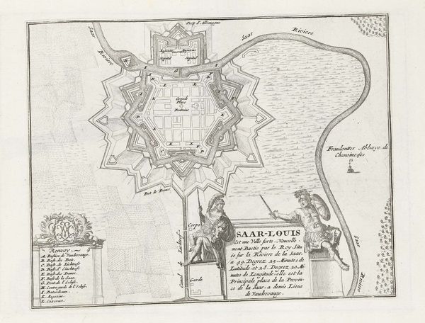
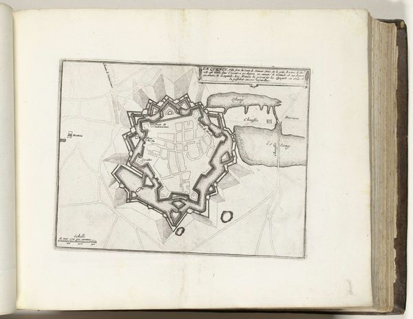
Editor: This is an interesting, almost technical-looking drawing. "Plattegrond van Homburg," or "Map of Homburg," created around 1702. It's ink on paper, so it reads like a blueprint. It’s all straight lines and angles forming this fortress, surrounded by landscape. It has this very rigid, formal feel. What jumps out to you when you look at this? Curator: It's fascinating how cityscapes become symbols. This "Plattegrond," at first glance a practical map, evolves into a representation of power, strategy, and collective identity. Think about the geometric shapes—each angle, each line etched in ink, what might those convey about the values and fears of the people who conceived it? Editor: I hadn’t thought about it that way. It definitely looks more like an idealization than just a factual depiction. It is a pretty imposing-looking geometric structure, too. Curator: Exactly! Notice how the design prioritizes defense and order? Those elaborate fortifications weren't just practical, but visual statements. The “Citadelle et Château” looming prominently suggests who held power and, crucially, who needed protection. Maps aren’t objective, but powerful cultural artifacts, carefully designed to project very specific meanings and to shape cultural memory. What emotions does this idealized representation evoke? Editor: A sense of security, perhaps, but also maybe paranoia that these walls are necessary? I’m also struck by how small everything beyond the walls seem, giving that central fortress this sense of overwhelming control and importance. Curator: And isn't that revealing? Visual symbols like these aren't just pretty pictures, they tell us so much about history. Editor: I’m beginning to see these maps aren't really about where things are, but about what they mean. It makes me wonder how current-day maps communicate different values and beliefs about us. Curator: Precisely! Every carefully chosen element—the line weights, the positioning of structures, what is shown or omitted—contributes to a deliberate construction of meaning. Thinking about these older maps in this light helps us question and explore the assumptions embedded within our contemporary visual landscape, too.
Comments
No comments
Be the first to comment and join the conversation on the ultimate creative platform.
More like this