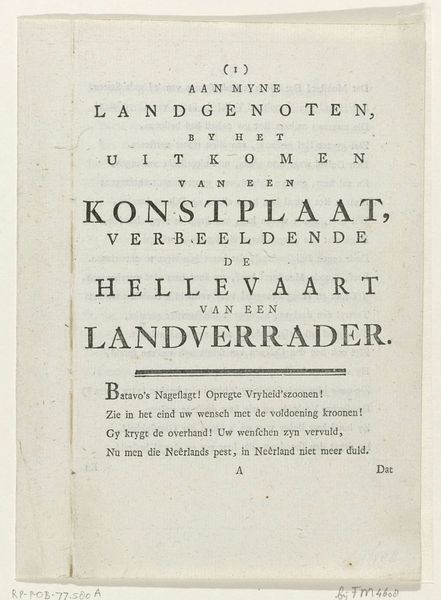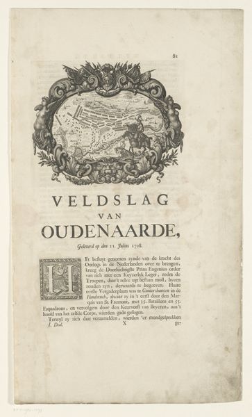
1674
Titelpagina voor de Schouburgh der Nederlandse veranderingen, geopent in ses tooneelen, 1674
Romeyn de Hooghe
1645 - 1708Location
RijksmuseumListen to curator's interpretation
Curatorial notes
Editor: This is the title page for "Schouburgh der Nederlandse veranderingen, geopent in ses tooneelen" from 1674, by Romeyn de Hooghe. It's an engraving and print. It strikes me how the typography and decorative elements create a sense of ordered hierarchy, but what does this tell us? Curator: The formal arrangement is indeed the key. Note how the varying sizes and weights of the typeface articulate the subject matter: the history of the Dutch Republic during wartime. Can you identify the major compositional axes and the interplay of geometric forms? Editor: Well, there’s a strong vertical axis established by the centered text, and then a decorative, almost heraldic, element breaks the rigid verticality and is reinforced at the bottom. The contrast of formal and organic lines gives the title a certain tension, but also cohesiveness. Is that accurate? Curator: Precisely! The use of line and form to create visual interest, what we would consider as tension, guides the viewer through the information in a clear and impactful way. Look also at the letter forms; what is their weight, relative size, and position? These contribute to the harmony, or disharmony, in the composition. How do you think this structure connects with the intent? Editor: That’s interesting. The weight and placement draw my eyes to ‘Nederlandse Veranderingen,’ implying a grand narrative or momentous occasion worth considering through "Historic Symbols." Curator: An astute observation. From a formal standpoint, it exemplifies the sophistication and purpose embedded within even seemingly straightforward works of graphic art. Editor: I now recognize the intent is revealed via strategic lettering and adornment that might be lost upon first glance. Thanks!