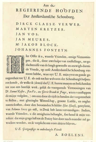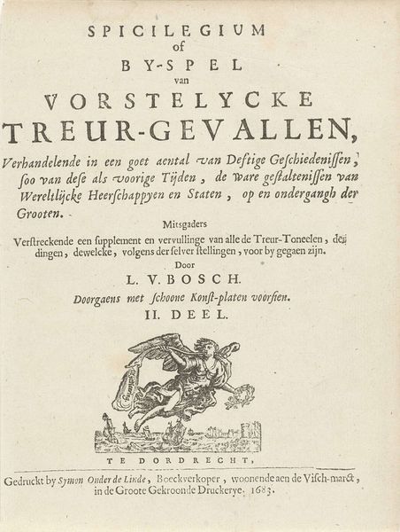
Titelpagina voor: T. Morus, Het onbekent en wonderlijk eyland Utopia, 1677 1677
0:00
0:00
arnoldhoubraken
Rijksmuseum
graphic-art, print, typography, engraving
#
graphic-art
#
hand-lettering
#
dutch-golden-age
# print
#
old engraving style
#
hand drawn type
#
hand lettering
#
personal sketchbook
#
typography
#
hand-drawn typeface
#
pen-ink sketch
#
pen work
#
sketchbook drawing
#
sketchbook art
#
engraving
Dimensions: height 103 mm, width 60 mm
Copyright: Rijks Museum: Open Domain
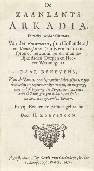
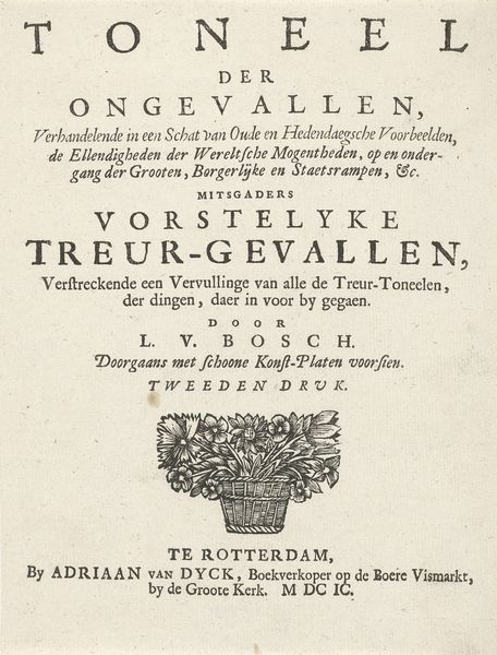
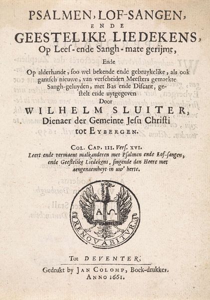
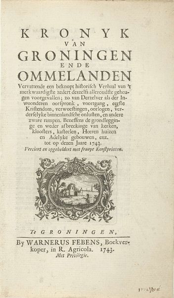
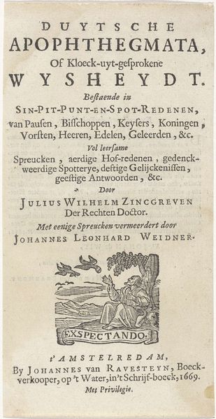
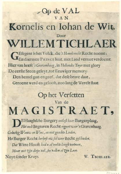
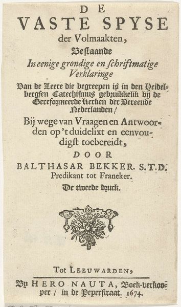
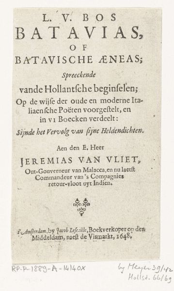
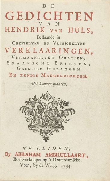
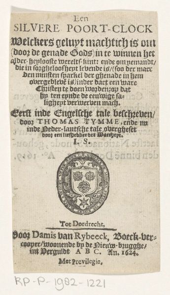
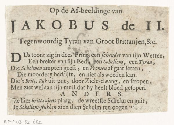
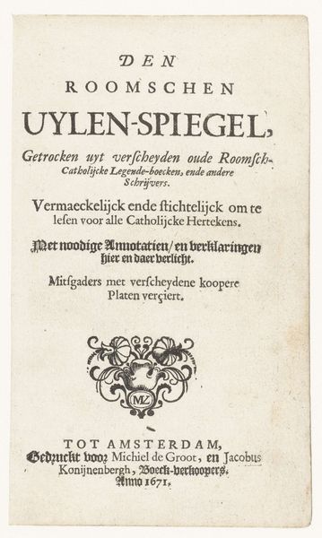
Curator: Right now we're looking at a title page from 1677, etched by Arnold Houbraken. It's promoting a Dutch translation of Thomas More's "Utopia." You know, that famous imagined island? Editor: Well, the first thing that strikes me is the incredible lettering. It feels so meticulous and dense, like a tightly packed philosophical argument rendered in ink. There’s this real gravitas, yet… is it just me, or is there a touch of whimsy in those flourishing serifs? Like the whole thing is on the verge of taking flight. Curator: I think that “whimsy” you sense is classic Dutch Golden Age. Even scholarly texts weren't immune to a bit of embellishment! Title pages were critical marketing for the book trade. Houbraken’s challenge was to telegraph More's complex ideas—social commentary, humanism, politics—into something immediately eye-catching. And he was primarily known as a painter! Editor: So this typography IS marketing in the guise of art, designed to intrigue and sell a dream of perfection, a blueprint for a better world—or maybe just the idea of one. That delicate little flourish at the bottom – almost looks like a stylized plant sprouting forth–does it mean something more? Curator: Ah, perhaps! It may simply be a decorative element, or it might subtly evoke ideas of growth, societal flourishing. We see these kinds of "printer's ornaments" frequently. Given that "Utopia" means "no place," or perhaps "good place," it's rather a visual wink. Editor: A little ironic embellishment! Considering how difficult a true "utopia" probably is, this engraving's beauty almost sets an impossibly high standard. The lettering implies a perfect system, but that tiny, off-kilter flourish hints that something, inevitably, will be just a little bit crooked, don't you think? Curator: Exactly! The engraver’s task here wasn’t just to reproduce words but to encapsulate a centuries-old dialogue between reality and ideals, one that the book itself had helped spark. The print had a circulation that extended way beyond any single owner or institution. Editor: Well, thinking about this piece now, it really prompts you to ponder the tension between striving for an ideal, and accepting the lovely, messy reality. Curator: For me, it serves as a compelling reminder of the enduring power of the printed word, to both envision and instigate discussions of alternate realities, and more fair societies.
Comments
No comments
Be the first to comment and join the conversation on the ultimate creative platform.
