print, textile, typography, engraving
#
hand written
#
hand-lettering
#
baroque
# print
#
old engraving style
#
hand drawn type
#
hand lettering
#
textile
#
typography
#
hand-drawn typeface
#
pen work
#
handwritten font
#
golden font
#
engraving
#
historical font
Dimensions: 96 mm, height 152 mm
Copyright: Rijks Museum: Open Domain
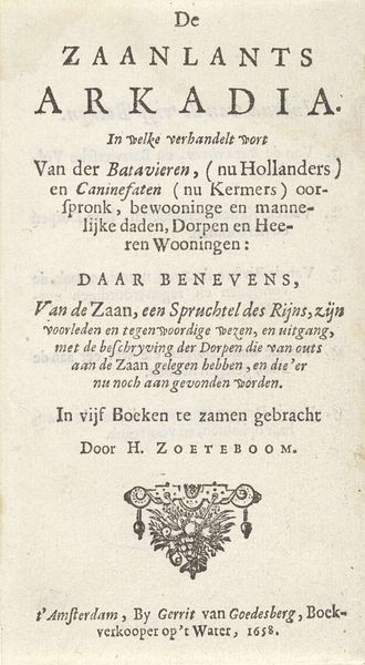
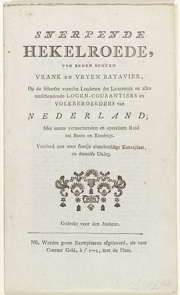
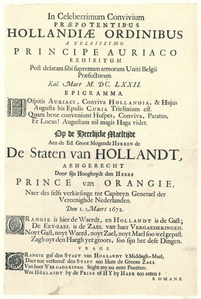
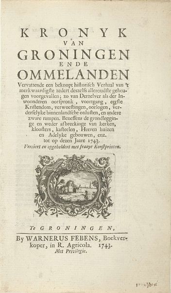
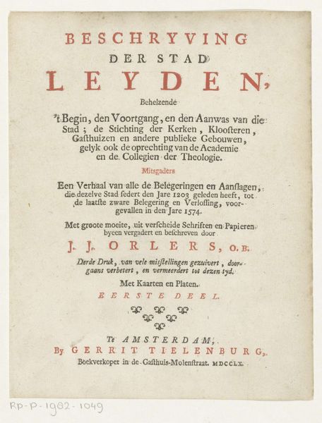
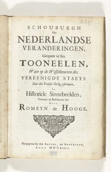
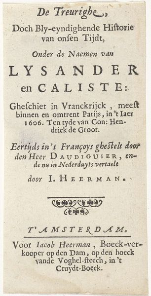
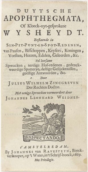
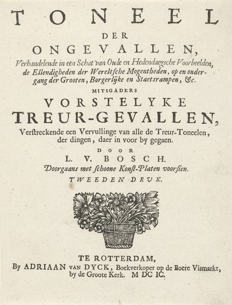
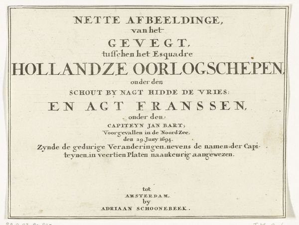
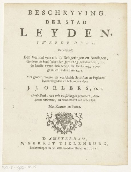
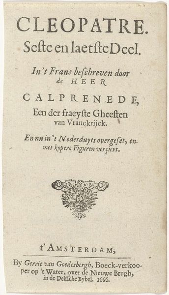
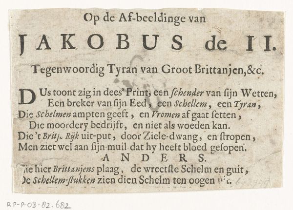
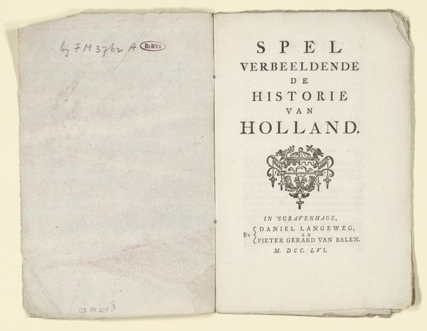
Editor: So, this is the title page for " 't Vermakelijk lottooneel van Holland", created in 1705 by H. van Damme. It’s an engraving, and it feels very…dense. All that text! I'm curious about how people would have seen and interpreted something like this back then. What stands out to you? Curator: What immediately grabs me is the symbolic power held within typographic forms themselves. Look at the letterforms – notice how they straddle that line between the mechanical reproduction of print and the intimate touch of hand-lettering. How do you think that tension played into the audience's reception? Editor: Well, maybe it was about trustworthiness? Like, print suggests accuracy, but the hand-drawn elements make it feel more personal, less like cold, hard data? Curator: Precisely! The combination could be perceived as imbuing the lottery—seen as capricious—with an aura of bespoke legitimacy. These visual cues tapped into cultural memories, drawing on associations of authority and personalized care simultaneously. See those floral garlands at the bottom? Editor: Yeah, they seem a bit out of place. Curator: On the contrary! They ground the text within the familiar vocabulary of domestic imagery—nature, growth, and abundance, maybe alluding to what the lottery promises: earthly flourishing. It’s fascinating how visual symbols can transform the perception of games of chance, yes? Editor: I never considered typography having so much meaning! I guess I'm used to just seeing fonts as… fonts. It's interesting to consider what kind of effect this image would have had at the time. Curator: Exactly! We learn to perceive how these elements communicate more than literal information; they communicate emotional and cultural contexts. Now, when you encounter other works with significant typography, you'll view them with this new awareness, understanding the complex dialogue of visual signs!
Comments
No comments
Be the first to comment and join the conversation on the ultimate creative platform.
