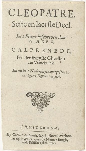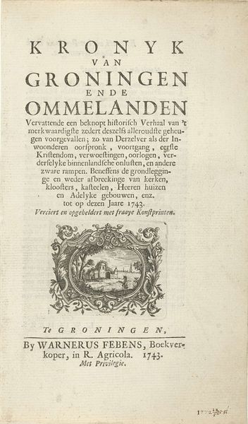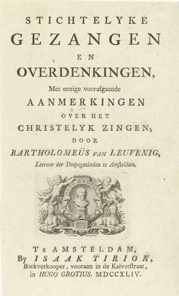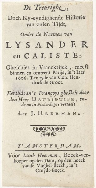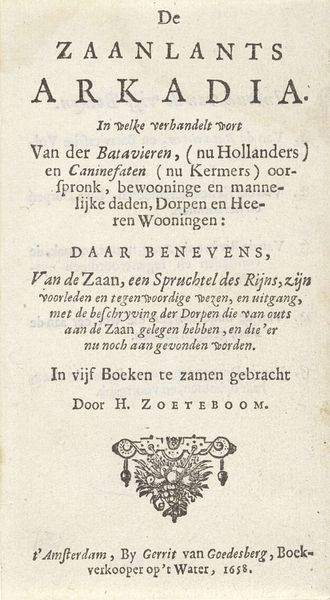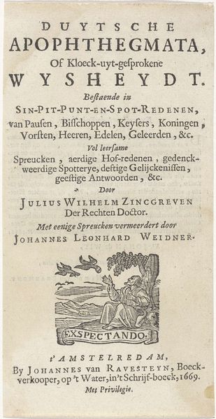
Titelprent voor een serie platen van een zeegevecht tussen Hollanders en Fransen op de Noordzee, 1694 1694
0:00
0:00
adriaenschoonebeek
Rijksmuseum
graphic-art, print, engraving
#
graphic-art
#
baroque
#
dutch-golden-age
# print
#
engraving
Dimensions: height 145 mm, width 190 mm
Copyright: Rijks Museum: Open Domain
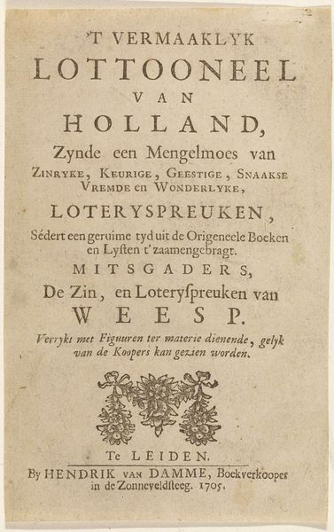
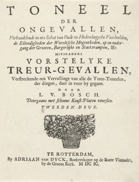
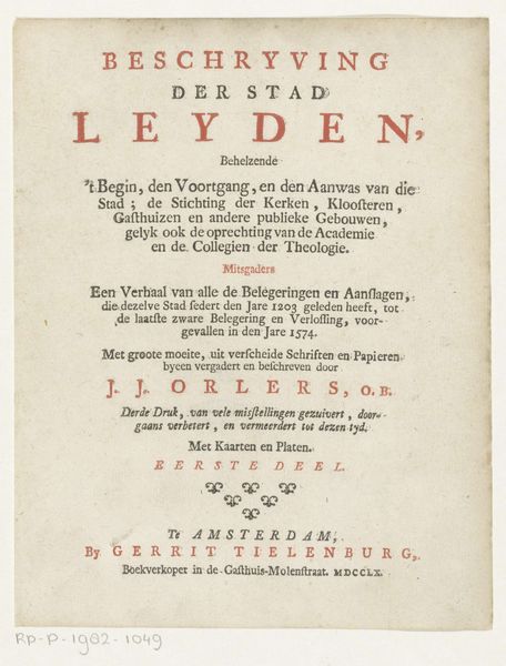
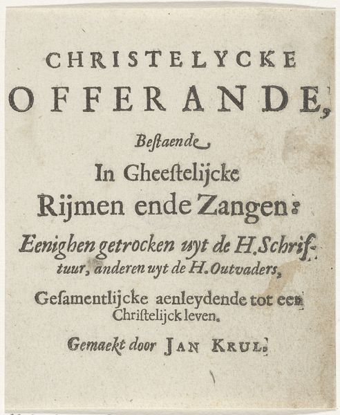
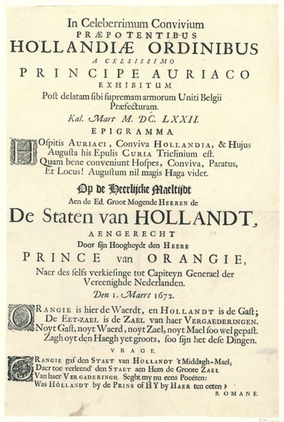
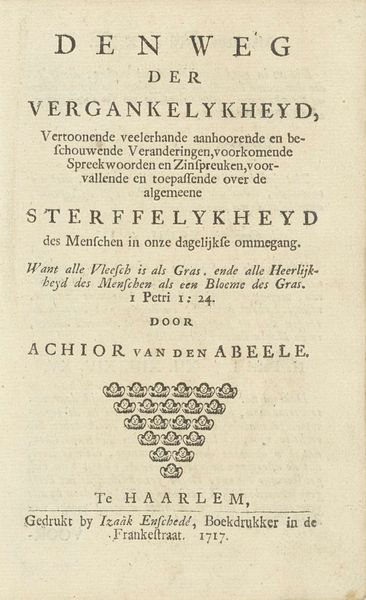
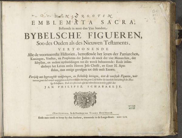
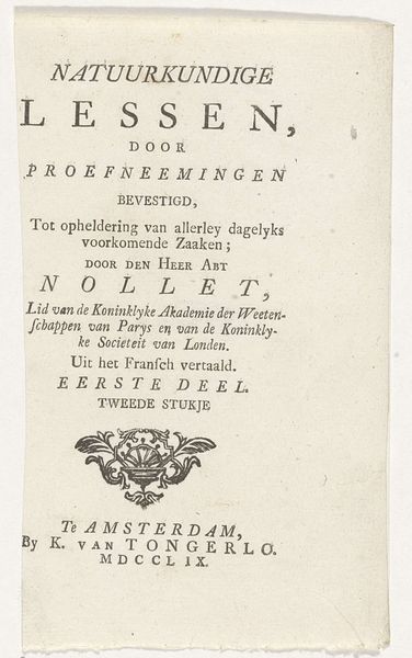
Curator: Here, we have a title print from 1694, crafted by Adriaen Schoonebeek. Its full title, translated, describes it as depicting the sea battle between Dutch and French ships in the North Sea. Editor: My first impression is that it feels like a carefully constructed declaration. All the text, symmetrically placed and intensely focused, projects authority and Dutch naval power. Curator: Precisely. This work exists as a prelude to a series of prints detailing the battle. Look at the use of language: "Nette afbeeldinge," or "neat depiction," implies a meticulous accuracy, a documentary intention despite the inevitable propagandistic elements. It clearly situates itself within a broader sociopolitical and cultural landscape. It sets the tone, framing the viewer’s perception of the events to follow. Editor: The Baroque sensibility is evident. While there is no overt imagery yet, the very presentation of text adopts the era’s taste for grandeur and display. Even fonts and their hierarchy project might! "Hollandze Oorlogschepen" for example. The symbolism inherent is Dutch power at that time. Curator: It certainly uses Baroque aesthetics to emphasize Dutch military prowess. Consider the context; this was a period of intense maritime rivalry, and imagery of naval victories played a significant role in shaping national identity and solidifying power structures. Who controlled the sea controlled the trade routes, thus the wealth of a nation. Editor: This work highlights continuity. Typographic arrangements resemble other forms of early modern heraldry, establishing pedigree, authority, and legitimacy in ways still relevant today. Visual communication borrows from an understood visual language. Curator: It calls upon both history and present politics to shape how these images are received. Editor: A perfect intersection between naval might and the rise of the printing press, one defining the other, if only visually. Curator: Yes, thinking about Schoonebeek's intent, it becomes more apparent. Thanks for that connection, as I look at the larger narratives surrounding power and image making. Editor: It was just a fascinating print that immediately brought forward a time when symbolic imagery and typographic authority ruled!
Comments
No comments
Be the first to comment and join the conversation on the ultimate creative platform.
