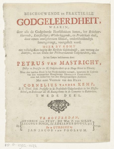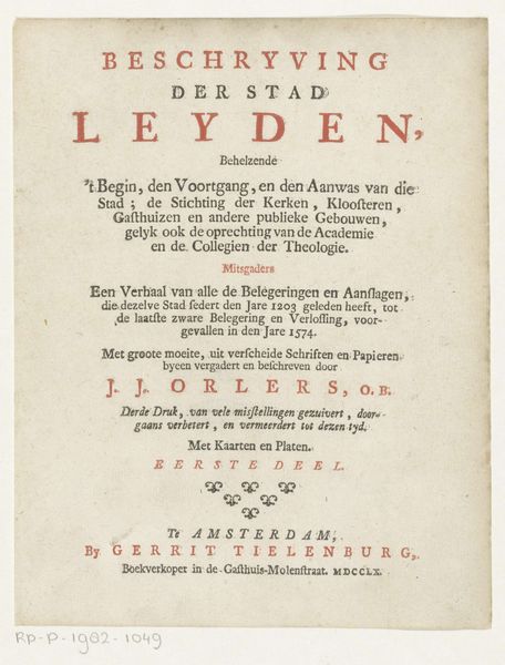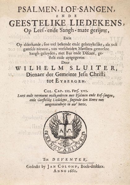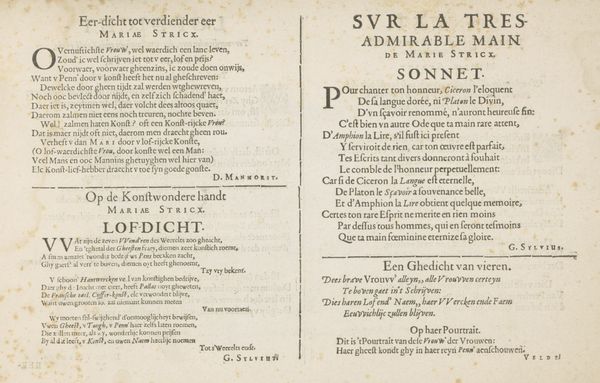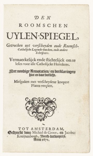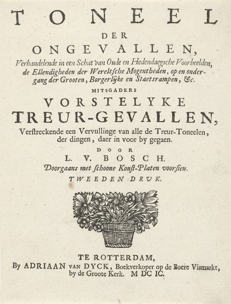
Titelpagina voor: J.P. Schabaelje, Den Grooten Emblemata Sacra, 1654 1654
0:00
0:00
janphilipszschabaelje
Rijksmuseum
print, typography
#
dutch-golden-age
# print
#
typography
#
calligraphy
Dimensions: height 295 mm, width 360 mm
Copyright: Rijks Museum: Open Domain
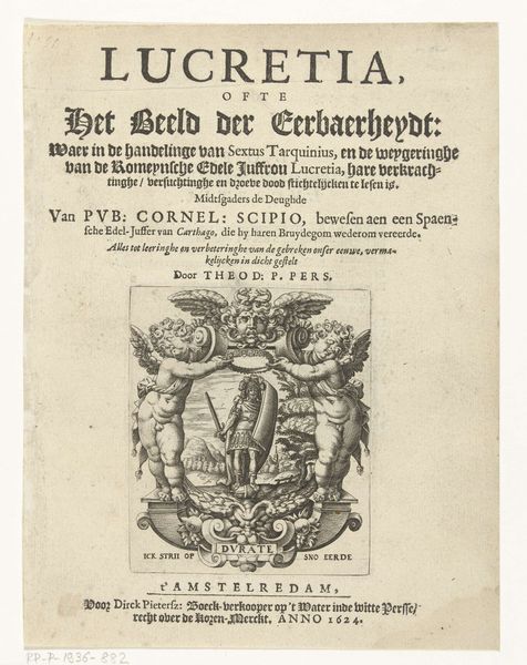
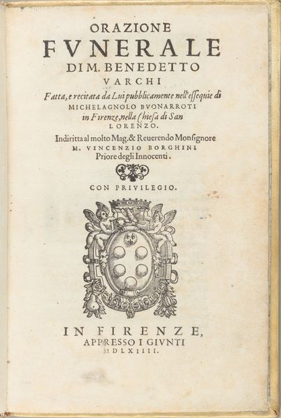
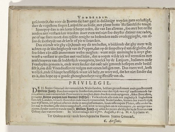
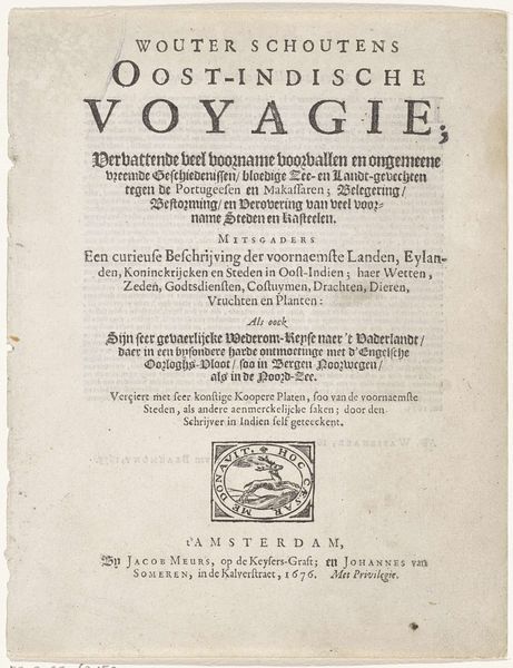
Curator: We're looking at the title page for "Den Grooten Emblemata Sacra," a book from 1654 by Jan Philipsz Schabaelje. The museum holds this print in its collection. Editor: The typography immediately grabs me. The lettering, the way it fills the space… there's a stark beauty in its functionality. The layout feels both balanced and incredibly dense. It's all substance. Curator: Indeed. The text itself becomes part of the artwork, showcasing the craft of calligraphy. And if we look closely, you can see a small printer's mark near the bottom, with a shield of wheat sheaves and the statement that is printed in Amsterdam. Editor: Those sheaves... they seem symbolic. What do they signify in this context? Is it connected to themes within the "Emblemata Sacra," or a reflection of the maker? Curator: I think the wheat is emblematic of spiritual nourishment, of God providing. It aligns with the book’s theme of biblical instruction. Consider how prints like these circulated widely. Production depended on highly skilled labor within workshops, a far cry from mass production. Editor: And thinking about readership...who was interacting with it and what did reading offer them? The language being Dutch is not necessarily restrictive as plenty would have understood, but what specific imagery and language of religion offered safety, warning, etc.? Curator: The intended audience was likely a broad readership. The accessible language—Dutch rather than Latin—combined with the visual appeal of the emblems, would've allowed more engagement than purely text-based theological works. Editor: Seeing the book in a gallery really reframes it as an artistic artifact. The wear on the paper, the texture... it all testifies to its survival and use, to all of those sets of hands that must have poured over this information. Curator: I agree. Focusing on materiality makes the context rich here; consider how the print transforms sacred ideas into something that could be widely disseminated and personally owned. Editor: The "Emblemata Sacra" presents complex theological concepts through typography, challenging our modern idea of artistic skill and the spiritual power of art. Curator: And perhaps reminding us that even seemingly functional objects can be profound cultural artifacts with encoded stories.
Comments
No comments
Be the first to comment and join the conversation on the ultimate creative platform.
