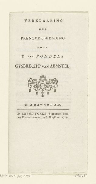
Titelpagina voor: Snerpende Hekelroede van een echten Vrank en Vryen Batavier, 1787 1787
0:00
0:00
johanneslefrancqvanberkhey
Rijksmuseum
graphic-art, print, textile, paper, typography, engraving
#
graphic-art
#
aged paper
#
dutch-golden-age
# print
#
old engraving style
#
hand drawn type
#
textile
#
paper
#
typography
#
hand-drawn typeface
#
fading type
#
thick font
#
handwritten font
#
golden font
#
word imagery
#
engraving
#
historical font
Dimensions: height 215 mm, width 128 mm
Copyright: Rijks Museum: Open Domain
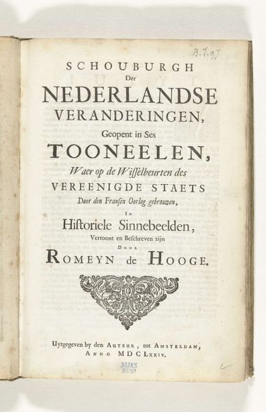
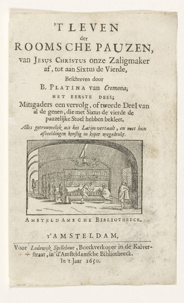
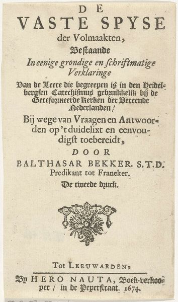
This title page for "Snerpende Hekelroede," or "Scathing Satire," was made in 1787 by Johannes le Francq van Berkhey using etching and engraving. These printing processes are closely related to those used by goldsmiths, and involve the precise cutting of lines into a metal plate, which is then inked and pressed onto paper. The stark black ink on the page immediately tells us a lot about the book’s intended audience. Text was carefully laid out using letterpress - a labor intensive process, reflective of early industrial capitalism, and the book's relatively high production cost. This was a book for the literate and relatively wealthy. The design features an ornamental vignette, reflecting the book’s polemical subject matter. More than just an image, this title page is an artifact of skilled labor, commerce, and the spirited political debates of its time. It reminds us that even seemingly simple printed matter has deep roots in material practices and social context.
Comments
No comments
Be the first to comment and join the conversation on the ultimate creative platform.
More like this