print, paper, typography, engraving
#
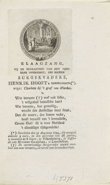
portrait
#
aged paper
#
neoclassicism
# print
#
hand drawn type
#
paper
#
text
#
typography
#
hand-written
#
hand-drawn typeface
#
stylized text
#
thick font
#
handwritten font
#
classical type
#
engraving
#
historical font
#
columned text
Dimensions: height 199 mm, width 155 mm
Copyright: Rijks Museum: Open Domain
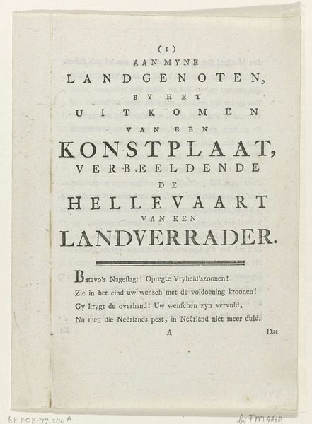
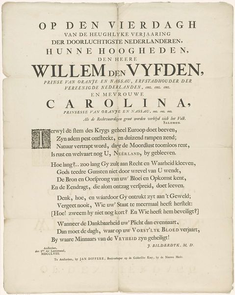
Curator: Here we have "Spotvers op Willem V," an engraving on paper dating back to 1795, attributed to Monogrammist SVK. Editor: The aged paper gives it a feeling of immediacy. Look at that gothic typeface; its texture creates a mood that is both weighty and rebellious. Curator: The overall composition relies heavily on vertical text blocks, doesn't it? We can see that the upper block gives way to poetry beneath a line of asterisks, all finished off with an accusatory line from the engraver at the bottom. The use of capitalized lettering gives the text a neoclassical character. Editor: Given the sociopolitical climate of 1795, that final accusation is hardly neutral! Here's my question—why choose printmaking to send a message like this? Curator: Print as a medium lends itself to the wide dissemination of ideas. Notice that the opening inscription promises "A Brief Sketch of the Excellent Deeds of the Stadtholders in the United Netherlands," yet ends with a damning accusation against William V. Editor: That promise serves to do more than inform, surely. Consider the French Revolution of 1789 and its ripple effect across Europe. SVK’s print emerges in this charged atmosphere. Is it suggesting William V has failed the Dutch people? Is "I sew and booze for the fatherland" a commentary on his perceived indolence, as opposed to earlier leaders of the country? Curator: Well, read purely as form and typography, it becomes clear that the work is a masterful execution of textual hierarchies within a rigid frame. I believe focusing on this print in relation to Dutch Neoclassical engraving traditions is the proper avenue for interpretation. Editor: I couldn't disagree more, I'm afraid! To ignore the wider resonance is an active misinterpretation of intent! Think of this from the perspective of class, too—how would the lower orders receive this print as it was plastered about towns and cities? Curator: Even if one ascribes political motive, this text also evokes a wider lament of the country, doesn't it? We may have no clear answers from SVK, but perhaps their intent lives in that very space. Editor: Perhaps you're right, and the point is that it enables the population to think!
Comments
No comments
Be the first to comment and join the conversation on the ultimate creative platform.
More like this