graphic-art, print, typography, engraving
#
graphic-art
#
script typography
#
baroque
#
dutch-golden-age
# print
#
typography
#
engraving
Dimensions: height 134 mm, width 85 mm
Copyright: Rijks Museum: Open Domain
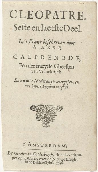
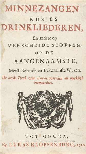
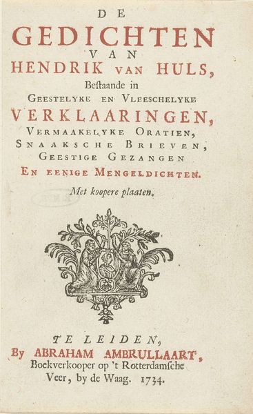
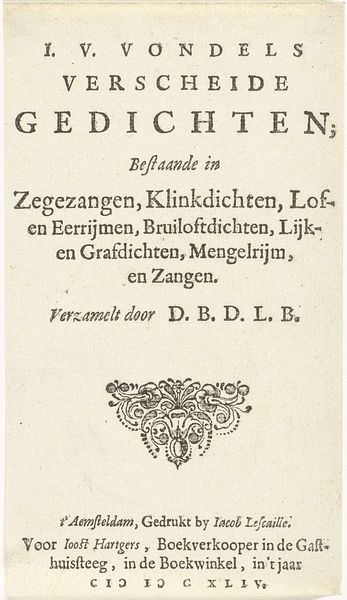
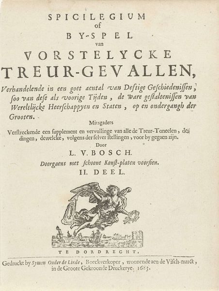
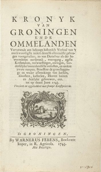
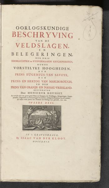
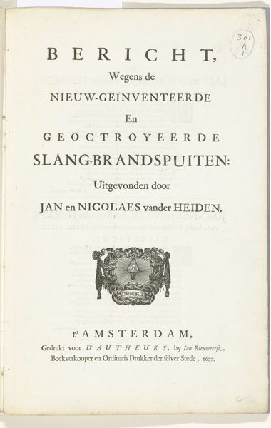
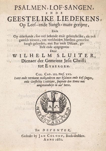
Curator: Before us is the title page for "Stichtelyke gedichten," or "Devotional Poems," by G. Brandt, published in Amsterdam in 1665. The print is an engraving by Jan Rieuwertsz. Editor: Immediately, I'm struck by its formality, the strict hierarchy of text, broken only by that central, almost bizarre, vignette. It feels quite…austere, but for that burst of peculiar imagery. Curator: Indeed, the typography commands attention. Note the interplay of sizes, the deliberate weighting given to key words – "Gedichten," or Poems, for instance, nearly jumps off the page. Editor: And below, we see a strange assembly. Is that a lamb? An infant figure…all gathered around what appears to be a single candle or chalice? Curator: Symbolism was integral to art during this period. The lamb is, of course, a Christ figure, often depicted as sacrifice or purity. The child might represent innocence or a new soul seeking guidance. The chalice – or lamp stand – could signify spiritual illumination or communion. Editor: The Baroque era loved to imbue every image with layers of meaning. This book's cover isn't merely decorative; it’s an introduction, preparing the reader for the spiritual themes within. The overall impression – with those symmetrical flourishes – almost feels like looking into a mirrored space…perhaps signifying introspection. Curator: Precisely. Rieuwertsz. uses these graphic elements – the letterforms themselves, the composition, the contrasting weight of lines – to construct a visual framework for theological reflection. Even the layout invites the viewer to meditate sequentially from title down to the imprint details. Editor: So the seemingly rigid structure actually serves a purpose – it mirrors, on a visual plane, the ordered devotion expressed through poetry within. It’s a deliberate echo, where text, image, and implicit symbolism coalesce. This cover certainly adds a wealth of information, and feeling. Curator: Ultimately, analyzing this title page unveils how deeply intertwined the visual and literary arts were, each capable of reinforcing the emotional and spiritual content of the other. Editor: It provides a potent insight into the 17th-century mindset – revealing just how saturated visual culture could be with implicit meanings, designed to guide the beholder towards deeper contemplation.
Comments
No comments
Be the first to comment and join the conversation on the ultimate creative platform.
