drawing, print, ink, engraving
#
drawing
# print
#
ink
#
geometric
#
line
#
engraving
Dimensions: height 73 mm, width 70 mm
Copyright: Rijks Museum: Open Domain
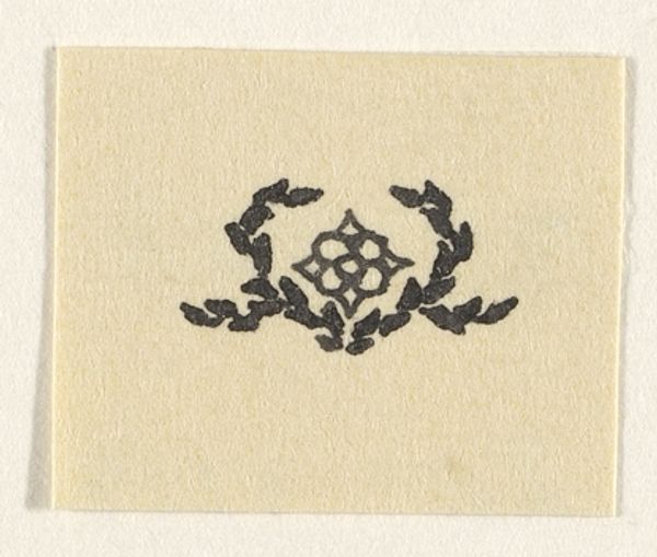
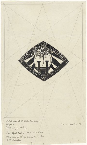
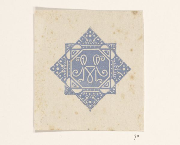
Elias Voet Jr. made this vignette with the coat of arms of Haarlem with some kind of graphic medium, probably ink on paper. It’s interesting how even in such a small, precise piece, you can see the artist's hand – those slightly wavering lines giving it this great sense of process. Look at the central emblem, how it's framed within the octagonal shape; the lines aren't perfectly rigid, they breathe a little. It's like seeing the underlying sketch still present in the final work, an idea that is solid but permeable. There's something about the starkness of the black ink on the plain paper that feels both old and modern, the date mark gives it an historical anchor, but the minimalist aesthetic also connects it to contemporary graphic design. Thinking about the graphic quality of heraldry makes me think of the work of someone like Paula Scher, who takes a similar approach to branding as image-making. In the end it all comes back to mark making and the ongoing conversations between then and now.
Comments
No comments
Be the first to comment and join the conversation on the ultimate creative platform.
More like this