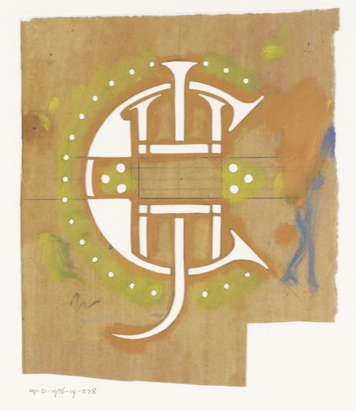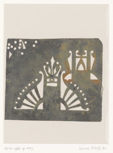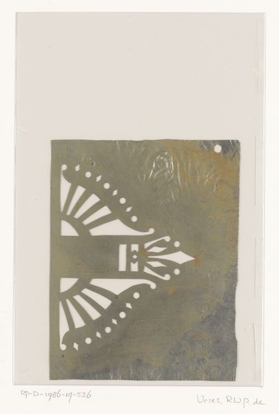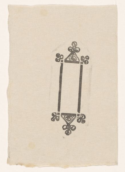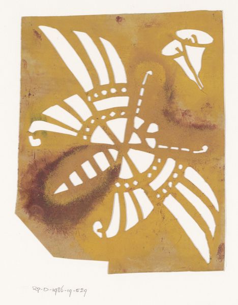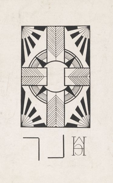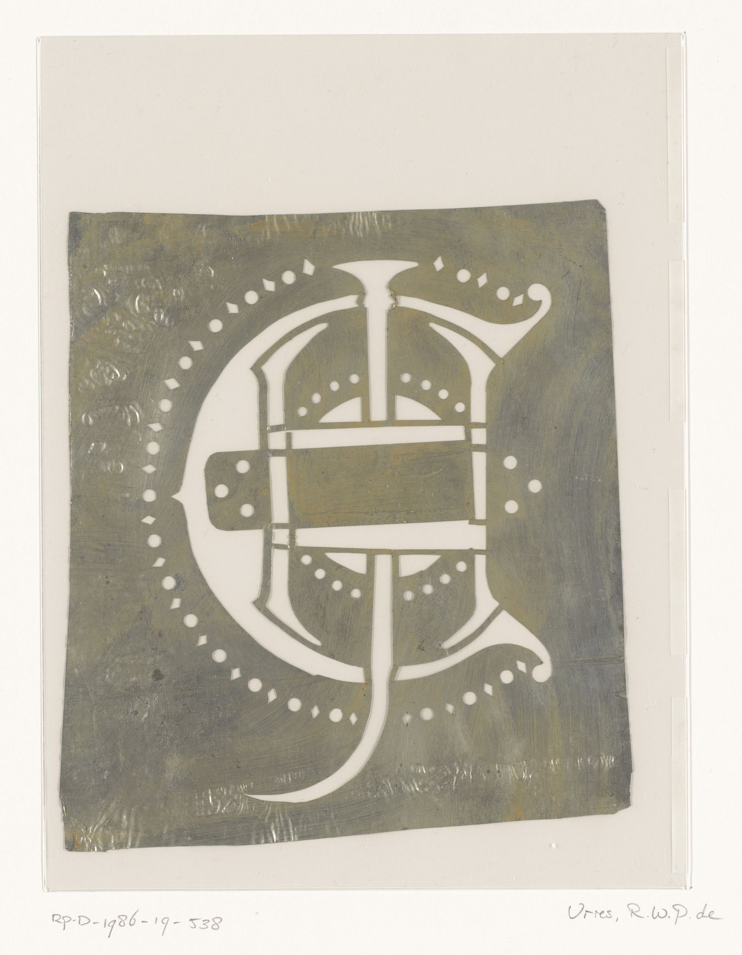
1884 - 1952
Sjabloon met monogram CHJ
Listen to curator's interpretation
Curatorial notes
Curator: What strikes you first about this "Sjabloon met monogram CHJ", a stencil design crafted sometime between 1884 and 1952 by Reinier Willem Petrus de Vries? Editor: The stark contrast, the monochromatic palette! It's so graphic, so immediate. A bold statement made with simple means. The density of the dark ground really makes the cut-out design pop. Curator: Indeed. This work, executed as a linocut stencil on paper, speaks volumes about the cultural functions of monograms. During that period, monograms were employed by individuals, families, and institutions to stake a claim of belonging. Their use marked possessions and personal belongings. Editor: Interesting! I’m really taken by how the artist uses geometric shapes to define the elaborate letterforms of the initials "CHJ". What looks like ornamentation also feels fundamental to the structure. And the dots, reminiscent of something ancient yet modern! Curator: Exactly. The strategic placement of the dots invites further analysis; do these patterns reflect influences like Art Deco aesthetics emerging in the early 20th century, or perhaps allude to coded symbol systems, reflecting Reinier's sociopolitical context? I believe we should not see a pure abstraction but look into the cultural use of such symbol and codes during the early and mid 20th Century. Editor: A semiotic perspective opens doors to how the design functions. But what about the medium? The crude, handmade feel of linocut clashes interestingly with the elegance implied by the monogram itself. Is there perhaps a democratizing gesture here? An upscale image delivered by decidedly commonplace means? Curator: A plausible argument. By considering its cultural and historical context, the function and medium of "Sjabloon met monogram CHJ", invite us to reassess notions of authorship, ownership and power reflected by early and mid-20th century's application of such glyphs. Editor: Ultimately, for me it boils down to its visual potency. That sharp, uncluttered form – the raw power of black and white. The interplay is forever compelling. Curator: I agree, this stencil encapsulates so much about both the evolution of visual language but, moreover, the role and deployment of coded signifiers as part of identity during turbulent times.