1887 - 1924
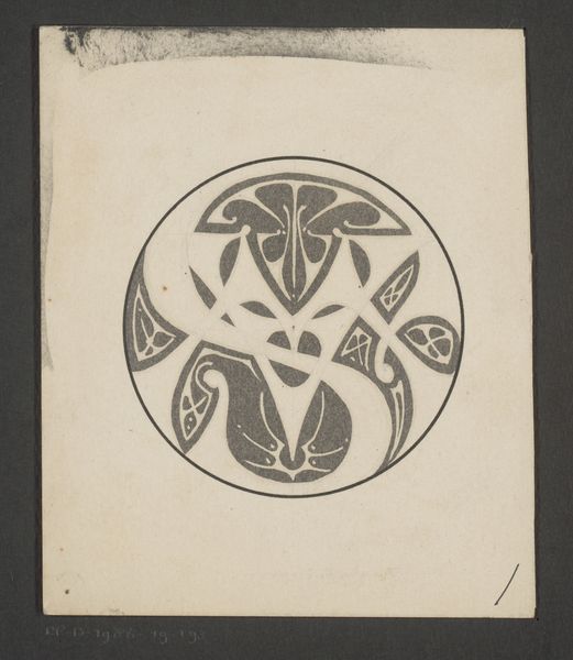
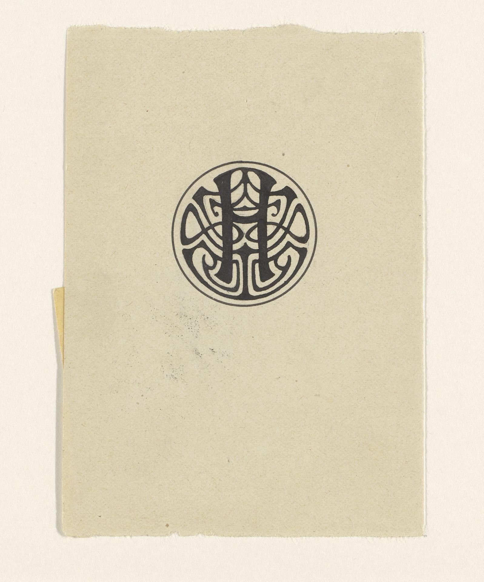
Ontwerp voor een ex libris met de letter H
Julie de Graag
1877 - 1924Location
RijksmuseumListen to curator's interpretation
Curatorial notes
Julie de Graag designed this ex libris, or bookplate, with the letter H, on paper. There's a real playfulness to the way she's approached mark-making here, those swirling lines feel so free. Looking at it, I’m struck by the texture, the grain of the paper coming through, giving the black ink something to grab onto. It's a simple design, just black on off-white, but it's got this raw, almost folk-art quality. The letter ‘H’ is intertwined with these flowing, organic shapes, contained within a circle, it looks like a logo for a secret society. Take a look at how the strokes vary in thickness, creating rhythm, the lines meet to create bulbous tear drop shapes. It reminds me of Hilma af Klint’s work. Similar to de Graag, she used geometric shapes in her work and also had an interest in the mystical, in a sense their art becomes a portal into another realm. Like all the best art, this piece asks more questions than it answers.