graphic-art, print, typography
#
art-deco
#
graphic-art
#
reduced colour palette
# print
#
old engraving style
#
typography
#
ink colored
#
monochrome
Dimensions: height 44 mm, width 47 mm
Copyright: Rijks Museum: Open Domain
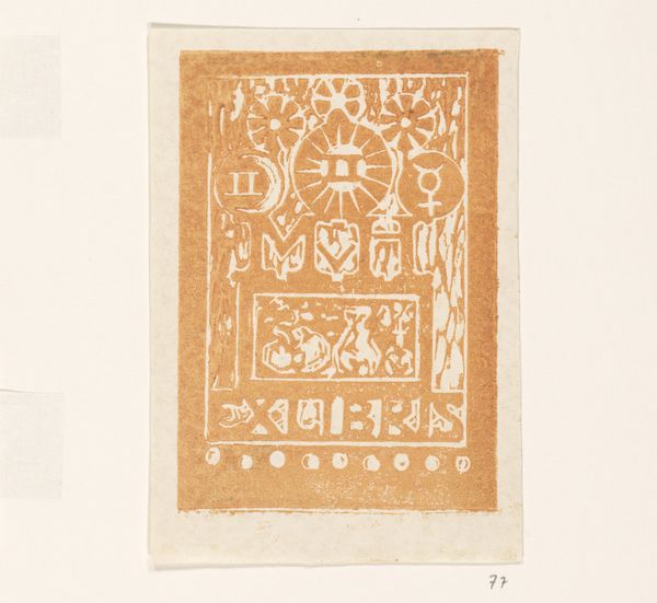
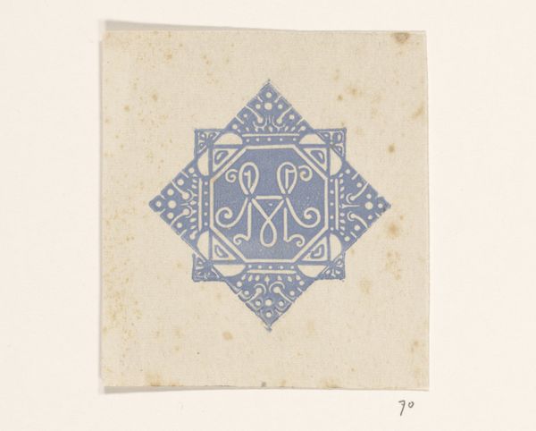
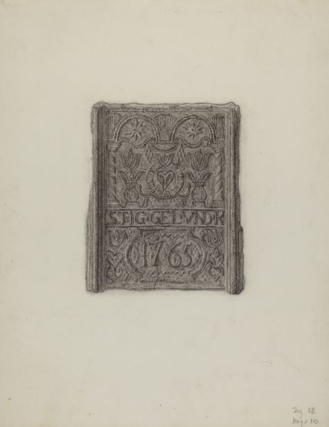
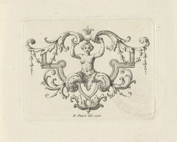
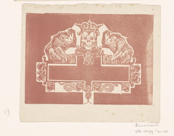
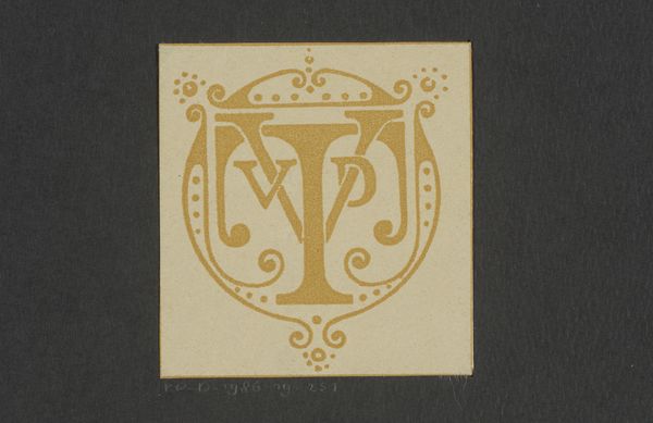
Editor: We're looking at "Vignet van Wierink met adres Valeriusstraat 40," created by Bernard Willem Wierink sometime between 1925 and 1939. It's a print using graphic art techniques. The use of one colour is quite striking. How do you read the symbolism within its composition? Curator: This print presents an intriguing study in geometric forms and textual integration. Observe how the circular emblem dominates the composition, encapsulating angular, stylized initials. What's particularly noteworthy is the deliberate balance between the typography, which grounds the design, and the abstract emblem above. Do you see how the simplified forms and limited palette contribute to a distinct visual language? Editor: Yes, the contrast definitely creates tension. It's interesting how the emblem itself seems to nestle a street address. Is the relationship of form to content significant here? Curator: Precisely. Note how the structural arrangement draws our eye to both the emblem and address simultaneously. The visual elements coalesce into a harmonious yet spatially challenging composition. The formal tension created invites interpretation: is it purely a study in form, or are we invited to find an elegant articulation between place, identity, and design? The considered composition and technical execution of this graphic work demand a rigorous appraisal of its formal relationships. What elements do you find particularly successful in the overall design? Editor: The clean lines give a sense of clarity and permanence. I think the unified colour contributes to that sense of permanence too. It's more than just a label; it's an assertion of identity. Curator: I concur. Considering the piece in terms of its graphic design, its form communicates the function clearly and elegantly. Editor: It's definitely given me a fresh perspective on the power of seemingly simple designs! Curator: Indeed. A deeper understanding emerges when formal components are analyzed meticulously.
Comments
No comments
Be the first to comment and join the conversation on the ultimate creative platform.
