drawing, graphic-art, print, paper, engraving
#
drawing
#
graphic-art
#
baroque
# print
#
paper
#
engraving
Dimensions: height 503 mm, width 585 mm
Copyright: Rijks Museum: Open Domain
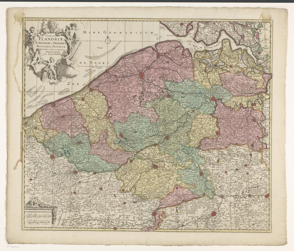
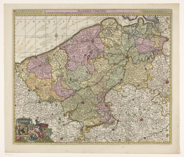
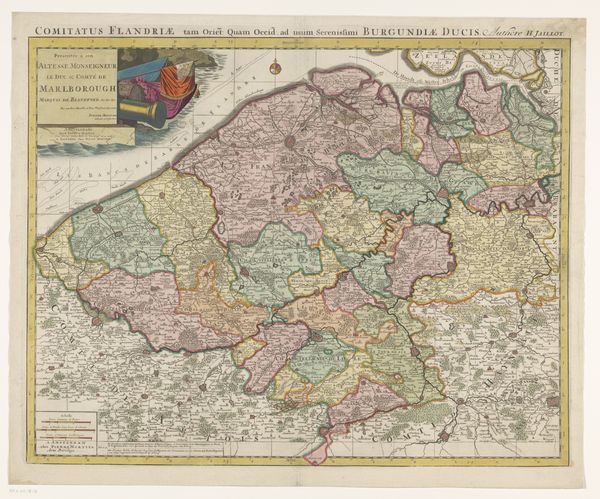
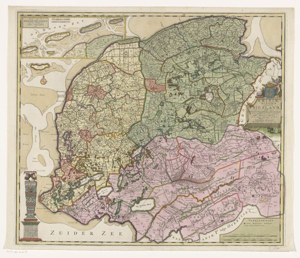
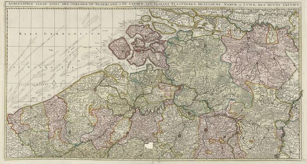
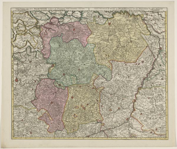
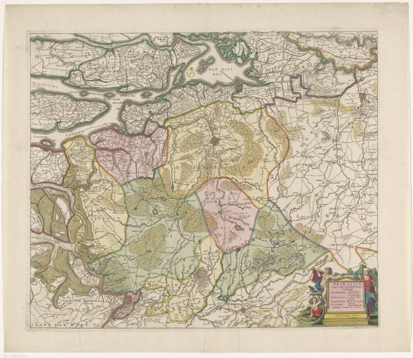
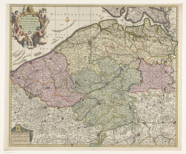
Editor: Here we have an intriguing artifact, *Kaart van het graafschap Vlaanderen,* created sometime between 1707 and 1757 by an anonymous hand. It's a baroque print, combining drawing and engraving on paper. The detail is captivating, almost dizzying! What draws your eye when you look at this map? Curator: Primarily, the cartographic form. Observe how the space is organized, dividing the area of Flanders. These subdivisions create a complex interplay of color and texture. Editor: The different colors delineating regions? Curator: Precisely. Notice, too, how the embellishments—the figures in the upper-left cartouche, for instance—function compositionally. They aren't mere decoration. Their curvilinear forms echo and complement the more geometric structure of the map itself. Editor: I see what you mean. It creates a kind of…visual harmony? But, as a map, wouldn’t accuracy be paramount? Doesn't the artistry detract from its primary function? Curator: The artistry elevates the work, giving the image an added meaning and texture. Moreover, accuracy is not necessarily the main priority. A map reflects not merely geography, but also cultural understanding. The elaborate Baroque styling underscores a specific visual language of power and order, relevant in its time. This way it allows it to function simultaneously as a representation and an artwork. Editor: That's fascinating. I never considered the visual language of maps before. I guess I was too focused on the content. Curator: The medium and form become the content. The technique becomes the story. Editor: I definitely have a different perspective on this map now! Thanks. Curator: My pleasure. Now let us contemplate how we might apply these observations to our understanding of Flemish Baroque.
Comments
No comments
Be the first to comment and join the conversation on the ultimate creative platform.
 Collect
 React
React Comment
More like this