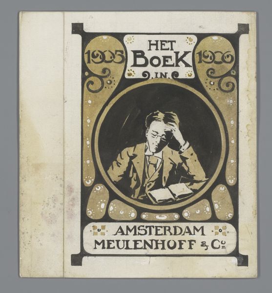
Ontwerp voor het titelhoofd van 'Samuel, geïllustreerd weekblad voor jongelieden' 1896
0:00
0:00
careladolphlioncachet
Rijksmuseum
drawing, graphic-art, typography
#
drawing
#
graphic-art
#
art-nouveau
#
typography
#
typography
Dimensions: height 124 mm, width 284 mm
Copyright: Rijks Museum: Open Domain
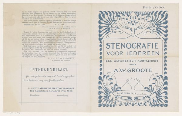
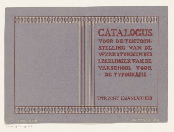
Editor: Here we have Carel Adolph Lion Cachet’s design for the masthead of “Samuel, geillustreerd weekblad voor jongelieden” created in 1896. The typography has a quiet, earnest feel, but I am curious: what strikes you most about this graphic work? Curator: What grabs my attention is how this seemingly straightforward design is imbued with a subtle yet powerful ideology of its time. Considering this was made during the rise of illustrated periodicals, and explicitly intended "for youngsters," how do you see it participating in broader societal dialogues about youth, literacy, and even Dutch national identity? Editor: I hadn't thought of that. I guess the choice of Art Nouveau style makes it modern, therefore aligned with the young readership and ideas of progress. Is there a relationship between these youth magazines and, say, colonialism? Curator: Absolutely. These publications often served as tools for shaping young minds, subtly promoting colonial agendas and reinforcing social hierarchies. What role might “Samuel,” as a periodical for young people, have played in disseminating particular notions of Dutch identity or its global role, through images, stories, and, of course, typography? Editor: That makes me look at the typography differently, almost like a silent vehicle for something bigger. Thanks, I didn't notice these contextual connections before. Curator: Art, even design, is never neutral. Considering its historical and social framework transforms the artwork, adding layers of relevance.
Comments
No comments
Be the first to comment and join the conversation on the ultimate creative platform.
