graphic-art, print, typography, poster
graphic-art
art-nouveau
script typography
hand-lettering
old engraving style
hand drawn type
hand lettering
typography
hand-drawn typeface
fading type
stylized text
thick font
handwritten font
poster
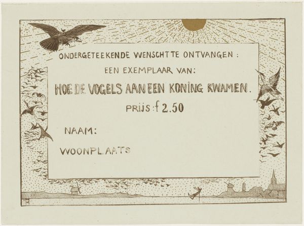
Dimensions: height 98 mm, width 136 mm
Copyright: Rijks Museum: Open Domain
Theo van Hoytema designed this order form for a 1902 calendar. The card is dominated by text, carefully arranged to convey information while also serving as the artwork's primary visual element. Notice how Hoytema uses typography, the art and technique of arranging type, to create a sense of order and clarity. The text is structured into distinct blocks, separated by horizontal lines that guide the eye. The contrasting sizes and weights of the lettering emphasize key words, drawing attention to 'KALENDER VOOR 1902', the central element of the card. The form prompts the viewer to interact with the artwork, transforming them from passive observer to active participant. It is not merely an image but an invitation to engage with the artist’s work through commerce. In doing so, the artwork challenges conventional boundaries between art and utility. It functions as a sign, a textual code, that invites interpretation and signifies a particular cultural and economic exchange.
Comments
No comments
Be the first to comment and join the conversation on the ultimate creative platform.