graphic-art, print, typography, poster
#
art-deco
#
graphic-art
#
reduced colour palette
# print
#
typography
#
solid block colours
#
poster
Dimensions: height 75 mm, width 110 mm
Copyright: Rijks Museum: Open Domain
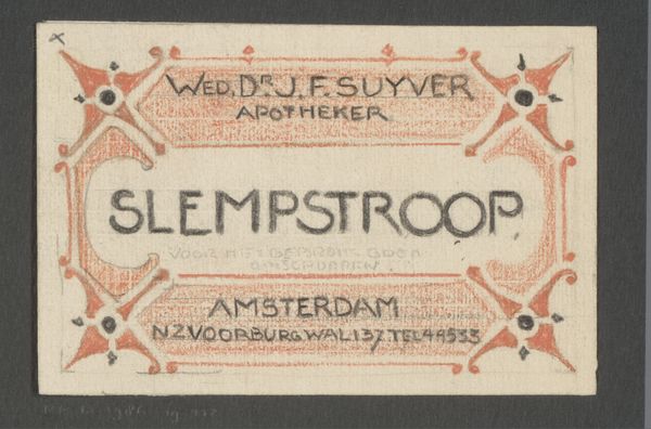
Editor: Here we have “Apothekersetiket voor bessensap,” or Apothecary Label for Berry Juice, from 1931, printed by Steendrukkerij De Jong & Co. It’s a print, almost a poster-like design. I’m struck by how clean and modern it feels, even though it's almost a century old. What draws your eye when you look at this piece? Curator: The visual structure immediately asserts itself. Note the careful arrangement of typographic elements within the rectangular frame. The designer uses the interplay of solid, contrasting blocks of color, and simple shapes – particularly those decorative corner elements – to create visual interest. What do you observe about the font choices? Editor: Well, "Bessensap" is in a bold, sans-serif font that really pops, while the other text is more refined, almost delicate. It creates a hierarchy, I think. Curator: Precisely. Observe how the heavier weight of “Bessensap” anchors the design. The contrasting lighter typeface, along with its strategic placement at the top and bottom, introduces a counterpoint that enhances readability. The graphic elements are clearly deployed to organize space. How would you describe their effect on the whole? Editor: They feel… intentional. Like they're not just decoration, but part of a system, like a visual language. The limited color palette also strikes me. Curator: Yes, a deliberate restriction creates a harmonious whole. Note how the artist adheres to the picture plane; the interplay is two-dimensional and calls attention to surface qualities, consistent with contemporary aesthetics of the era. Consider the impact if more colors had been introduced. Would it achieve the same unity? Editor: I see what you mean. More colors might disrupt the balance and the very streamlined feel of it. Thanks, I wouldn't have considered all these design elements otherwise. Curator: And I appreciate your sharp insights into its immediate appeal, it offers a reminder to appreciate the structure of seemingly simple works.
Comments
No comments
Be the first to comment and join the conversation on the ultimate creative platform.
More like this