Dimensions: height 495 mm, width 586 mm
Copyright: Rijks Museum: Open Domain
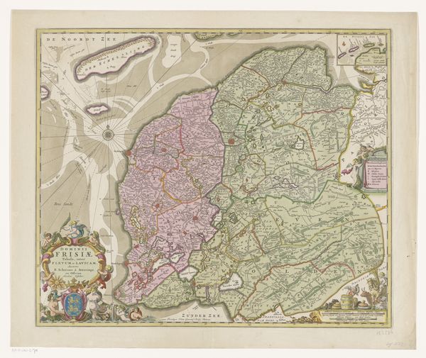
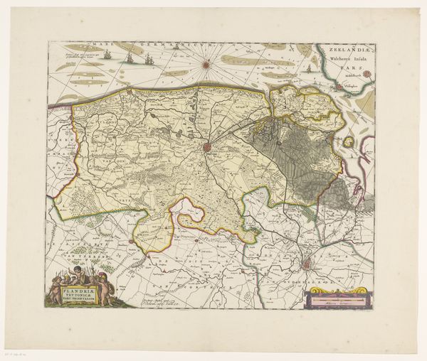
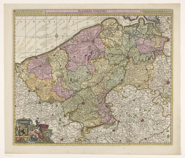
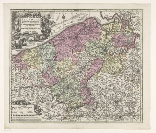
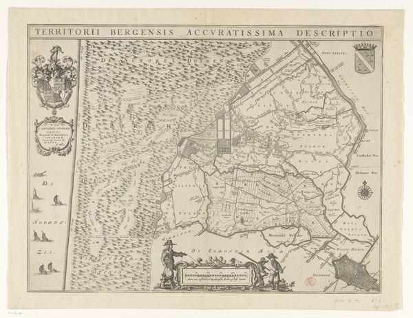
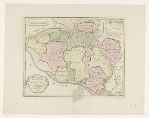
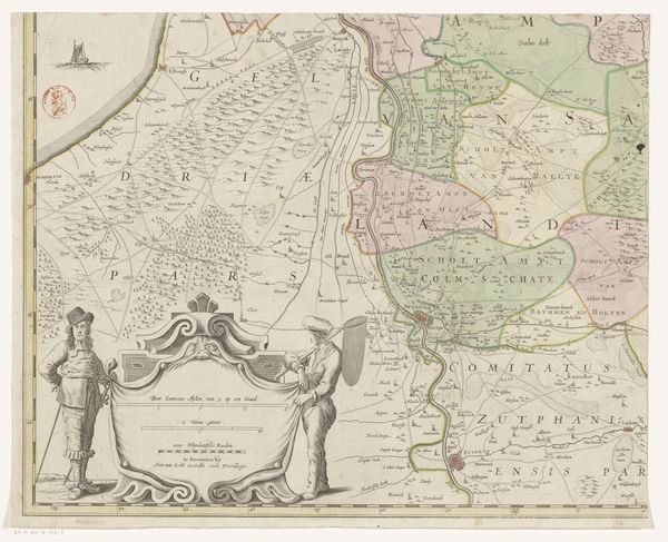
Editor: This is "Kaart van Walcheren," a map of Walcheren, dating from 1757 to 1778, created by Georg Friedrich Lotter. It’s an engraving with pen work and watercolor – the colors are so delicate! It gives me a real sense of the past. What do you see in this piece? Curator: This map is more than just geography; it's a container of cultural memory. The Baroque embellishments and the ship imagery speak to Walcheren's identity as an island shaped by the sea. Look at the compass rose—a symbol of navigation but also of destiny. It suggests a yearning for exploration but also a reminder of human limitations in the face of nature’s power. Editor: That's interesting. So the visual elements carry meaning beyond their practical function? Curator: Exactly. The island itself, meticulously detailed, almost becomes a character. Think about what it meant to depict one’s land with such care. How does that visual act instill a sense of belonging and continuity across generations? This map projects not just spatial information but a sense of self. Consider, for example, the fortified cities colored in red; these could be a reflection of protection, territory and power at the time the map was created. Editor: I hadn't thought about the map in that way. I was just seeing a historical document. Curator: These old maps are mirrors reflecting collective identities. This “Kaart van Walcheren” shows both what the island *is* and what it *meant* to those who inhabited it. Editor: So by studying the imagery and style, we understand more than just geography? Curator: Precisely. The symbolic language embedded in this engraving teaches us about the cultural values and world view of people living centuries ago. Editor: This map suddenly feels a lot less flat and a lot more like a story. Thank you. Curator: A pleasure. Remembering the cultural context enriches the way we view any art.
Comments
No comments
Be the first to comment and join the conversation on the ultimate creative platform.
More like this