Copyright: Modern Artists: Artvee
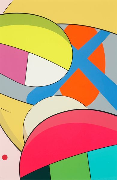
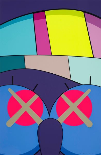
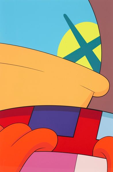
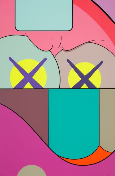
Here we have Kaws's "Ups And Downs #1", probably made with acrylic paint to achieve those flat, bold colors. I love the way Kaws embraces the flatness of the surface, making no attempt to create depth or illusionism, and in doing so, really announces artmaking as a process of choices. The texture is smooth, almost like it’s been printed, you know? The colors are so vivid and sharply defined that they almost vibrate against each other, and the black outlines around each shape really make them pop. Look at that row of squares along the smile – each one a different hue, and yet they all sit so perfectly together. This work reminds me of the graphic punch of someone like, say, Peter Saul. But where Saul's work is often politically charged and grotesque, Kaws has this playful, almost melancholic feel. It’s like he’s inviting us to see the world with a kind of knowing innocence.
Comments
No comments
Be the first to comment and join the conversation on the ultimate creative platform.
More like this