Copyright: Modern Artists: Artvee
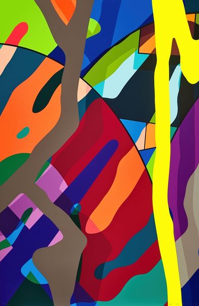
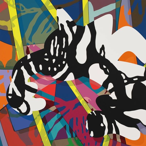
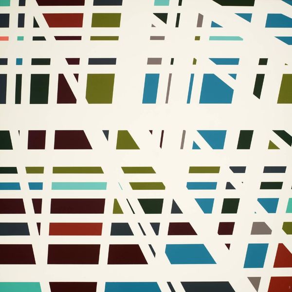
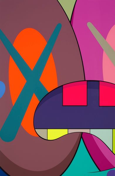
Editor: So here we have KAWS' "Tension #1," from 2019, an acrylic on canvas. It’s incredibly vibrant! The shapes feel both organic and geometric, and the colours just pop. It makes me think of the organised chaos of a city, perhaps? What’s your take on this piece? Curator: Ah, organised chaos, I love that. It’s like KAWS has taken a city, fed it through a cartoon filter, and then painted the result with candy floss. The clashing colours are part of the thrill, right? He's working within the language of pop art, but also engaging with color field painting, where the surface becomes this playground for the interaction of hues. Tell me, what does the title 'Tension #1' evoke for you when you look at this riot of colour? Editor: It makes me think about how opposing forces create a kind of exciting balance. I can sense visual tension, particularly between those saturated blocks of colour. Curator: Exactly! Tension is such a loaded word here. It hints at the push and pull, not just visually with colour and form, but maybe also the cultural tension KAWS often plays with, this intersection between street art, commercialism, and fine art. Are we meant to feel a little uneasy amidst all the fun? Or is this about pure joyful release? Editor: That's a cool idea. I hadn't considered it that way! I tend to focus on just what's on the canvas rather than its context. Curator: That’s the beautiful thing about art though – it is what you bring to it! And it keeps evolving as we evolve. I do love the invitation it gives for everyone to form their own judgements about what he's showing, without the weight of traditional painting. So much to think about! Editor: This has really changed the way I look at it. Thanks, I see that pop art context much more now!
Comments
No comments
Be the first to comment and join the conversation on the ultimate creative platform.
More like this