Copyright: Modern Artists: Artvee
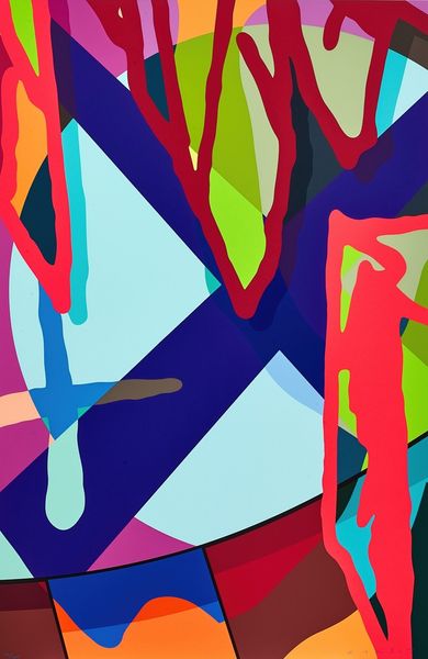
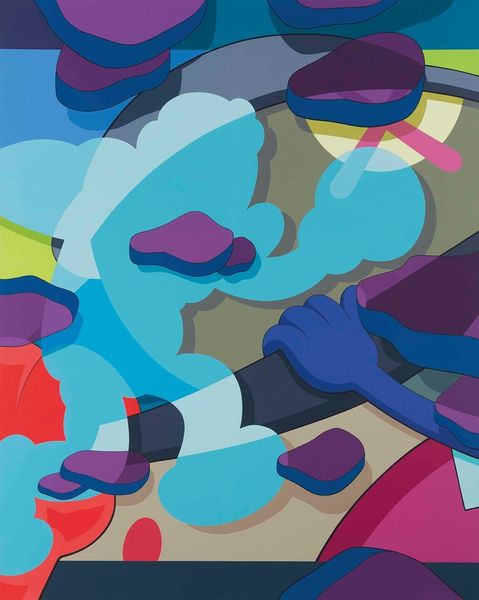
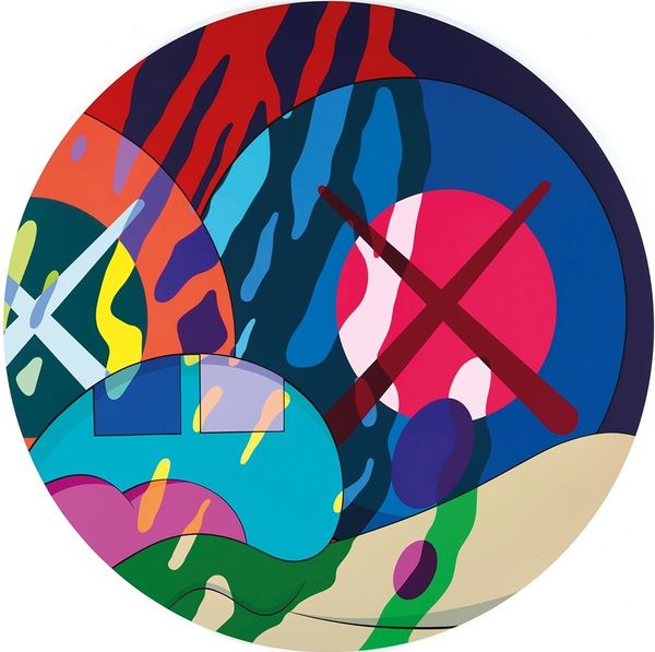
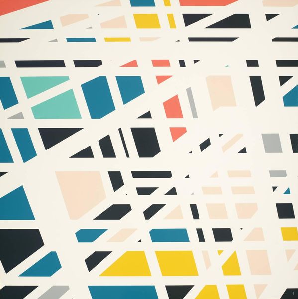
Editor: So, this is "Tension #3" by KAWS, created in 2019. It’s an acrylic painting with a really vibrant, almost chaotic, feel. I'm struck by how the colours clash and overlap. What symbolic meaning do you think KAWS is playing with here? Curator: Interesting observation. This clashing and overlapping of colours are actually quite deliberate, acting as signifiers, not just decoration. It's Pop Art, after all. Look closely, the abstract shapes could reference recognizable commercial images stripped of their original context. Are there familiar forms lurking beneath? Editor: I see what you mean. Now that you mention it, some of those shapes feel vaguely cartoonish. Curator: Exactly! These familiar echoes are loaded with cultural memory. KAWS is prompting us to decode and question our relationship with commercial imagery and how it informs our identities. He's utilizing bright colours reminiscent of childhood. What emotions are evoked through this choice? Editor: I definitely feel a sense of playfulness but also a kind of…unease, maybe because those friendly associations are juxtaposed with harder-edged geometric forms? Curator: A powerful contradiction! KAWS masterfully utilizes the psychology of colour and form to trigger contrasting emotions. Are we free individuals or a demographic targeted through coded messaging? This push-and-pull encapsulates what many feel navigating our contemporary image-saturated lives. What do you take away from this? Editor: It's a lot to think about – how much these seemingly simple images can influence us without us even realizing it. I guess I'll pay more attention to the visuals around me! Curator: Absolutely. By examining art like "Tension #3," we sharpen our awareness, becoming more discerning interpreters of the symbols that shape our world.
Comments
No comments
Be the first to comment and join the conversation on the ultimate creative platform.
More like this