Copyright: Modern Artists: Artvee
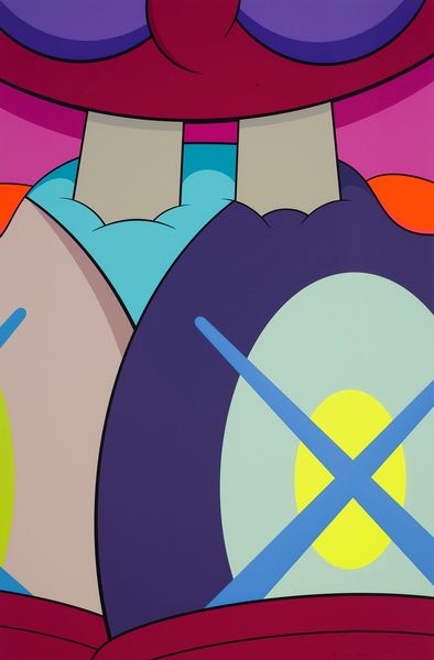
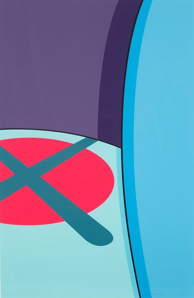
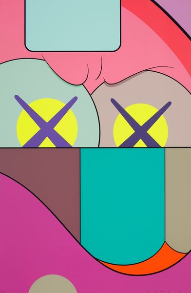
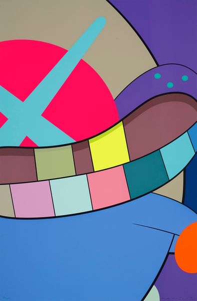
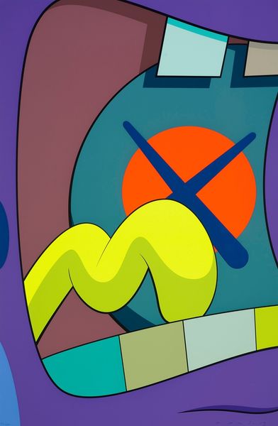
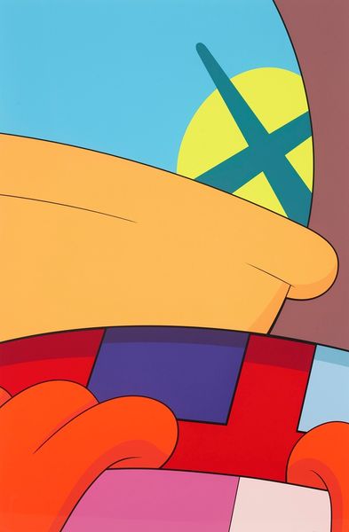
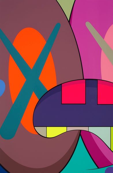
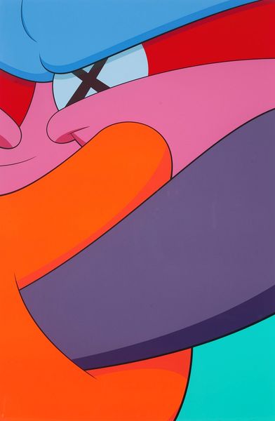
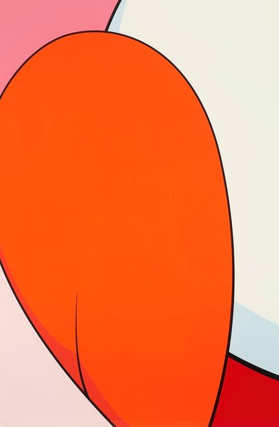
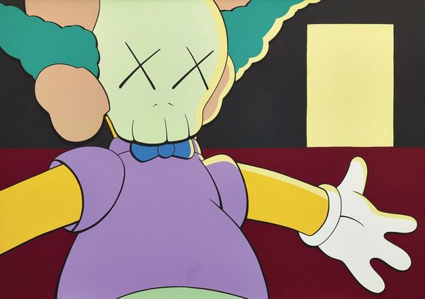
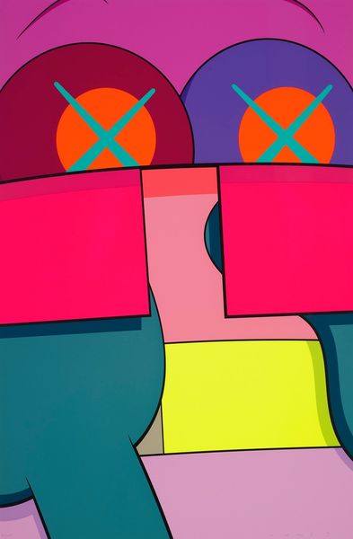
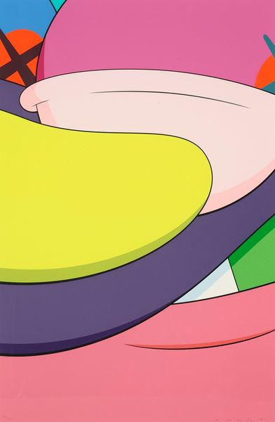
Kaws made this ‘Ups And Downs #5’ painting, using flat areas of color and bold lines. It’s all about how those colors bump up against each other, right? Looking closely, you'll notice the surface is super smooth, almost like it's been printed. The paint seems thin, and he’s really controlled the application. Take those criss-crossed eyes. They're like a brand, but also, a comment on blindness, maybe? The neon pink against that blue is jarring, like a visual shout. There is something of Elizabeth Murray's playful abstraction in the composition; I think Kaws shares her interest in distorting recognizable forms and pushing boundaries. Ultimately, it reminds us that art doesn’t always need to be serious. It can be playful, a little dark, and still pack a punch.
Comments
No comments
Be the first to comment and join the conversation on the ultimate creative platform.
More like this